Typography

Our typography is a visual representation of our Tone of Voice, reflecting the friendly, creative spirit of Simply.
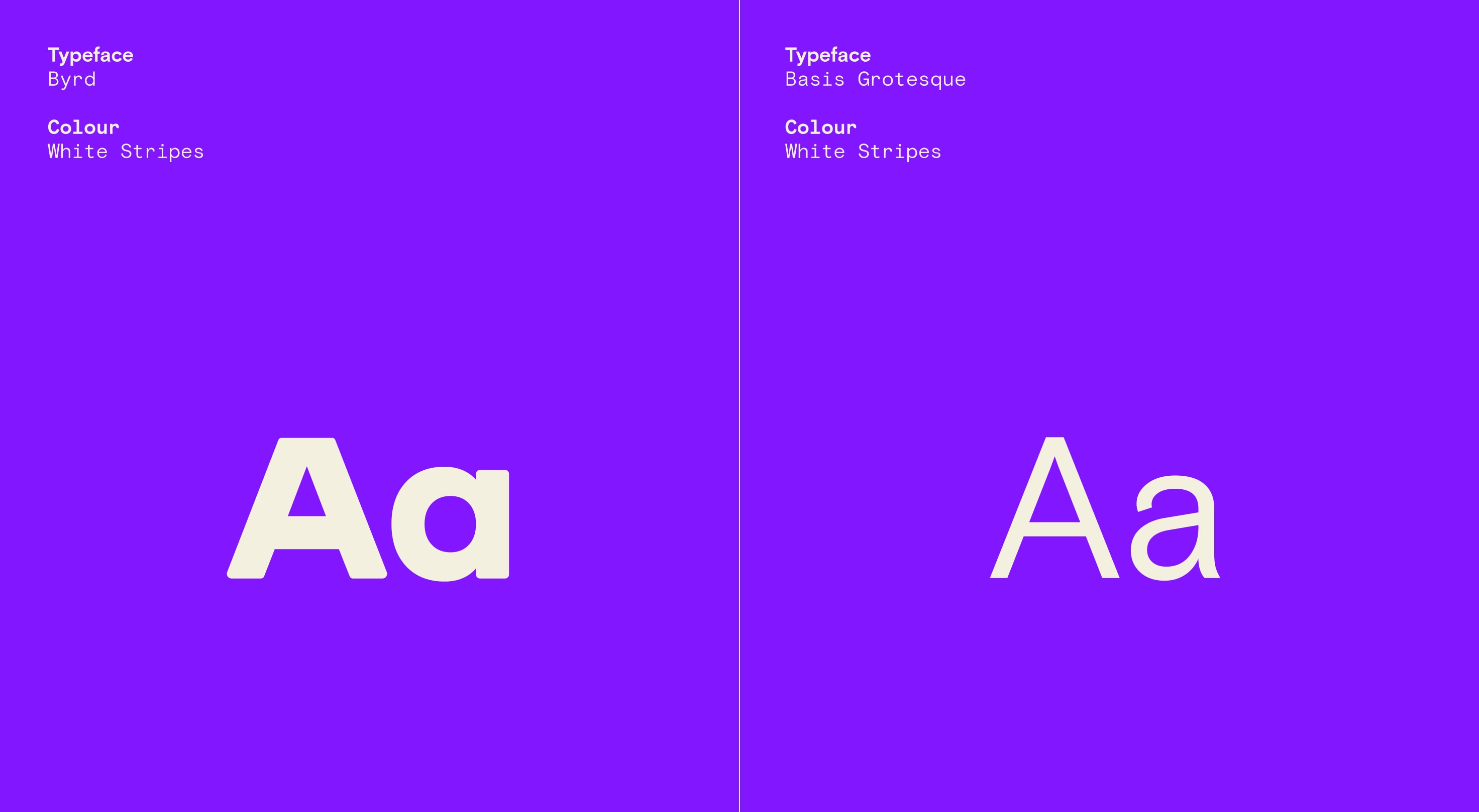
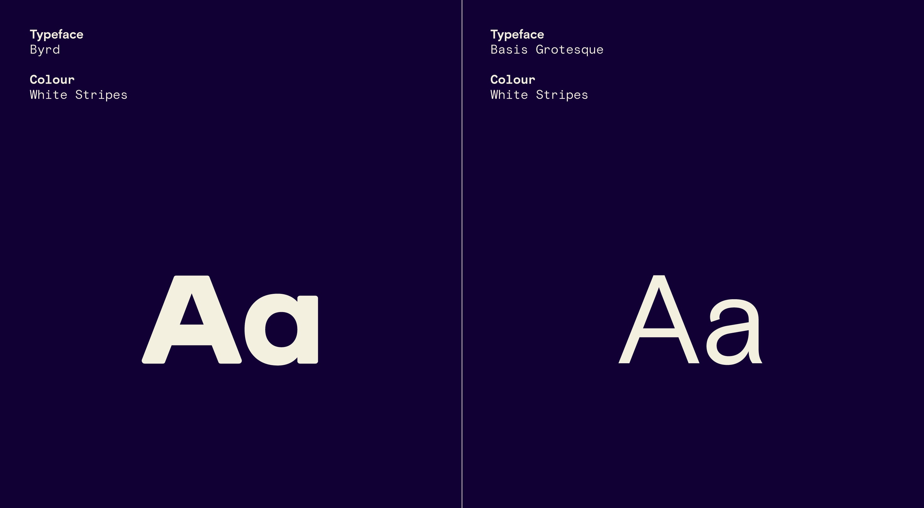
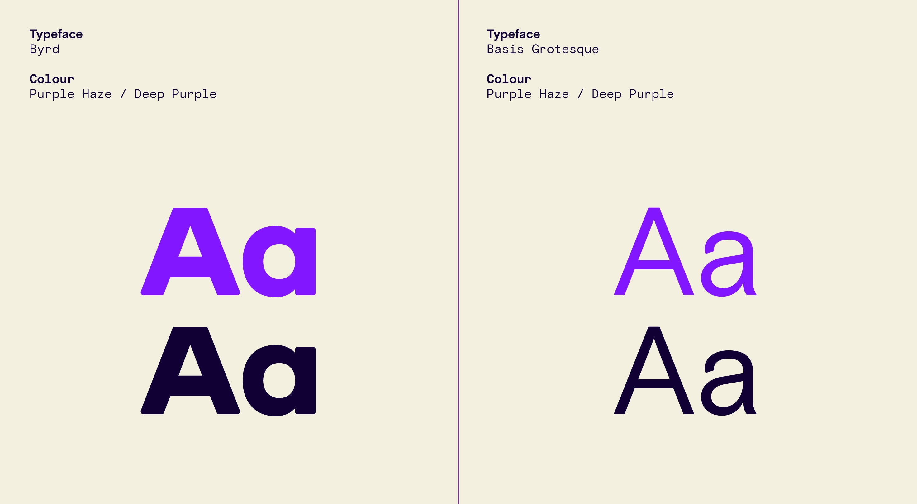
Our custom headline font, Byrd, is a clean, contemporary typeface with warm and friendly characteristics. It’s easy to read and plays a key role in building a consistent identity for our brand. Meanwhile, Basis Grotesque adds rigor, clarity and functionality to all our communications.
Overview
Our two core typefaces provide us with plenty of flexibility. We use our custom headline font Byrd to convey joyful and welcoming primary messaging. We use our body font Basis Grotesque for clear, functional secondary messaging.
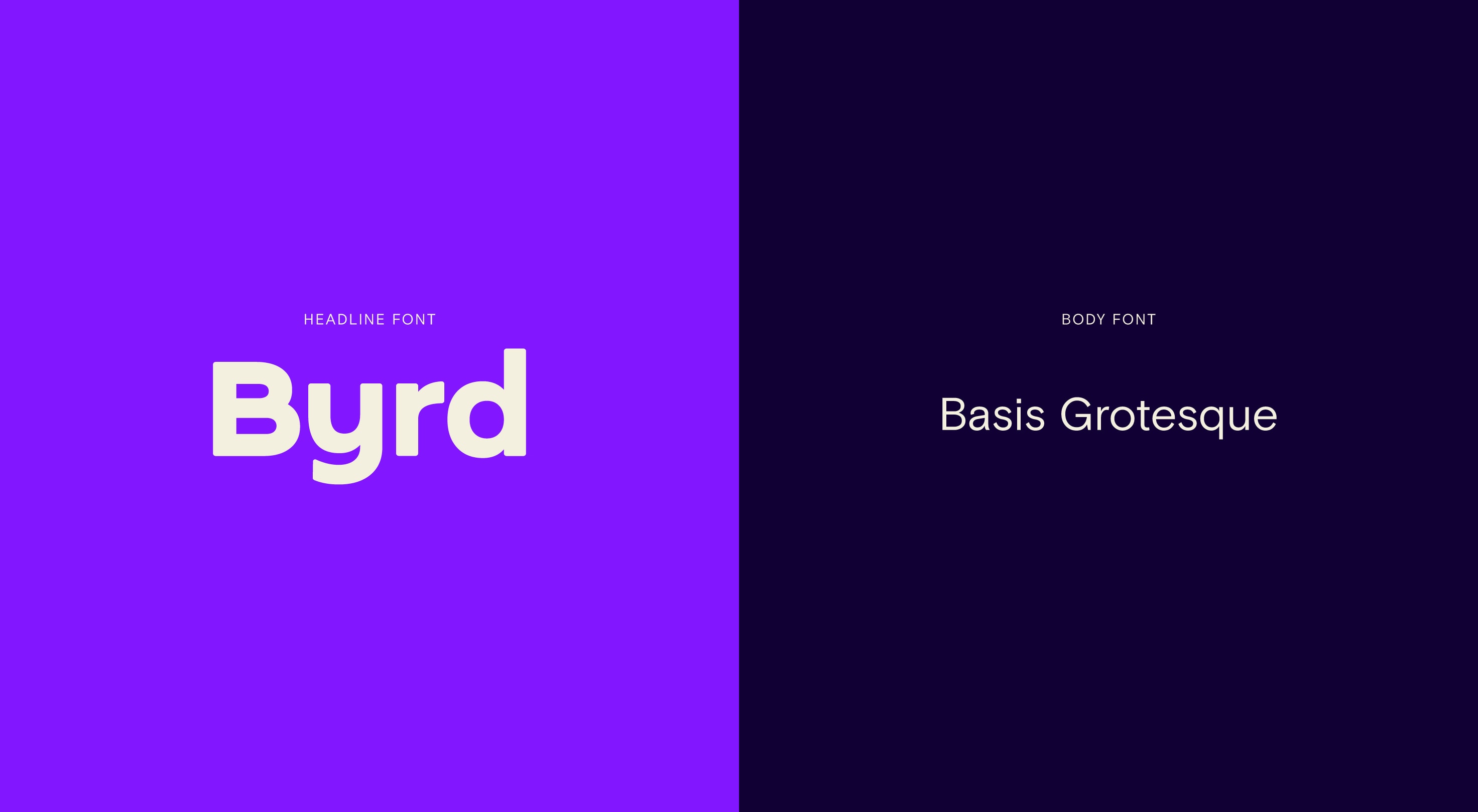
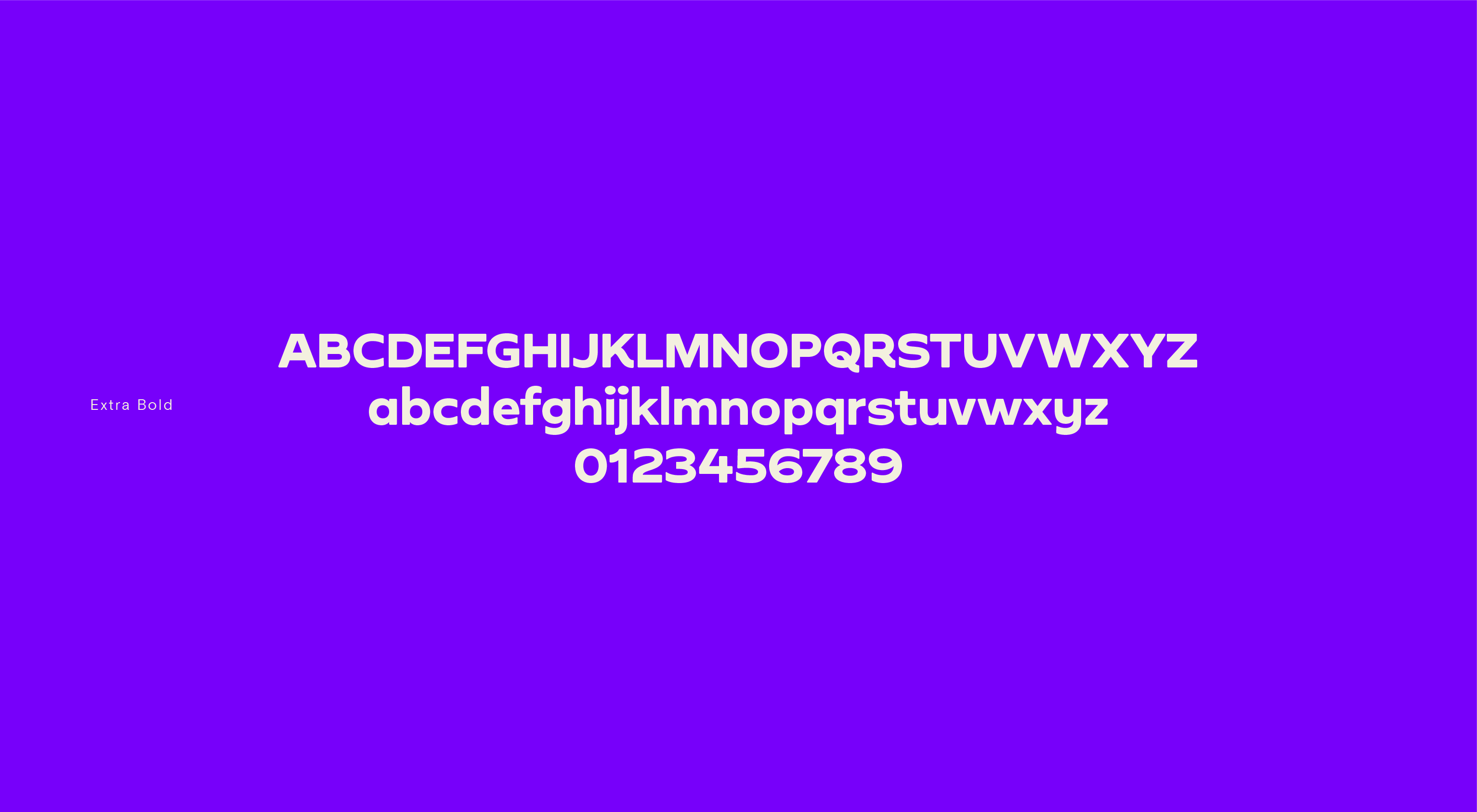
Headline font
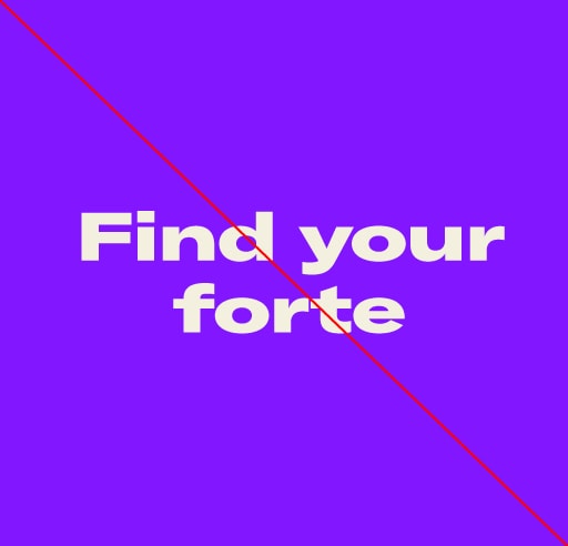
Our customised headline font is a Byrd. We use this when we want to create joyful headlines that make a big impact.
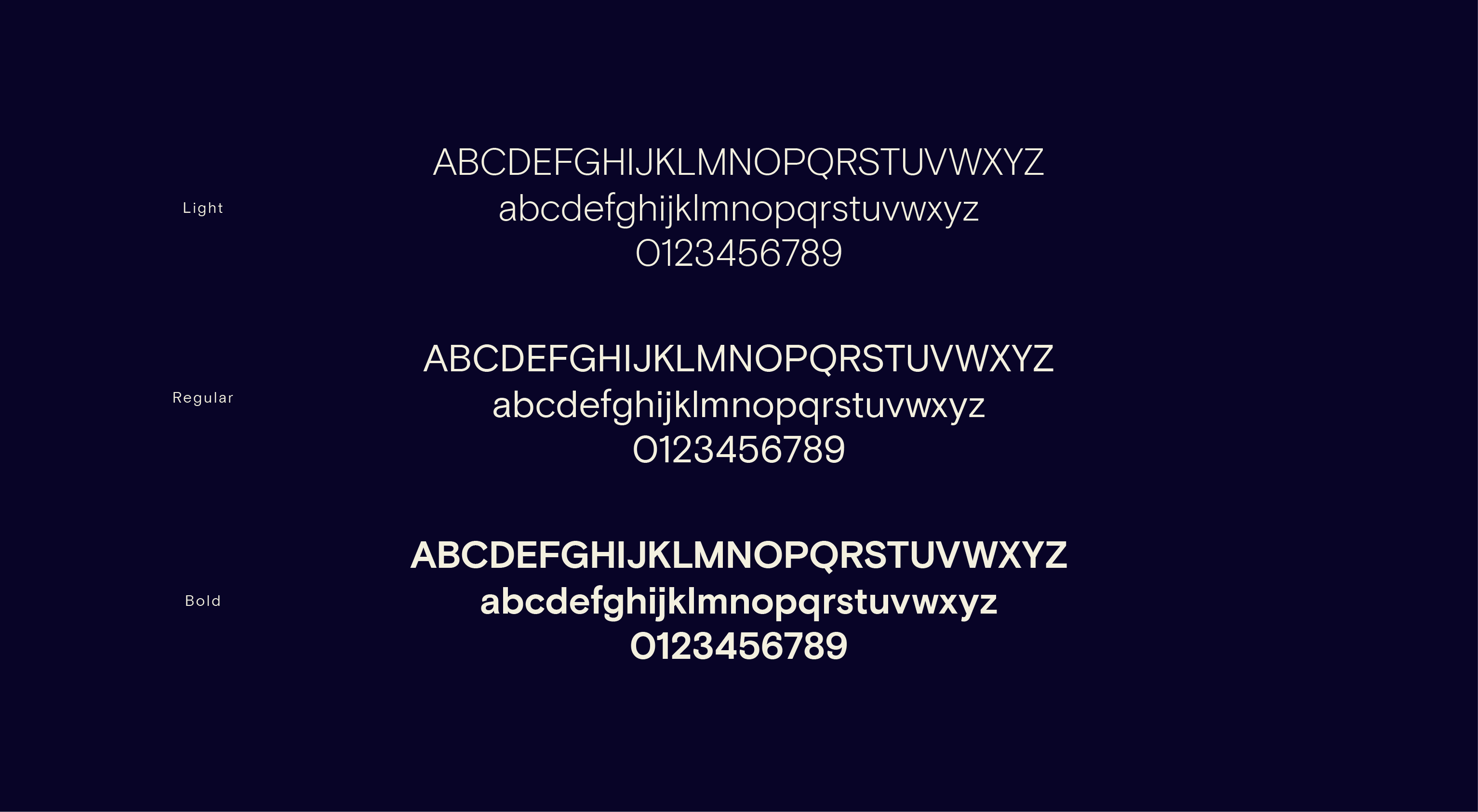
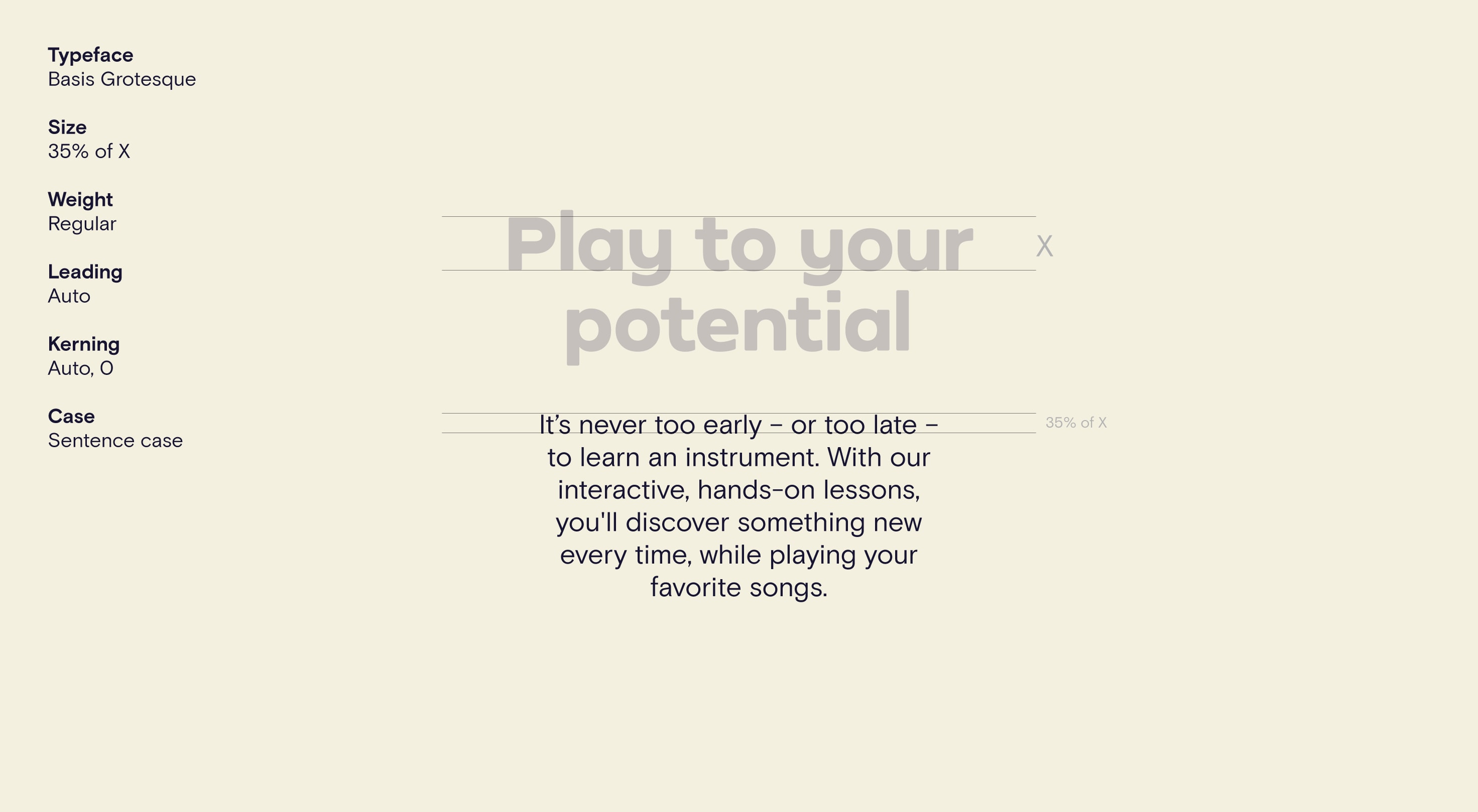
Body font
Our body font is Basis Grotesque. We use this when we want to create functional, informative sub-headlines and body copy.
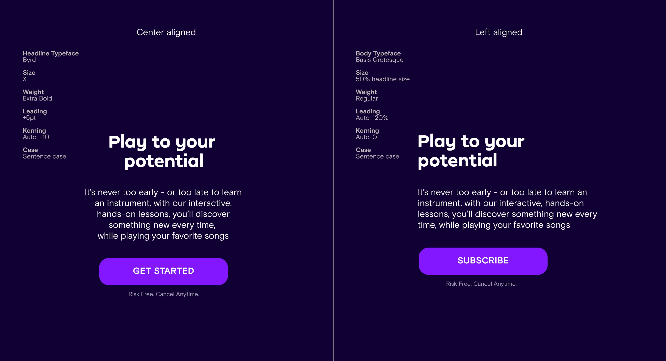
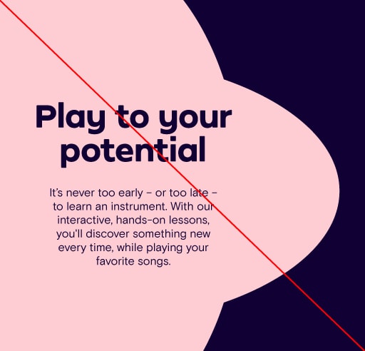
Hierarchy & typesetting
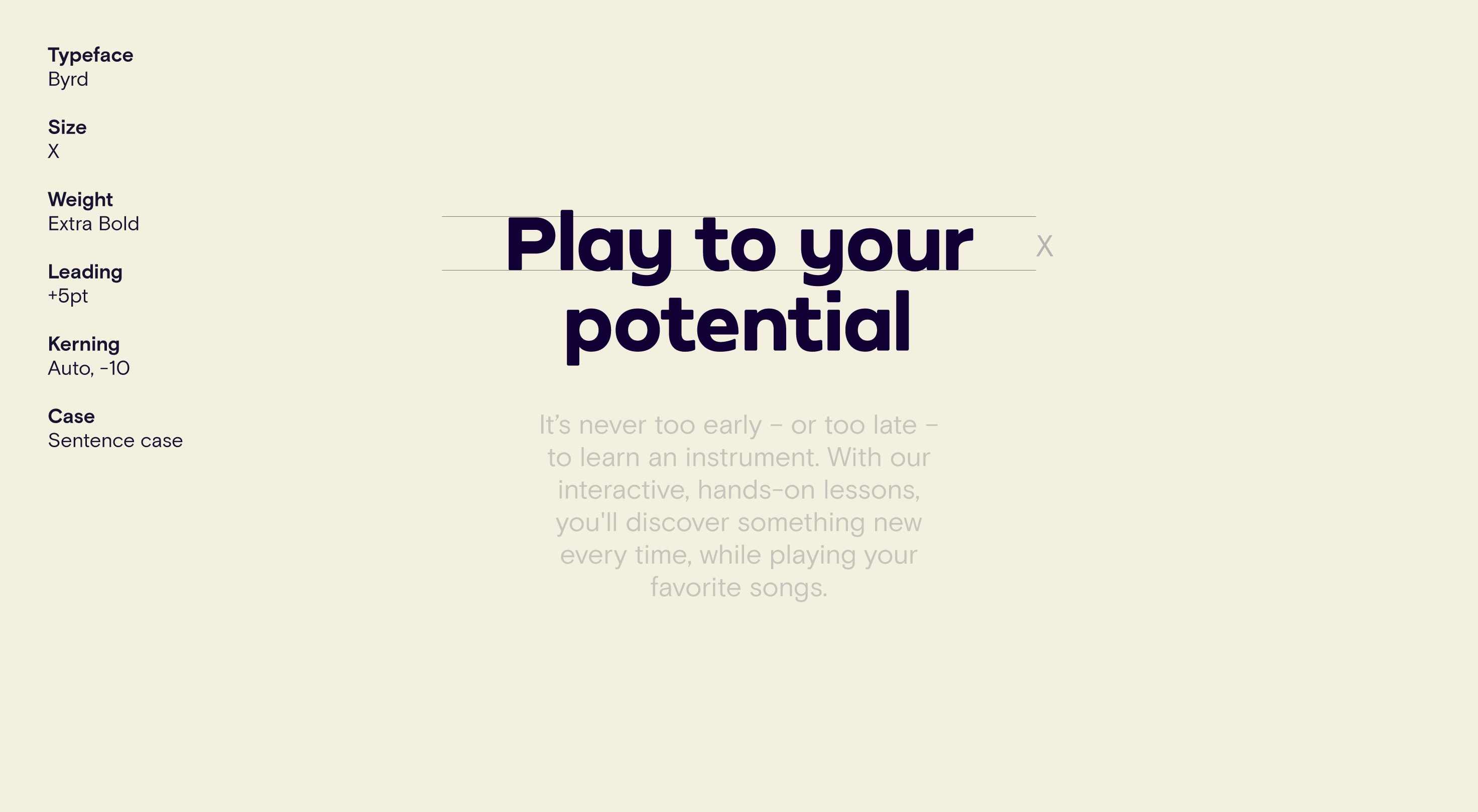
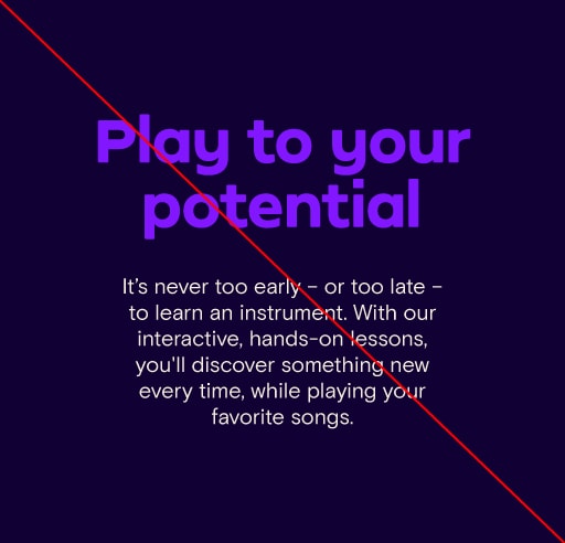
Here is an example of how we can typeset a headline paired with body copy. We use a combination of Byrd for the headline typeface and Basis Grotesque for the body copy.
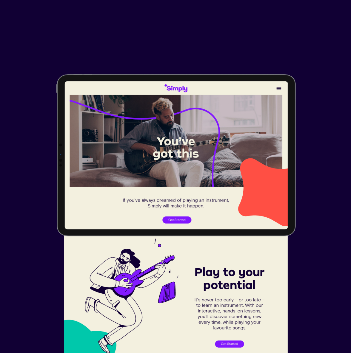
In-app typesetting & hierarchy
*Add Copy Here*
Typographic color
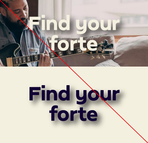
Our typography can sit over the top of 3 background colors (Purple Haze, Deep Purple and White Stripes). Each background color has a preferred typecolour combination to ensure we retain maximum legibility.
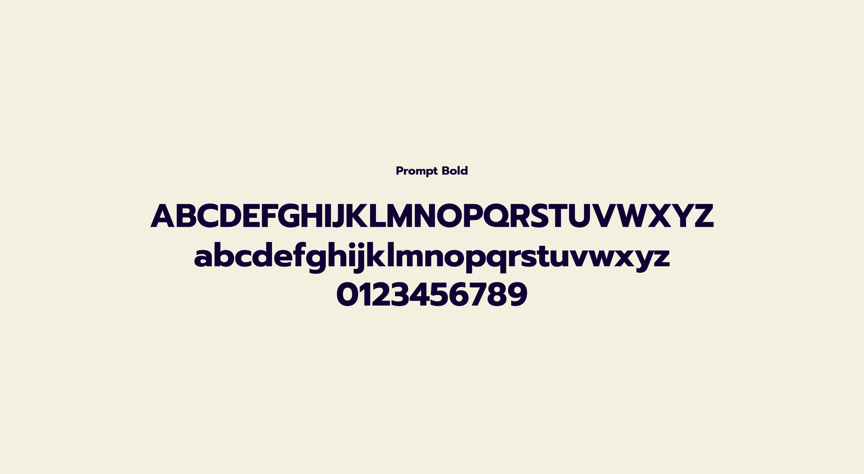
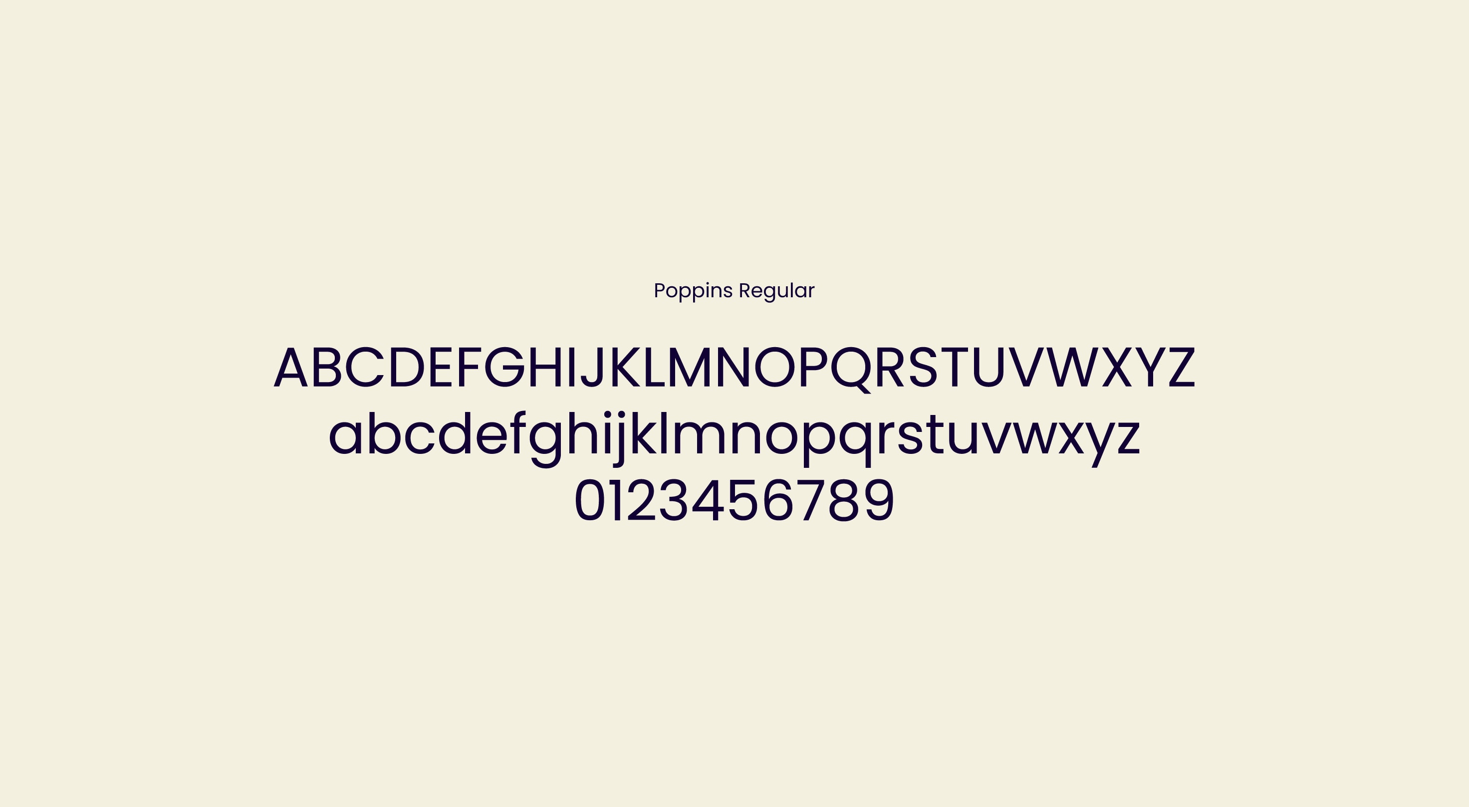
Internal system font
Our two Google fonts for internal use are Prompt Bold for headlines and Poppins for body copy. Avoid using these fonts for any external branded content.
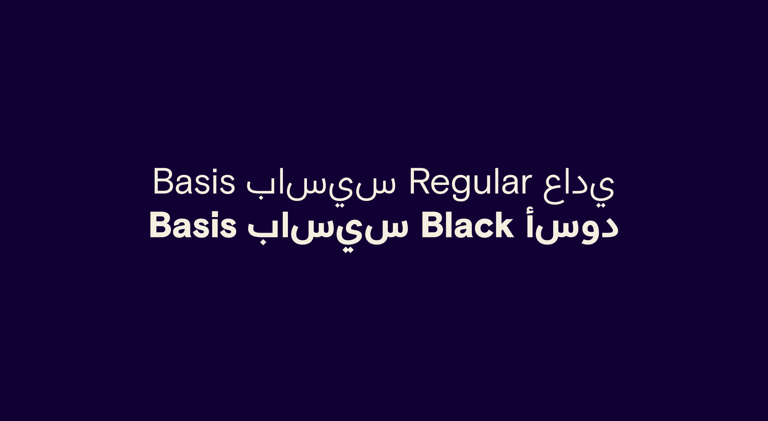
International fonts
Our substitute fonts for Arabic character sets are Basis-Arabic regular and Black.
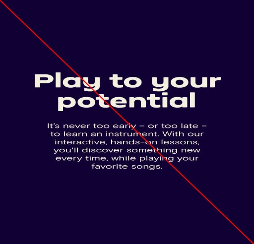
Things to avoid
Here are some examples of things to avoid when working with typography.
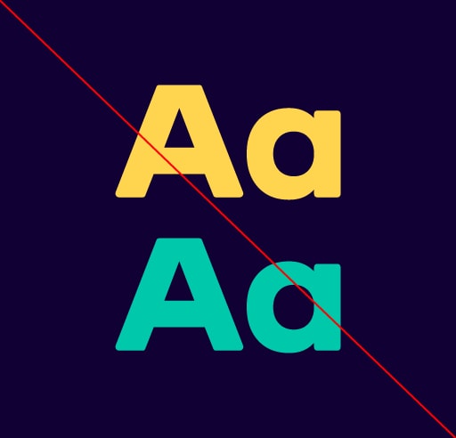
Do not set typography in our secondary colors.
Do not stretch or warp typography.
Do not use alternative fonts for headlines.
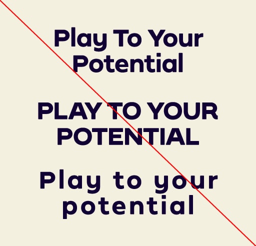
Do not set headlines in all caps or title case and do not add additional tracking.
Do not set headlines in all caps or title case and do not add additional tracking.
Do not add effects or drop shadows to type.
Do not use shapes as a text container.
Do not use internal fonts for branded content.
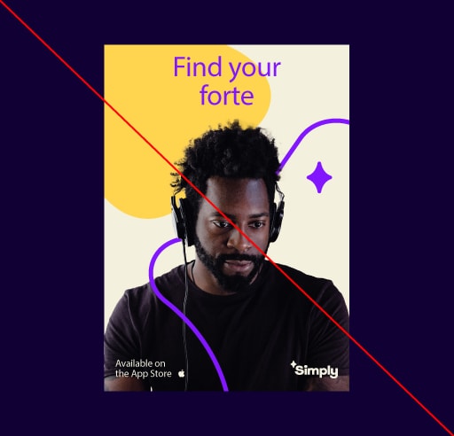
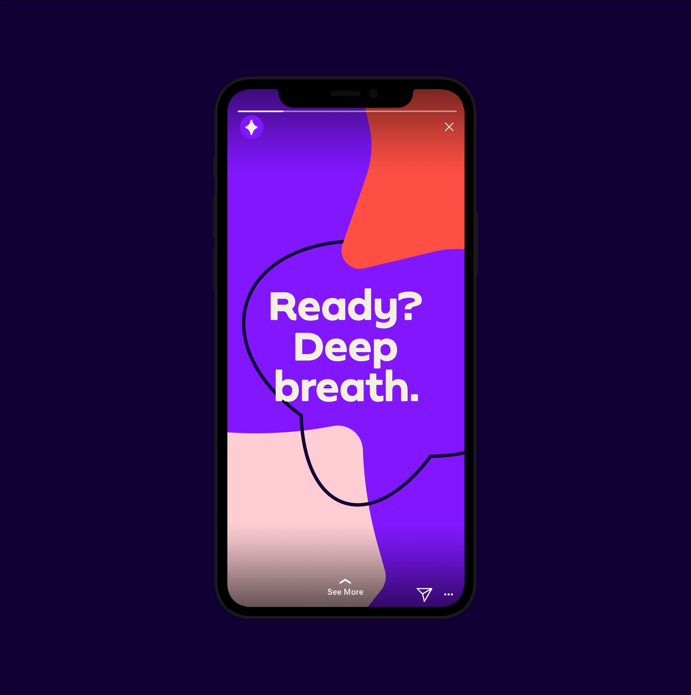
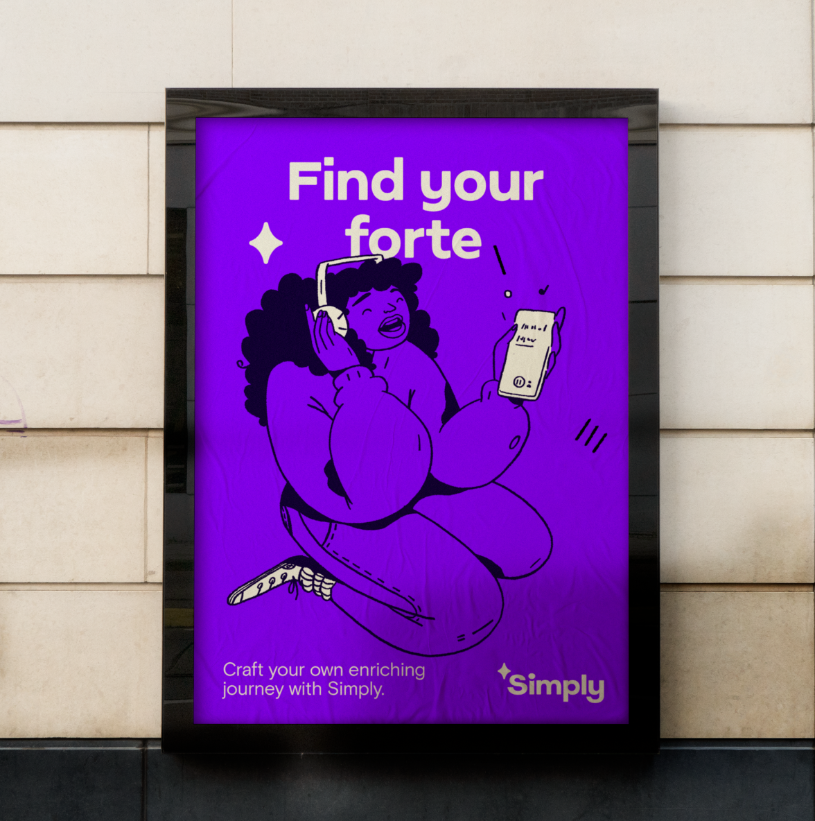
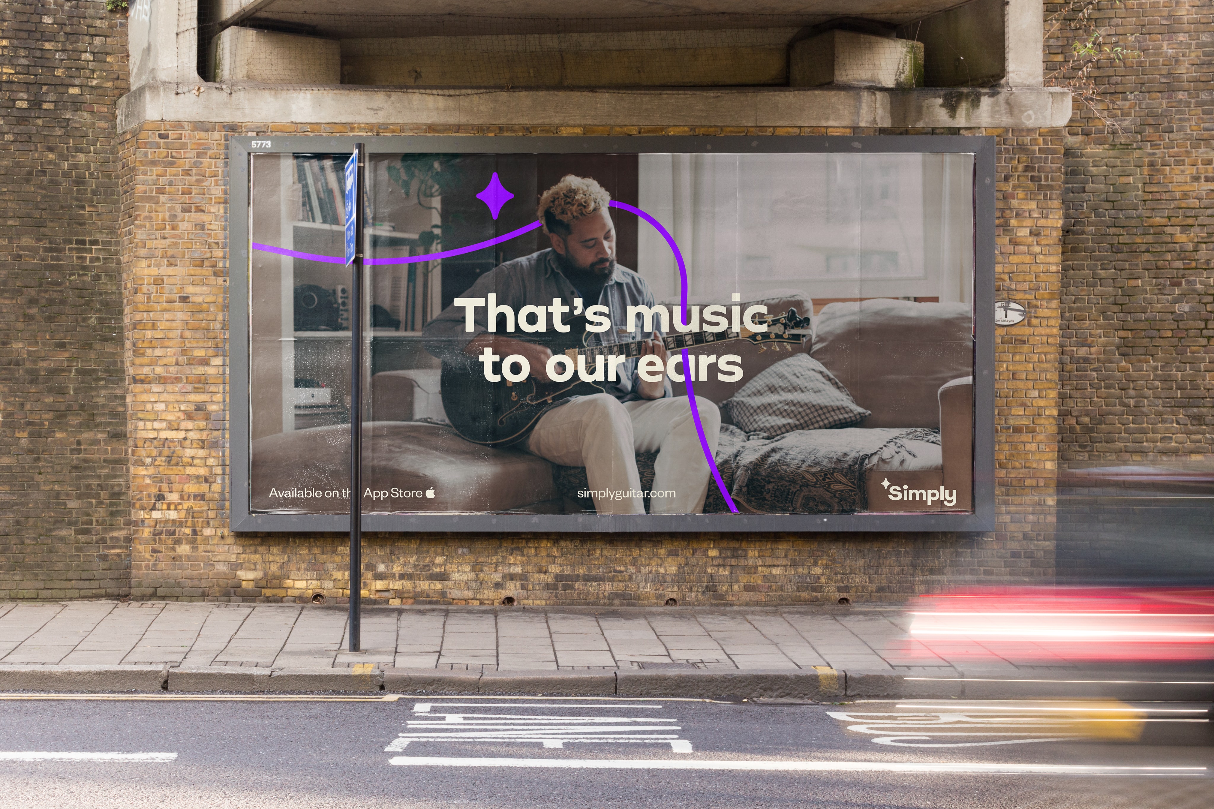
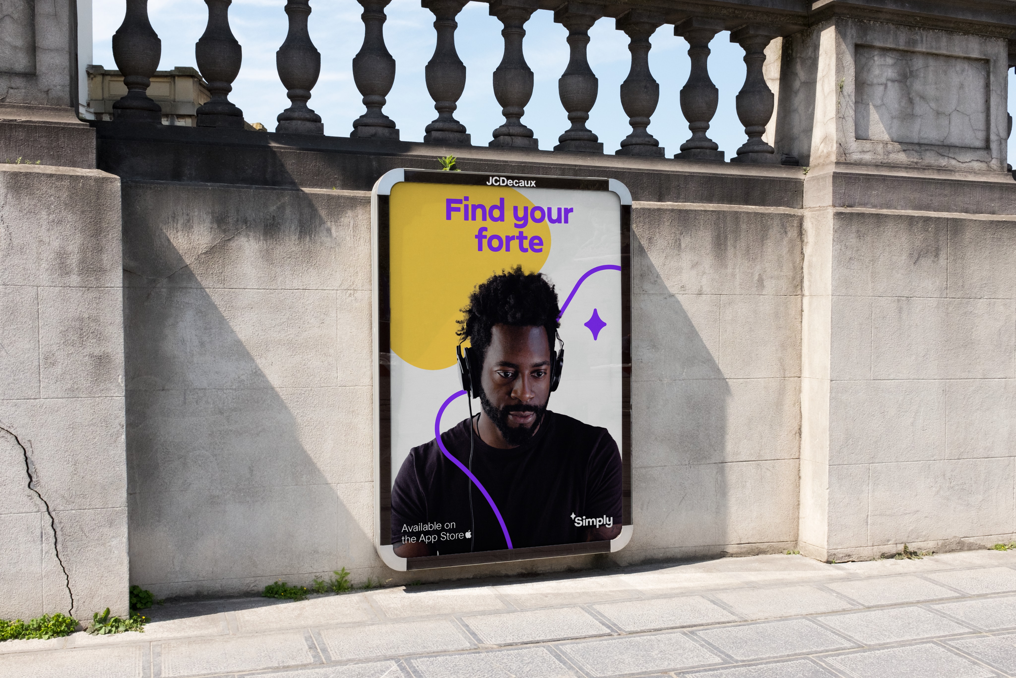
Application
Here are some examples of how our typography should look across a series of successful brand applications.