Logo
Joyful, welcoming, and instantly recognizable, our logo is one of our most important visual assets. It’s the most easily identifiable expression of who we are and what we stand for. When used consistently, it builds recognition of our brand, acting as a distinctive sign of the quality, enrichment and joy that our users can rely upon wherever they encounter Simply.
Our logo
Our logo is the primary presentation of who we are, what we stand for, and everything we do. Tied to the idea of enriching journeys, our logo has been crafted to be distinct and joyful.
Core logo
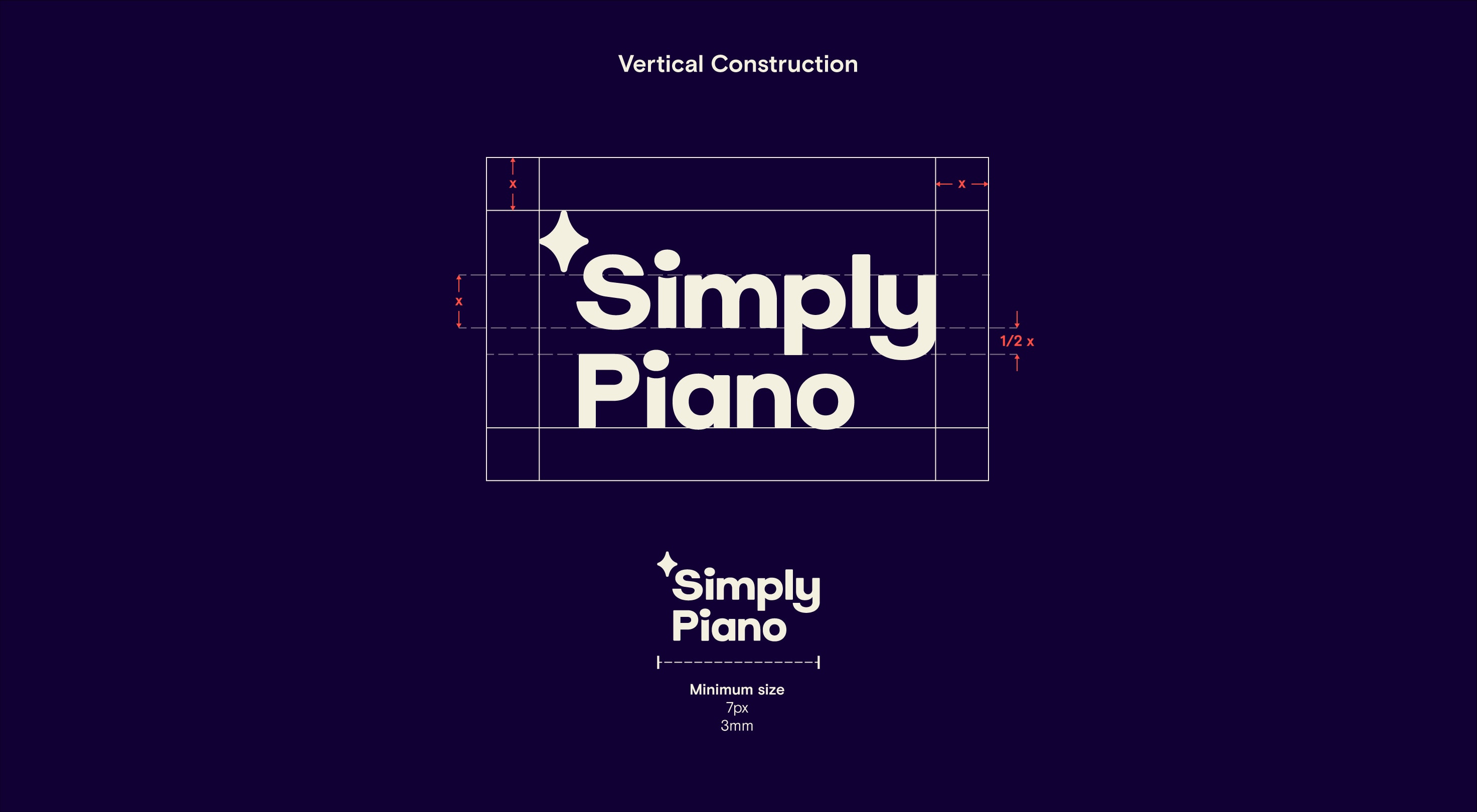
Our symbol and wordmark lockup to create our core logo, which acts as the main signifier for our brand. To ensure that it always looks its best, refer to the clear space and minimum sizing guidance.
To maintain consistency and make sure our logo remains recognizable, our wordmark never appears without the spark symbol. The spark represents joyfulness, guidance and support, so it’s important it always makes an appearance.
Symbol
At the core of our brand is our symbol. Inspired by the North Star, this bold mark becomes our shorthand for enrichment in communications. We use the symbol predominantly alongside our wordmark, and only on its own in specified circumstances, such as small banner ads and applications already situated in the Simply world. Use the following clear space and minimum sizing guidance.

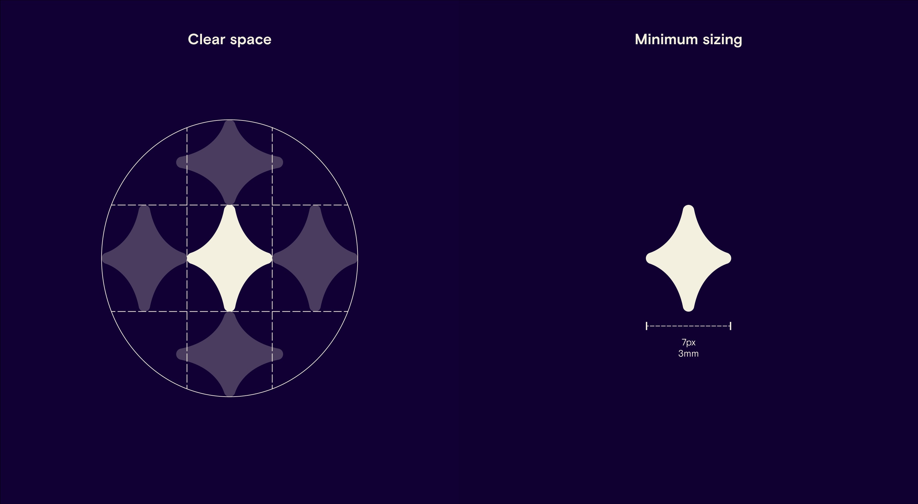
Symbol usage
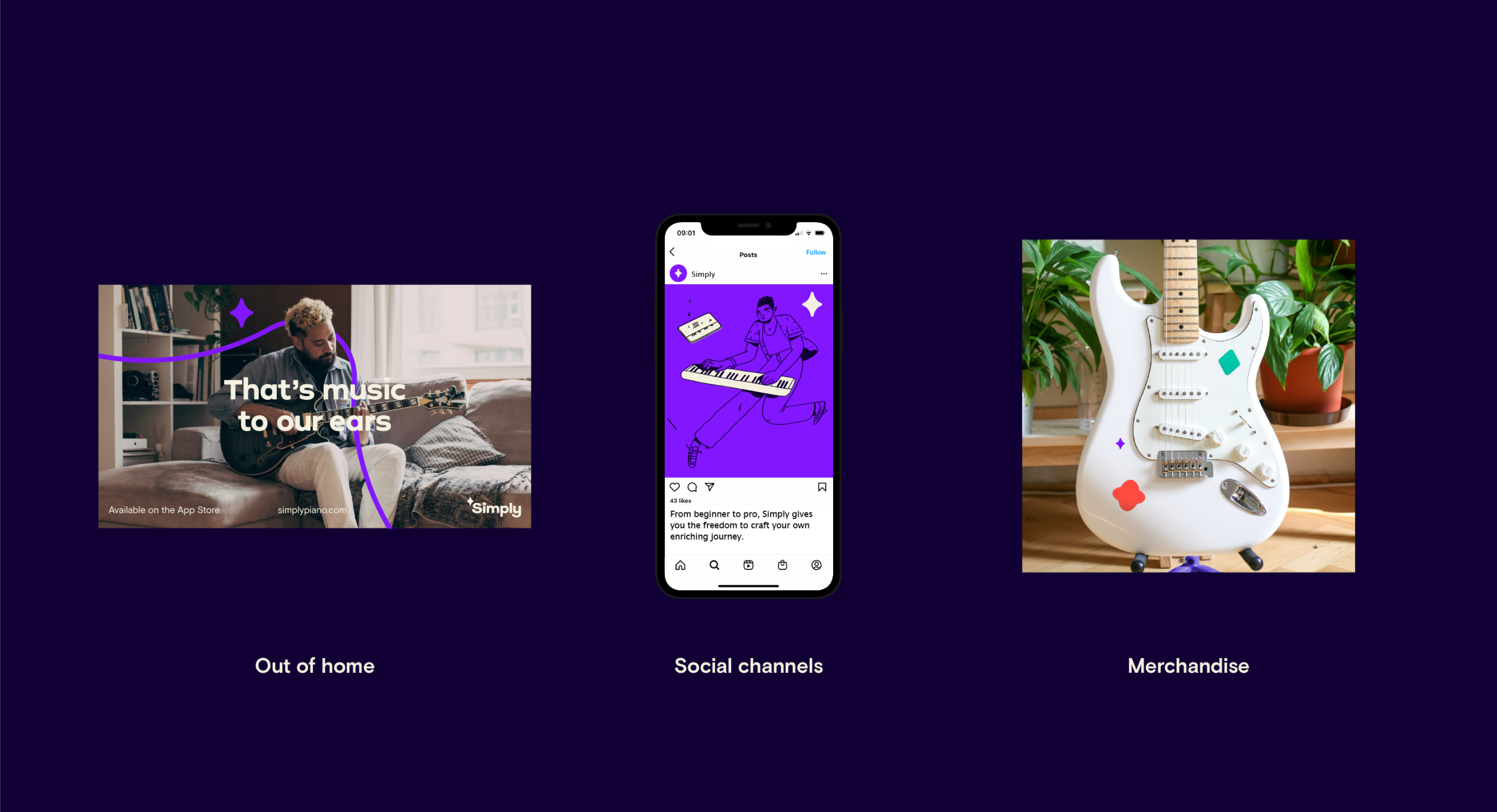
Our symbol can be used in scenarios within our Simply brand ecosystem when our wordmark and symbol are used in close proximity. For example, we can use our symbol across social posts or stories, within our product, across OOH or on merchandise.
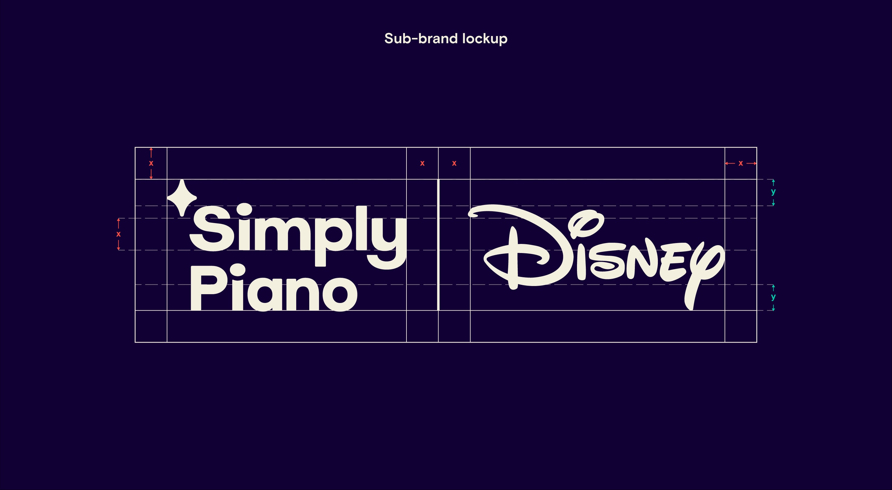
Sub-brand lockups
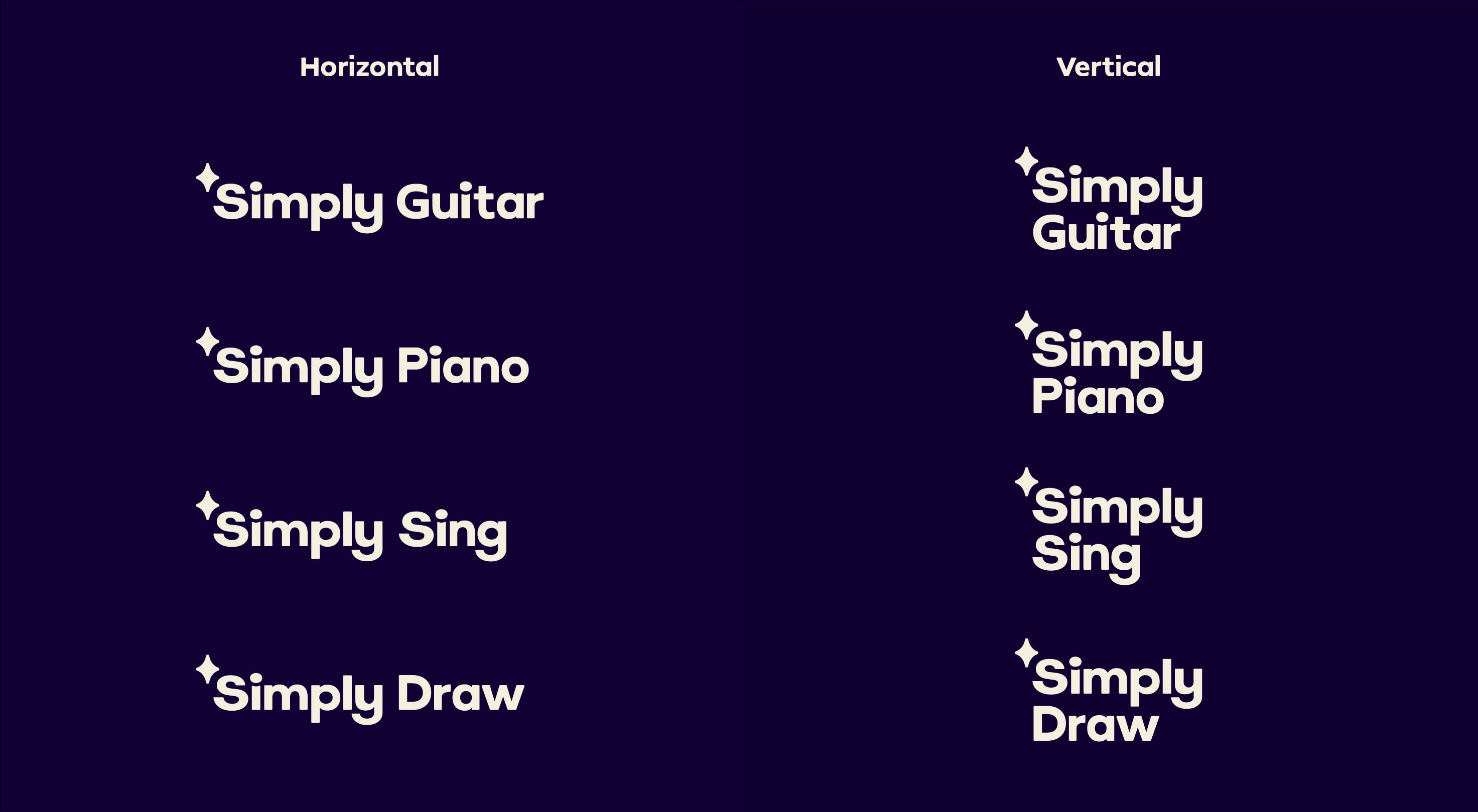
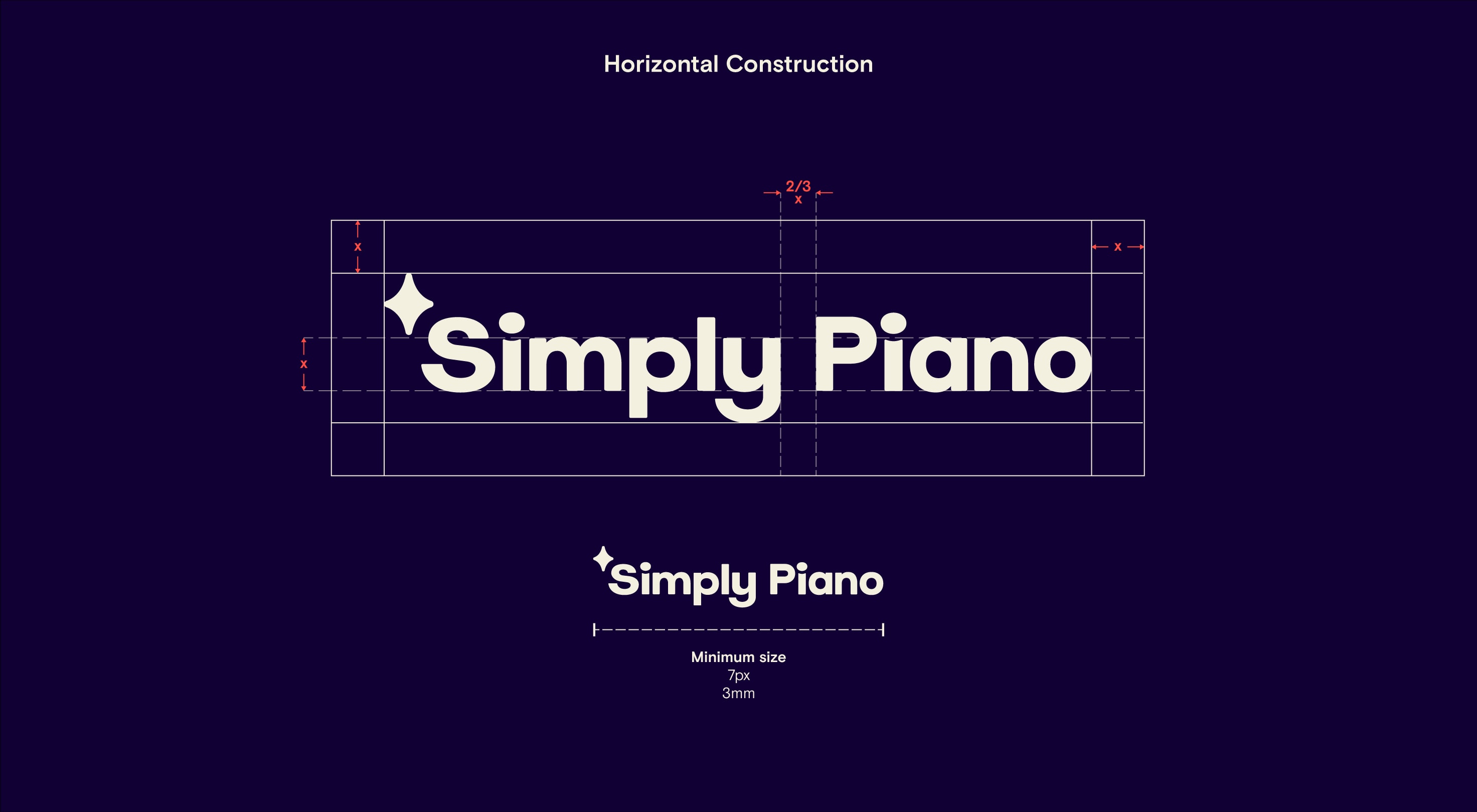
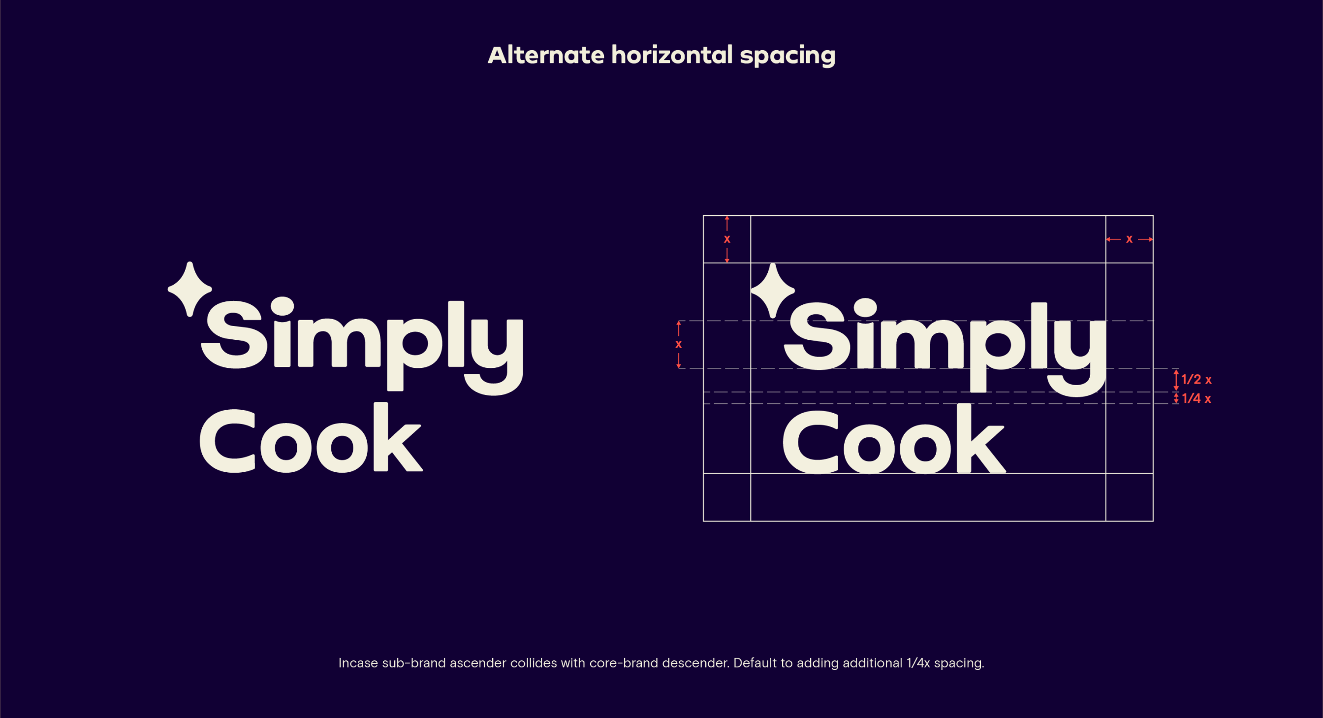
Our logo can also adapt to represent our wider product offerings. To do this we can lockup the logo in multiple ways depending on the use case and sizing of the medium. When constructing a new sub-brand logo, use Simply Sans alongside our construction guidance, adjusting the kerning optically for visual consistency.
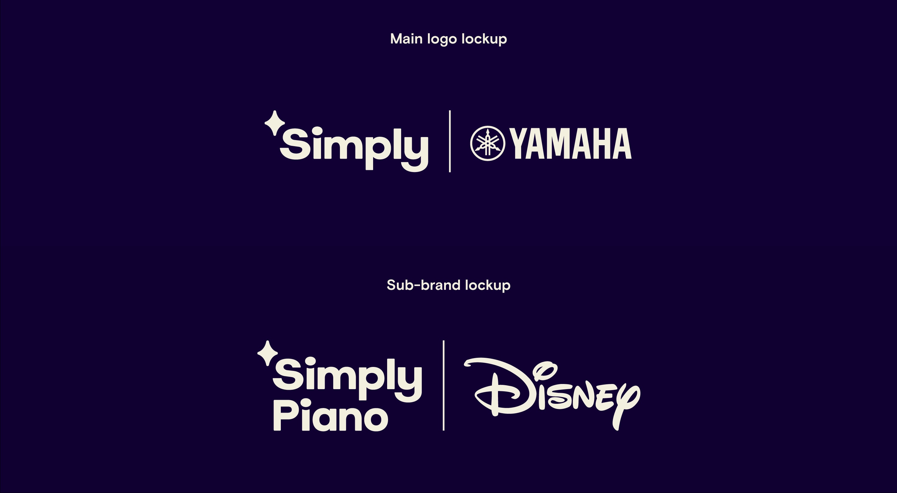
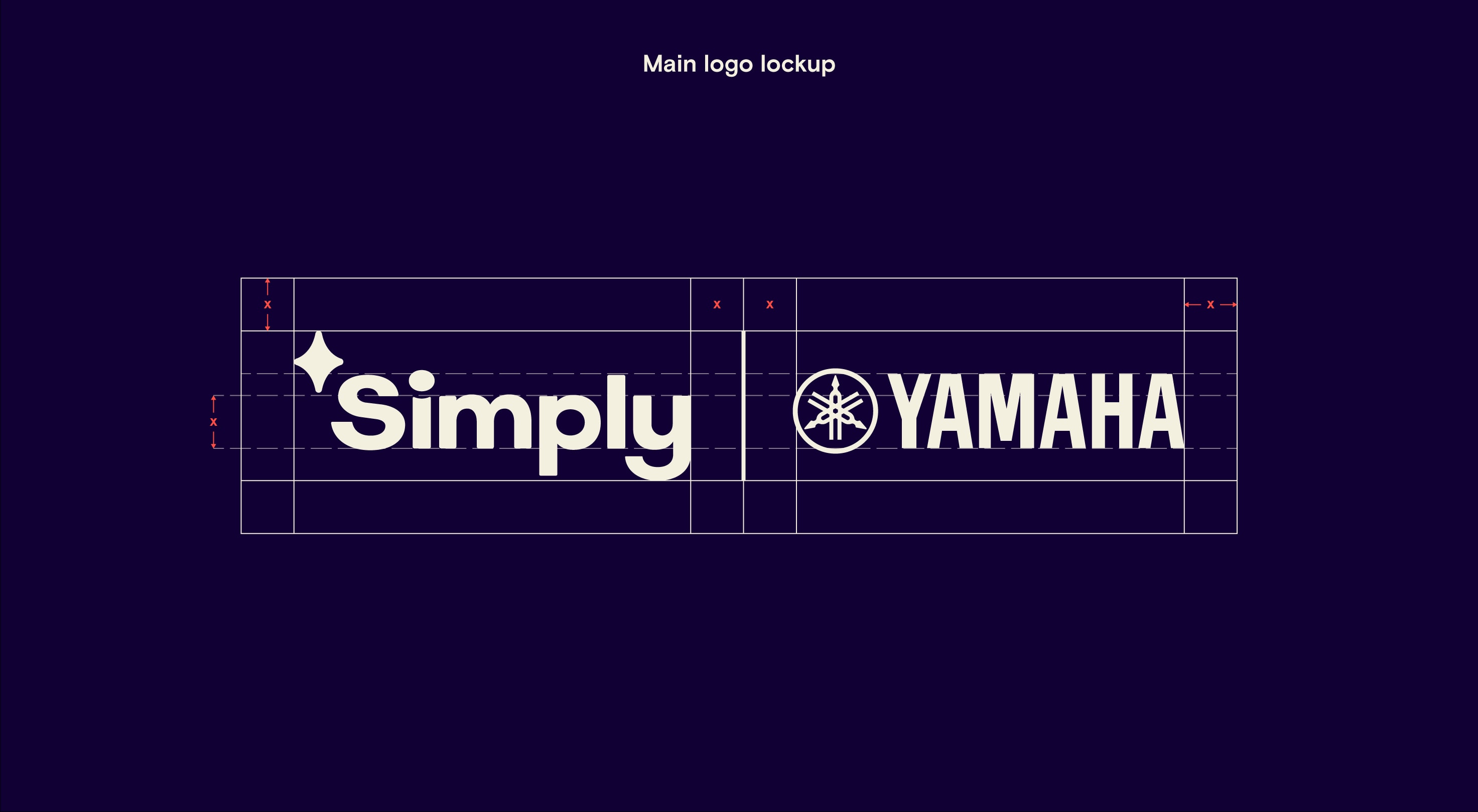
Partner lockups
Our logo and vertical sub-brand lockup can be placed alongside partner logos. To do this follow the guidance shown and optically adjust the size of the partner logo to match the size of our logo and align it centrally. Logos should always be separated by a vertical divider line.
Logo positioning
Our logo and symbol can be used confidently as a central hero element or as a sign-off on any brand touchpoint.
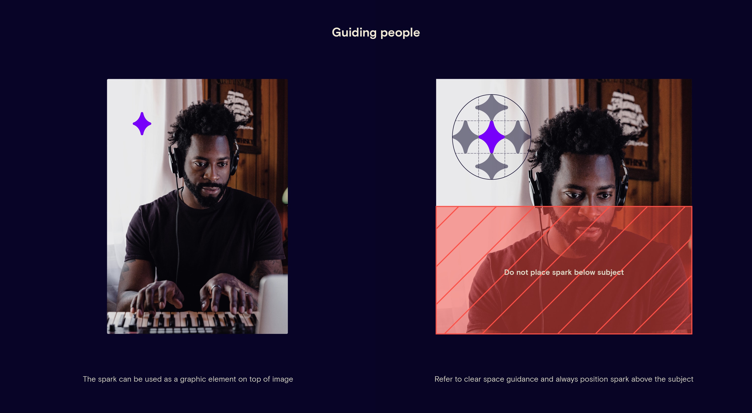
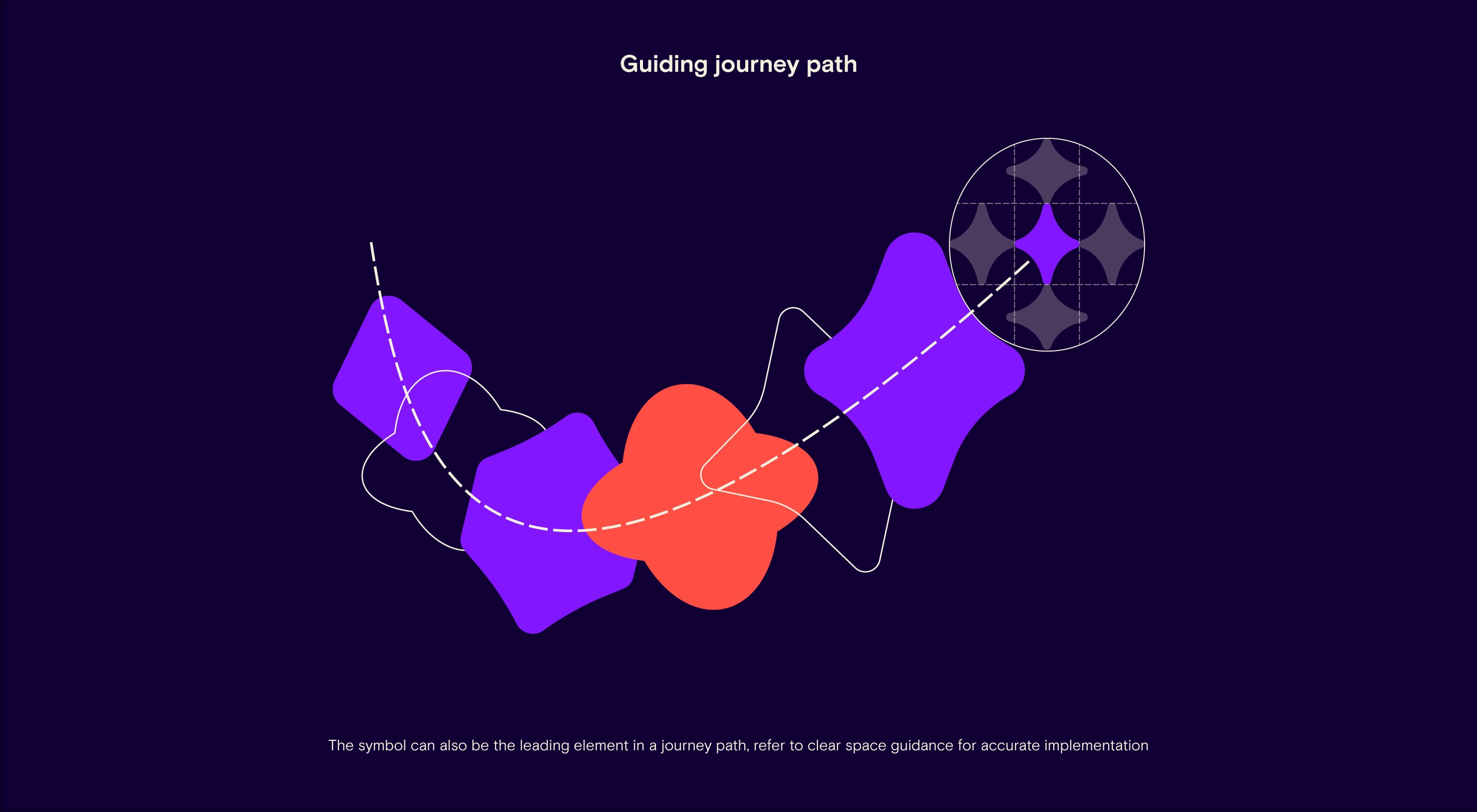
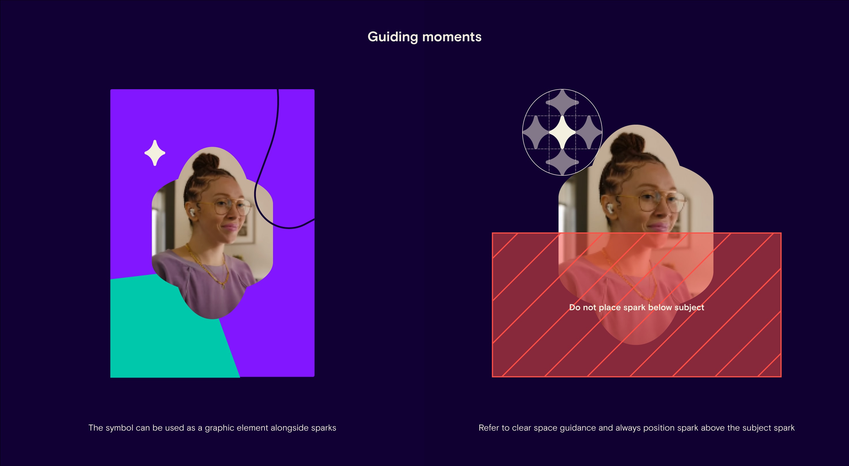
North Star positioning
Here is a guide to correctly placing our north star on people, a journey graphic, and guiding moments.
Logo on color
We can use our logo and symbol on top of primary colored backgrounds in either Purple Haze or White Stripes depending on the use case, with readability in mind. Be aware that we do not place our logo over any secondary colors.
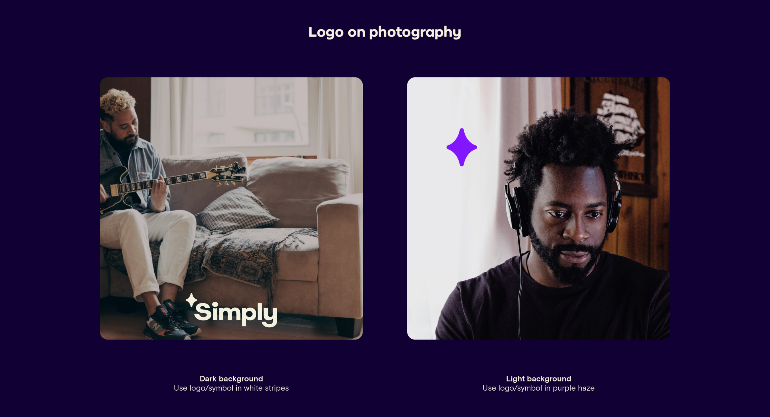
Logo on image
We can use our logo and symbol over the top of photography. Please choose the color according to the image.
Logo in animation
Our logo and symbol can also be brought to life in animation. Inspired by our story of enriching journeys, our symbol can add sparks of joy to elements appearing on frame.

Do not adapt the logo or symbol
Our logo and symbol should not be altered in any thematic way (e.g. winter special). It is important to use the original logo to build brand equity and recognition.
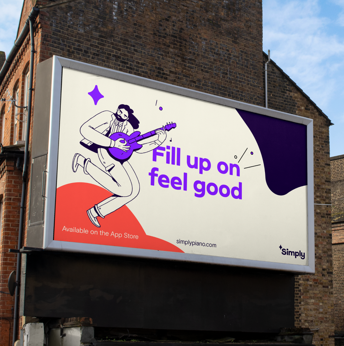
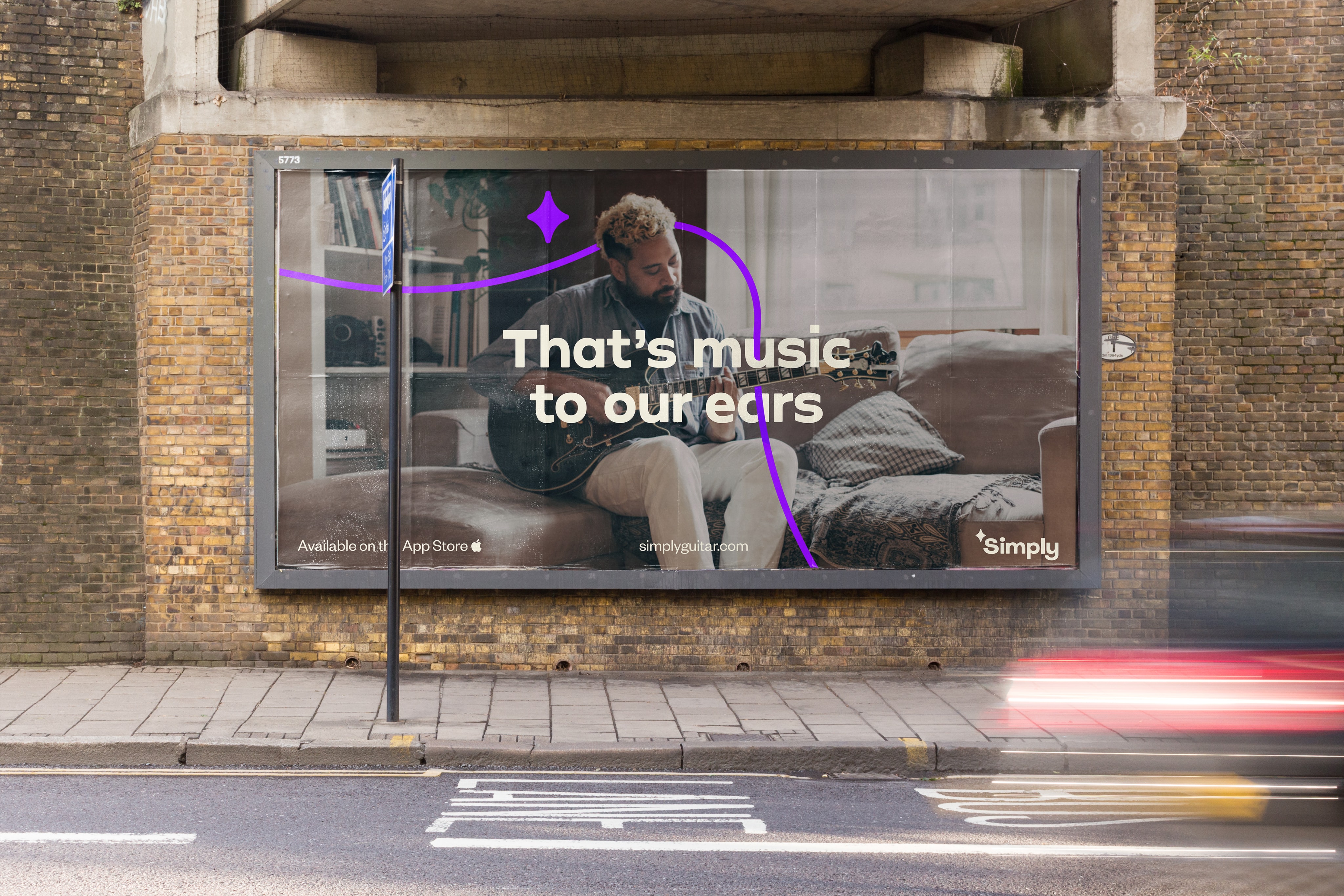
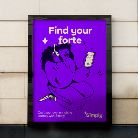
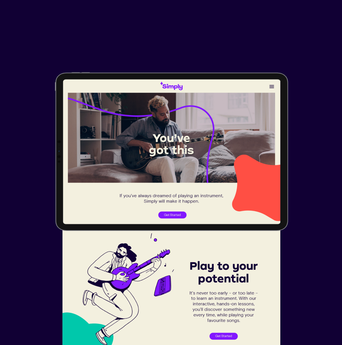
Application
Here are some examples of how our logo should look across a series of successful brand applications.
Things to avoid
Here are some examples of things to avoid when working with the logo.
Do no scale symbol out of proportion.
Do not use multiple colors in the logo.
Do not set logo in secondary colors.
Do not add gradients or effects.
Do not overlap the symbol/logo on sparks.
Do not position the logo in away that makes it ‘float’.
Do not place logo on busy image areas.
Do not position the symbol anywhere other than the end of a journey path.