Layout
We create all sorts of communications across a wide range of channels and formats. So we’ve created a flexible layout system that draws attention to the most important messages in any communication, whatever the format.
Our layout system guides the placement of elements to form our applications. It is flexible while ensuring there is consistency across the brand.
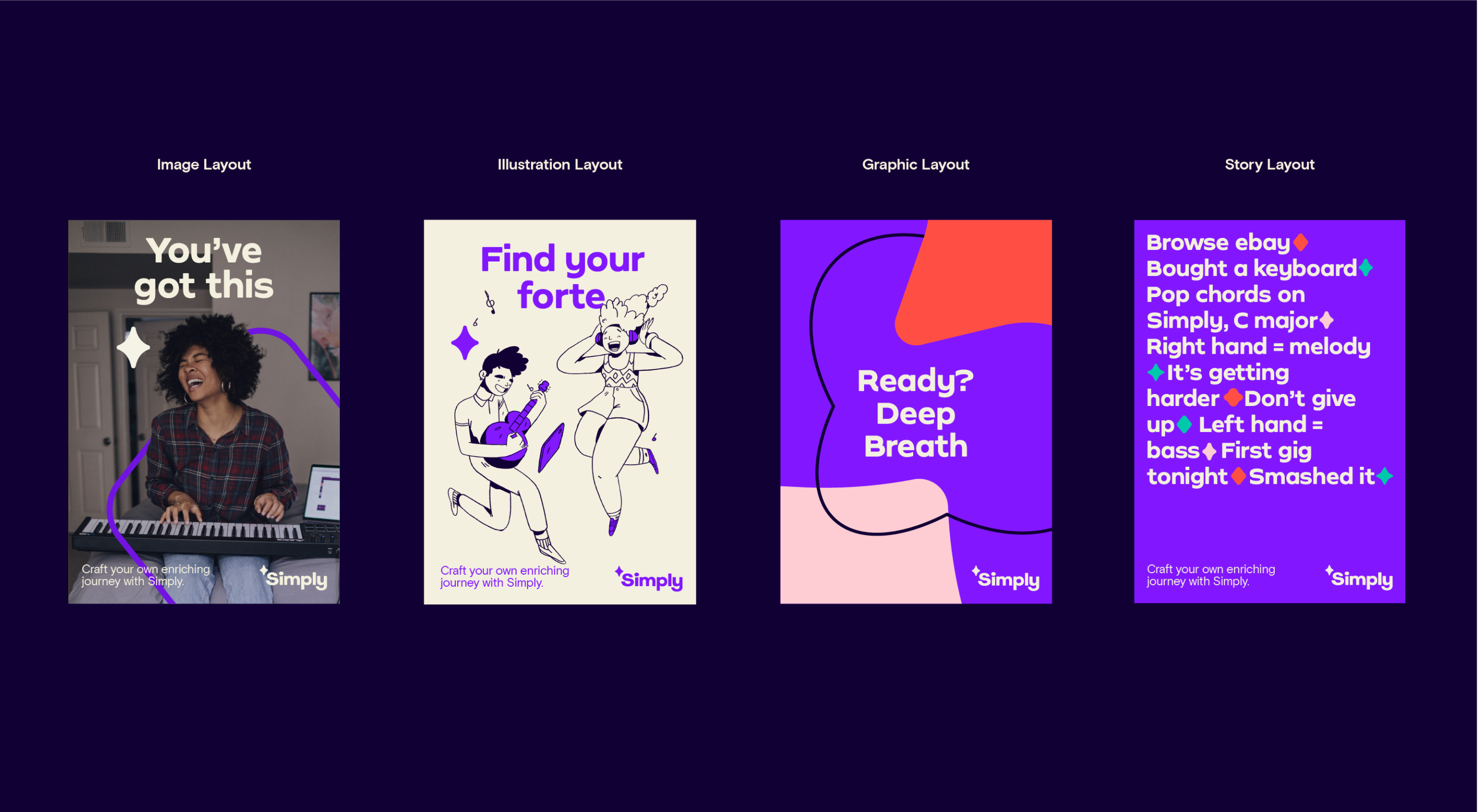
Layout overview
Below are some examples of the different types of layouts we can create for Simply brand communications.
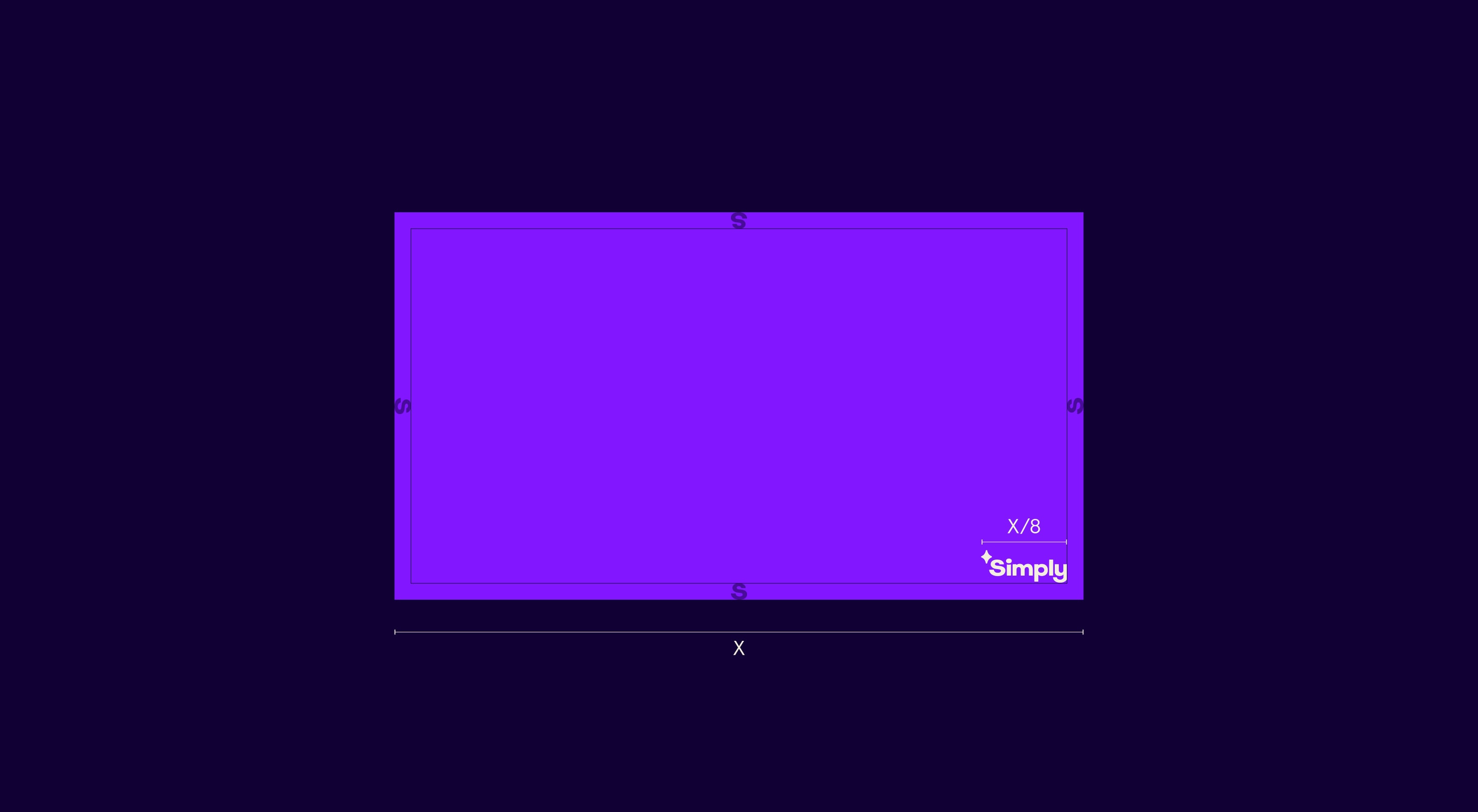
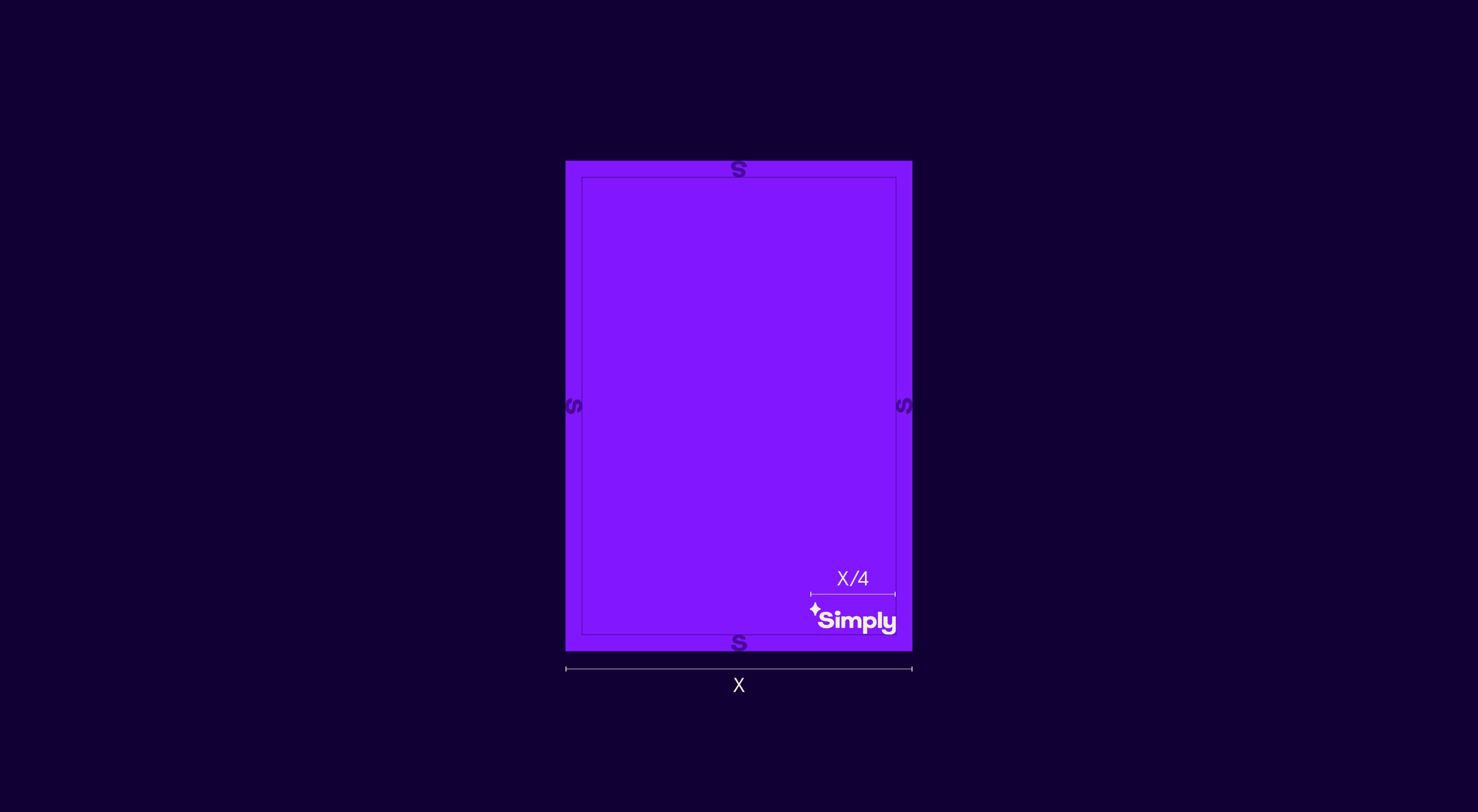
Logo & margins
Each layout is underpinned by a margin and grid. The S of the logo size determines exactly how big our margins are. Depending on the format, the logo can appear at two different sizes to ensure it maintains a confident yet legible presence on the application.
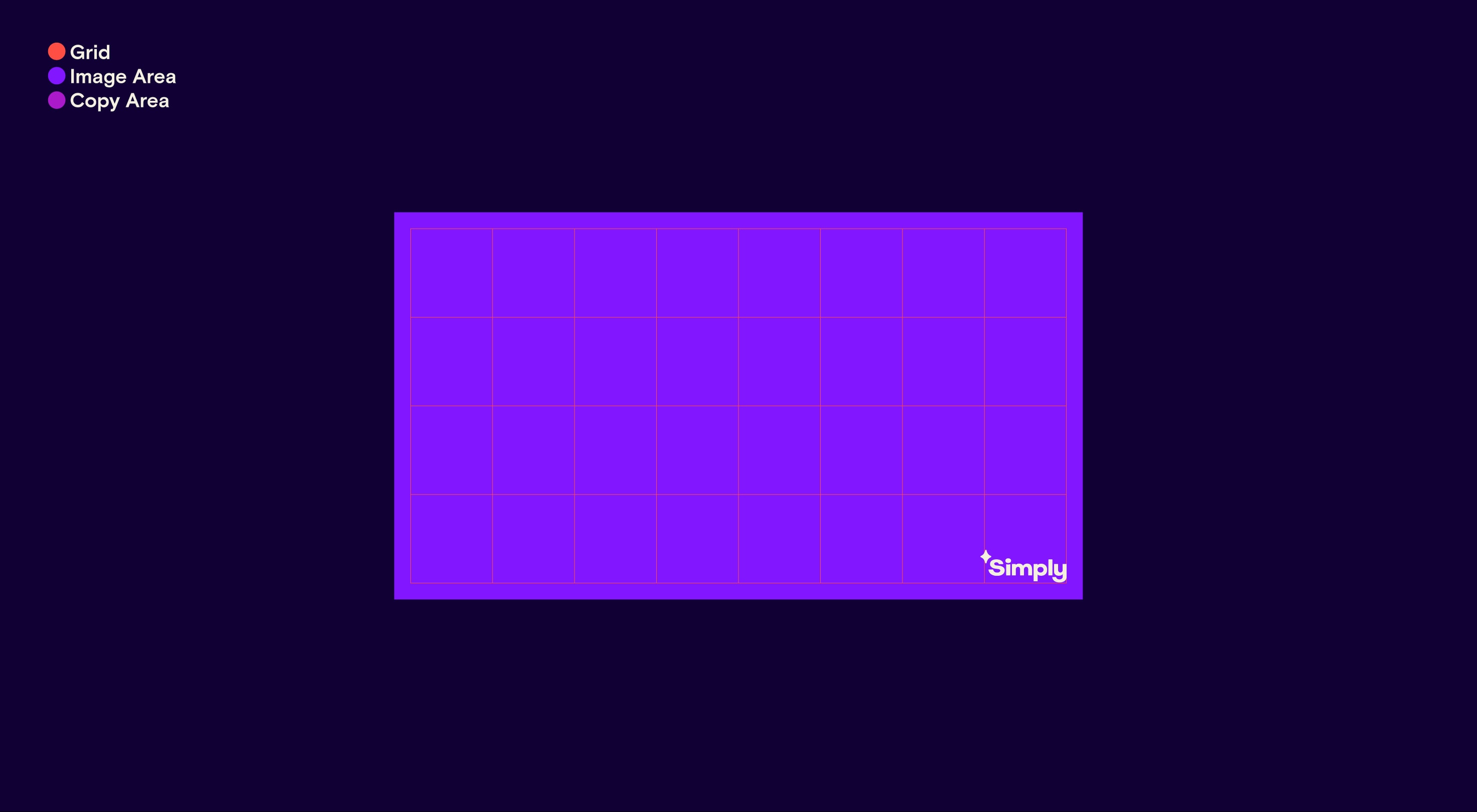
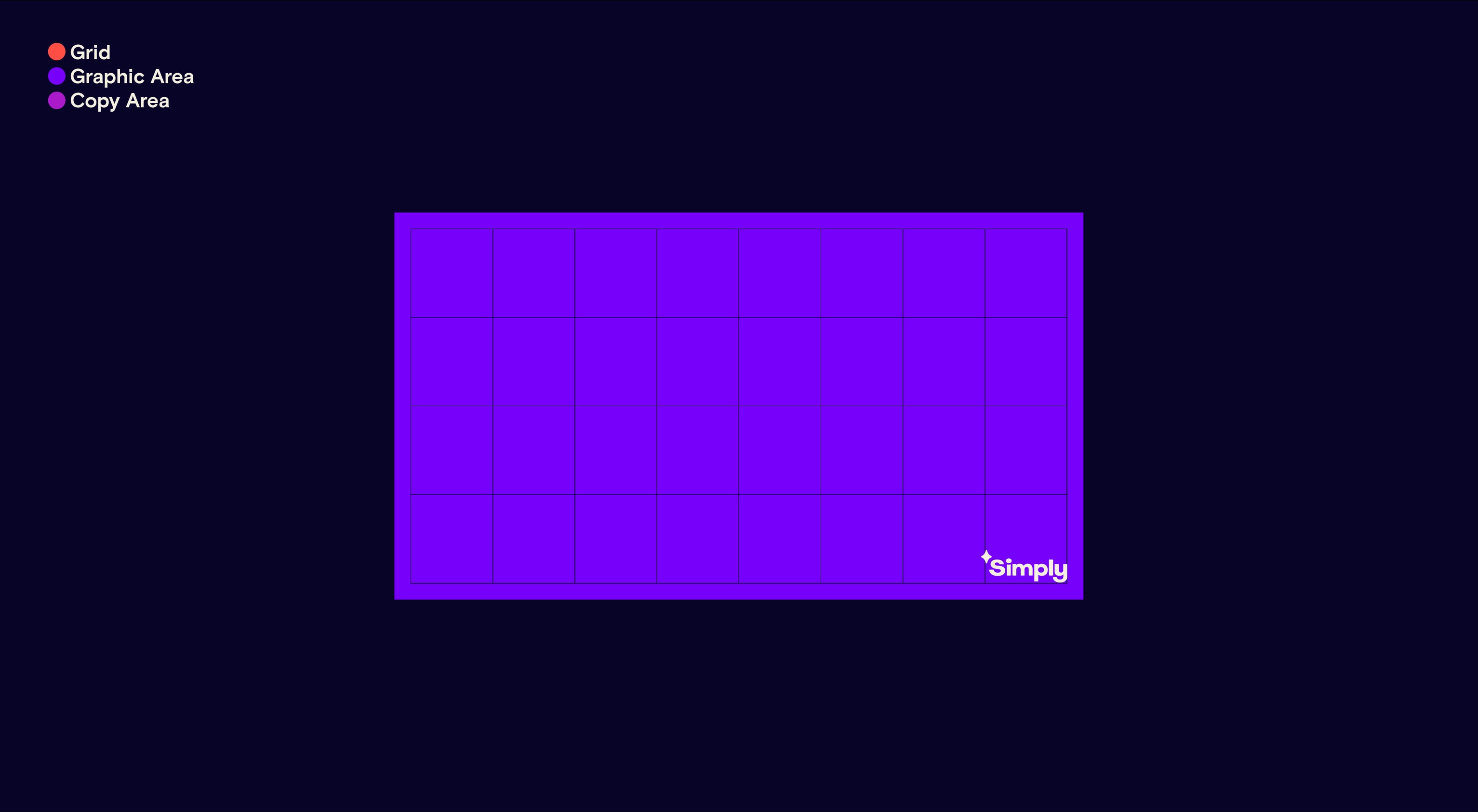
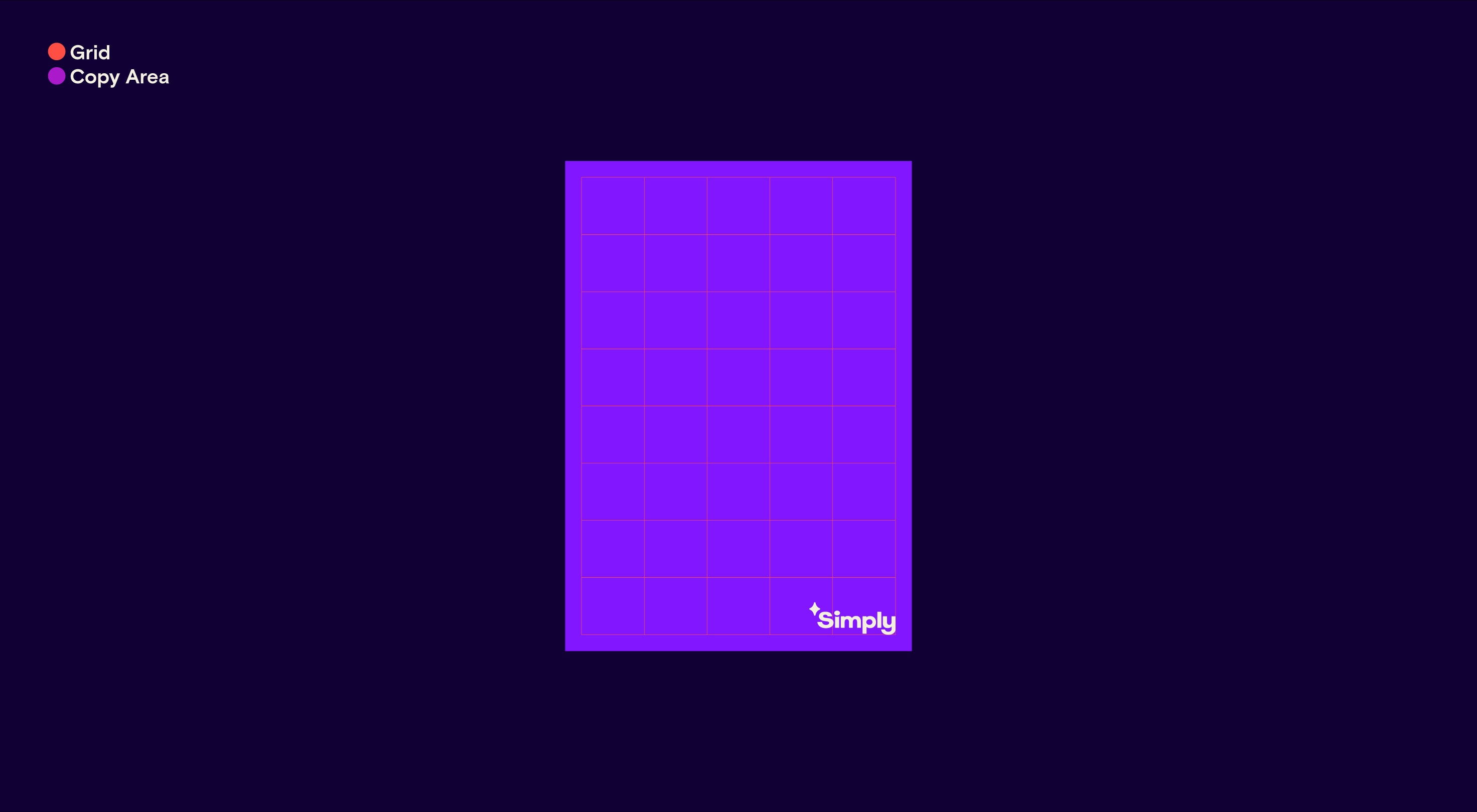
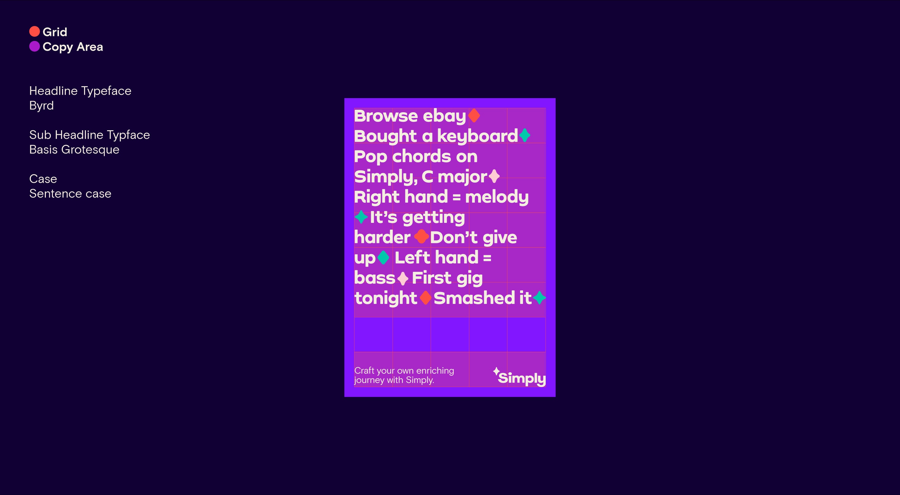
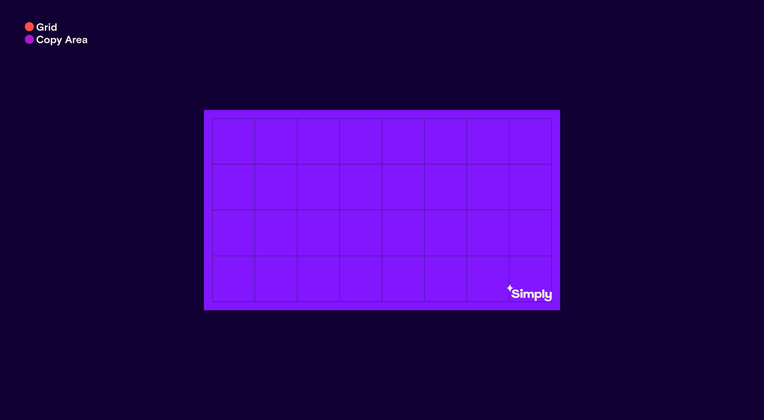
Modular grid
Once we have our margin sizes we can create a 4x8 modular grid for both vertical and horizontal layouts. This gives us a guide to where we should place our typographic and image elements for each layout.
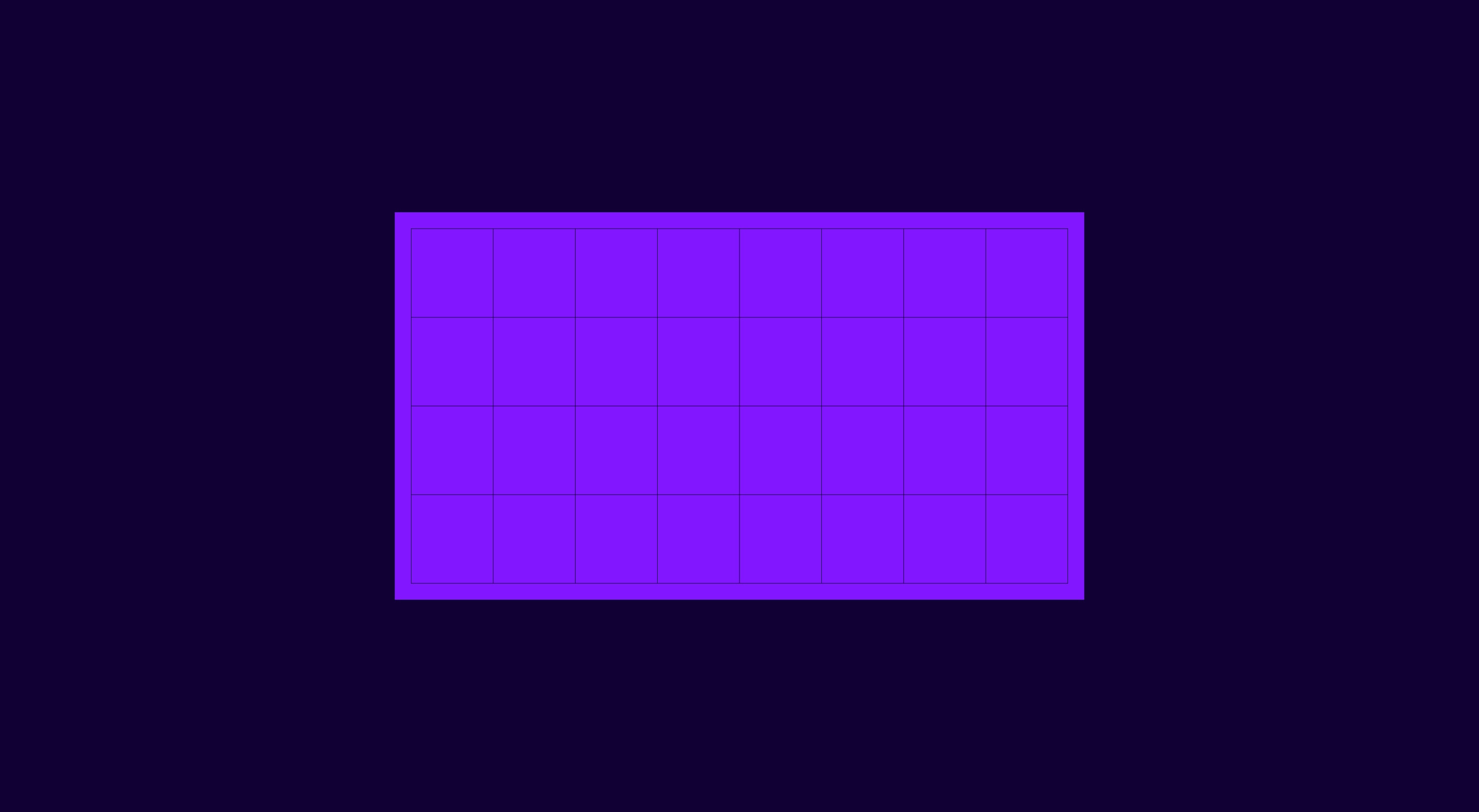
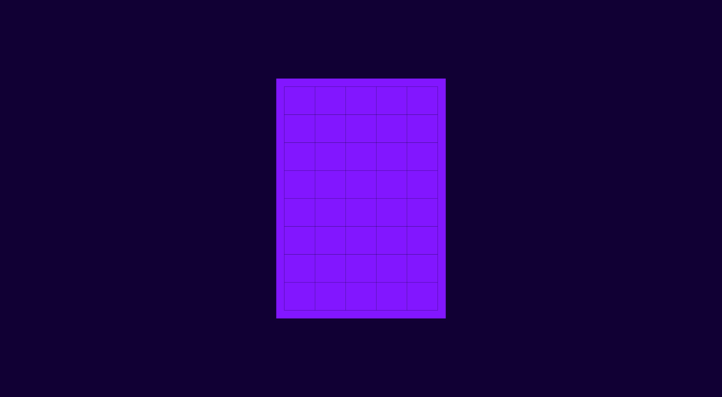
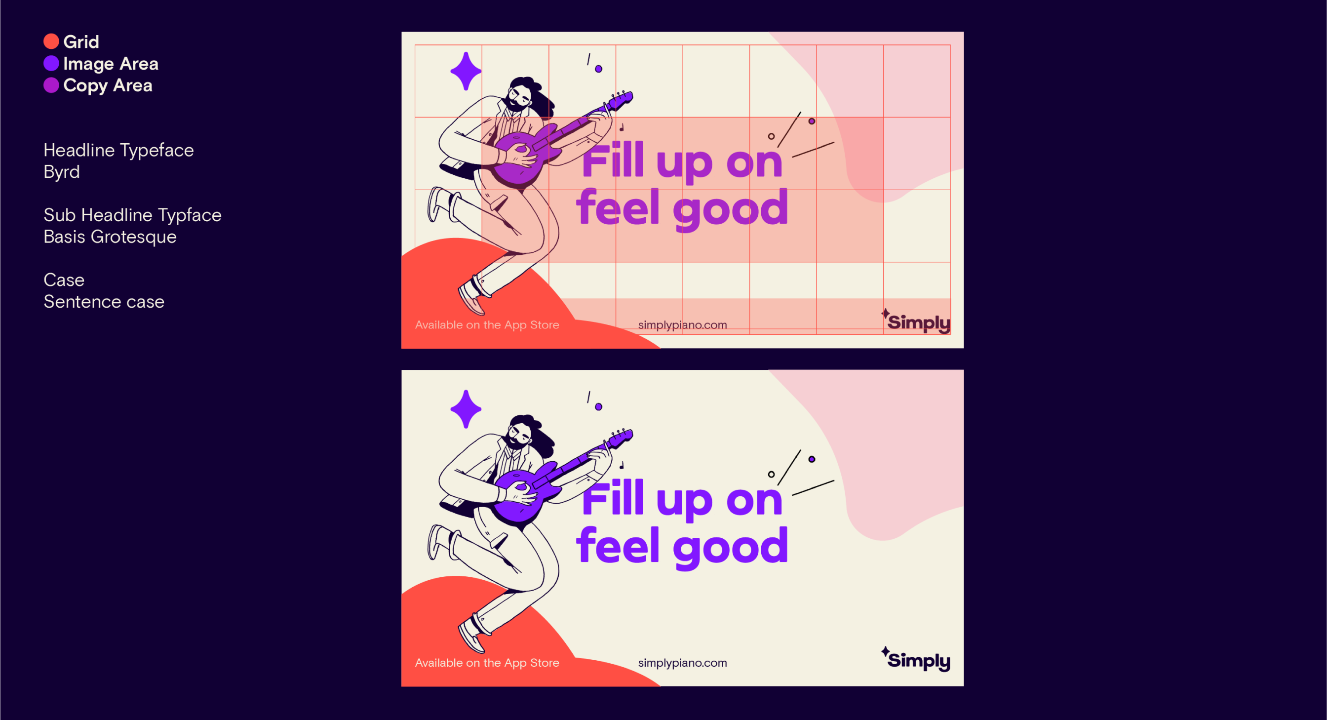
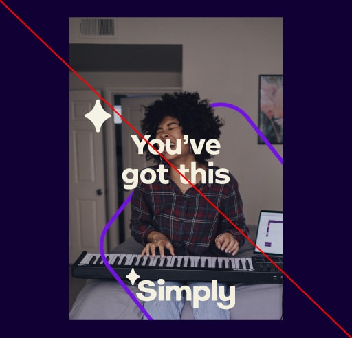
Image and illustration layout Portrait
Our photographic and illustration layouts are set on the same principles: we have clear headline and subcopy areas that create a frame for the content.
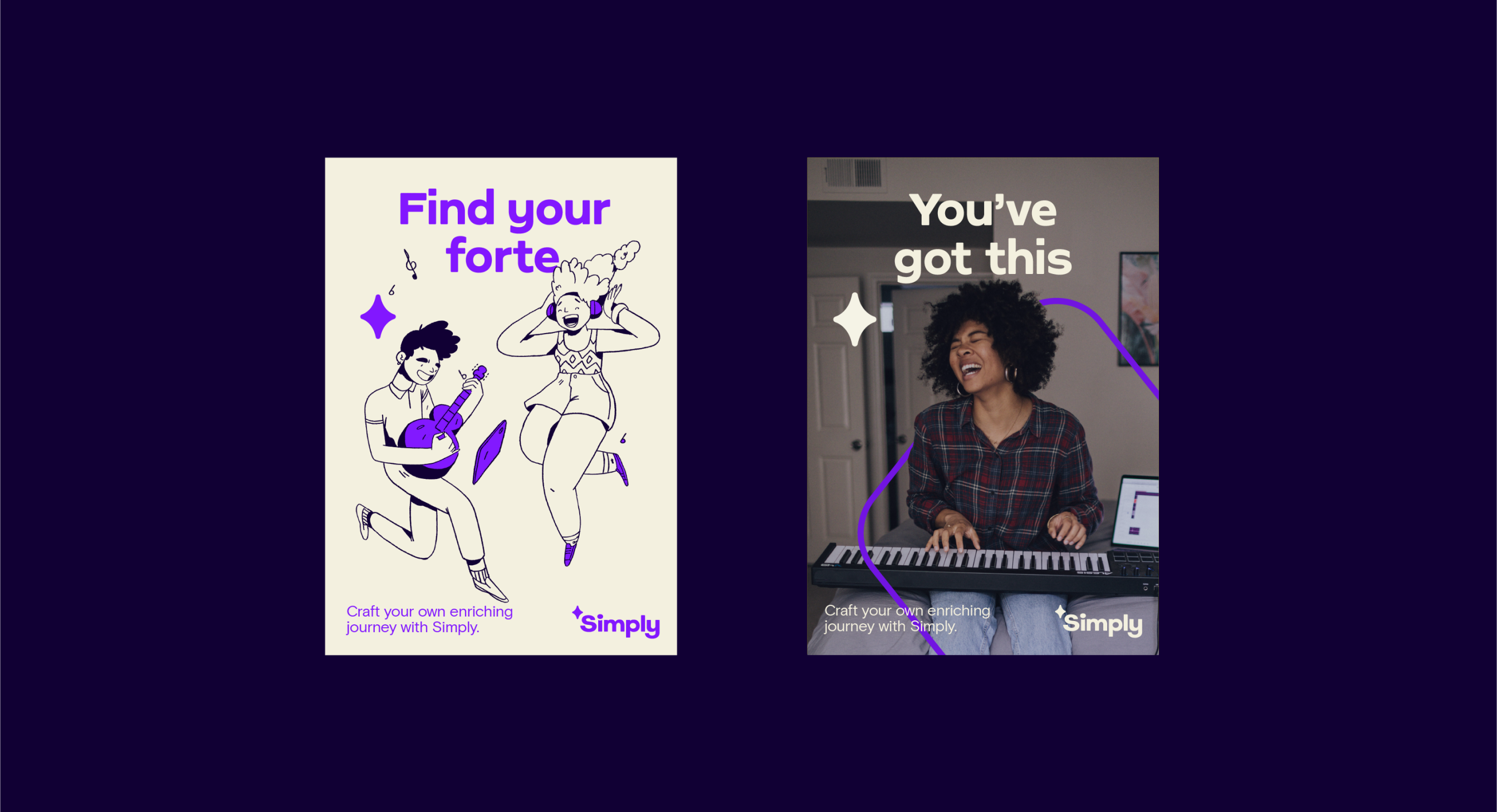
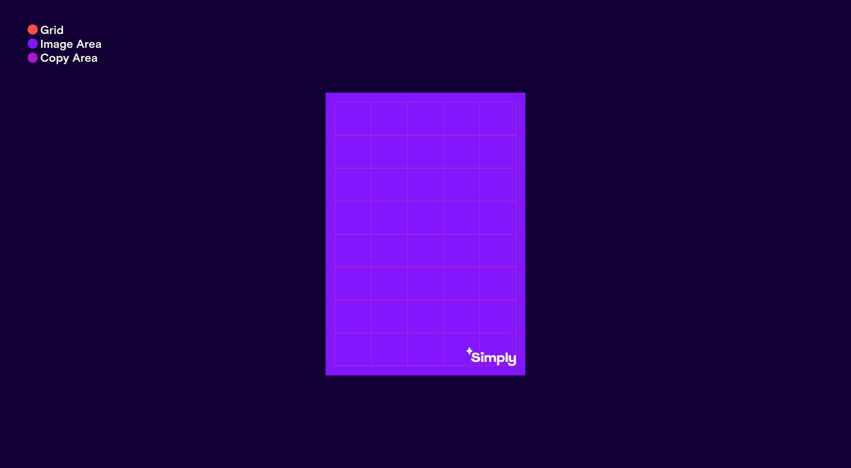
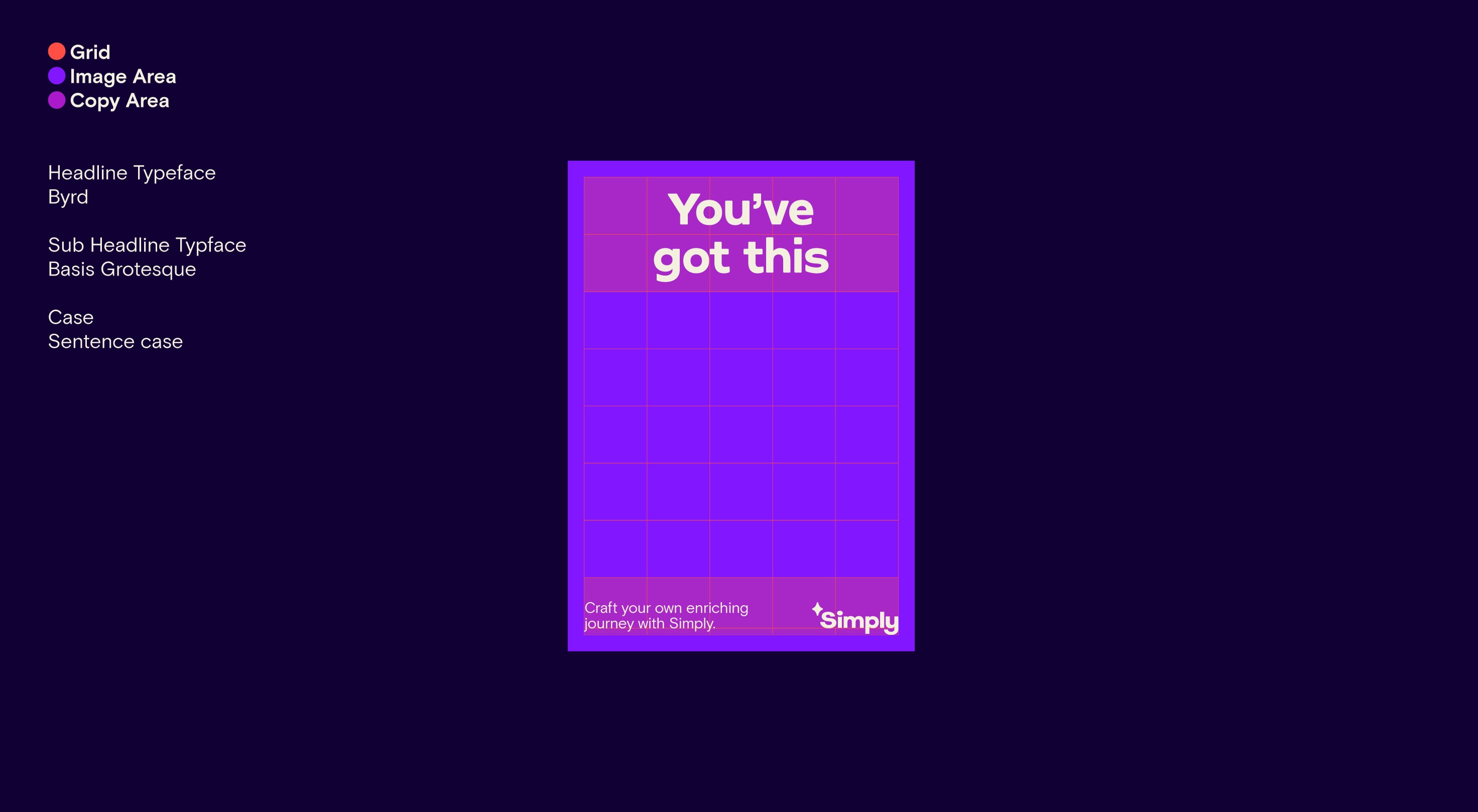
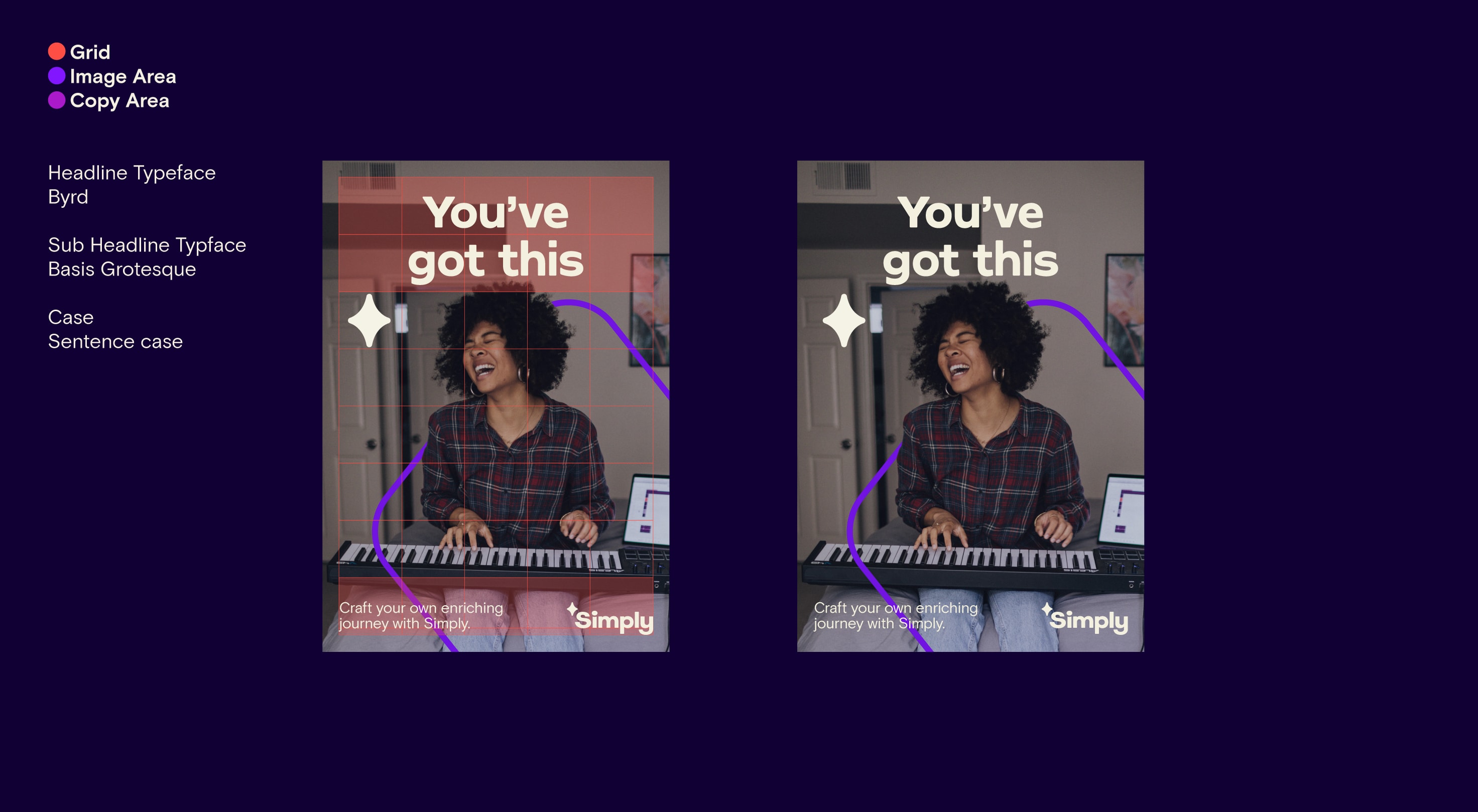
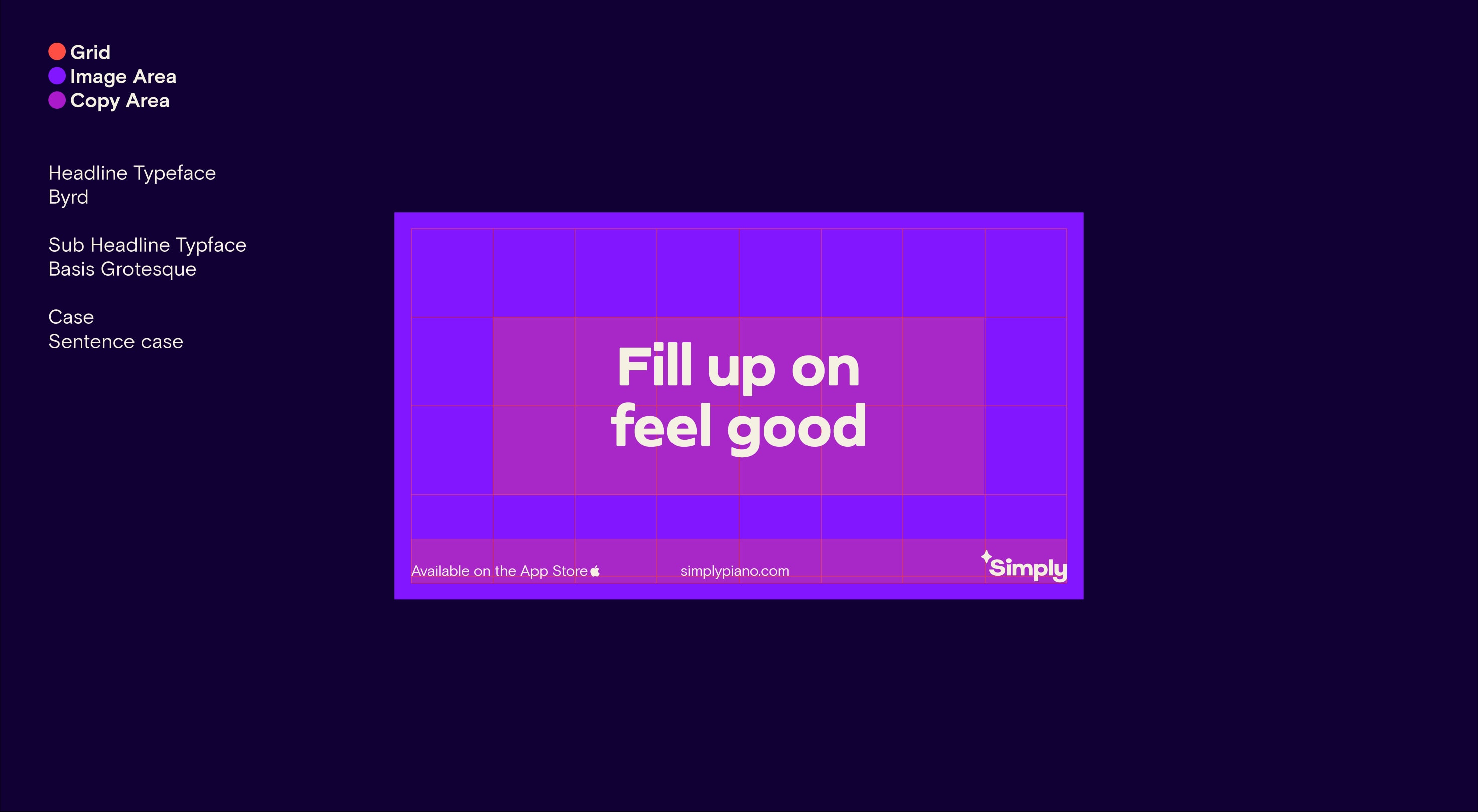
Image and illustration layout Landscape
Our photographic and illustration layouts are set on the same principles: we have clear headline and subcopy areas that create a frame for the image content.
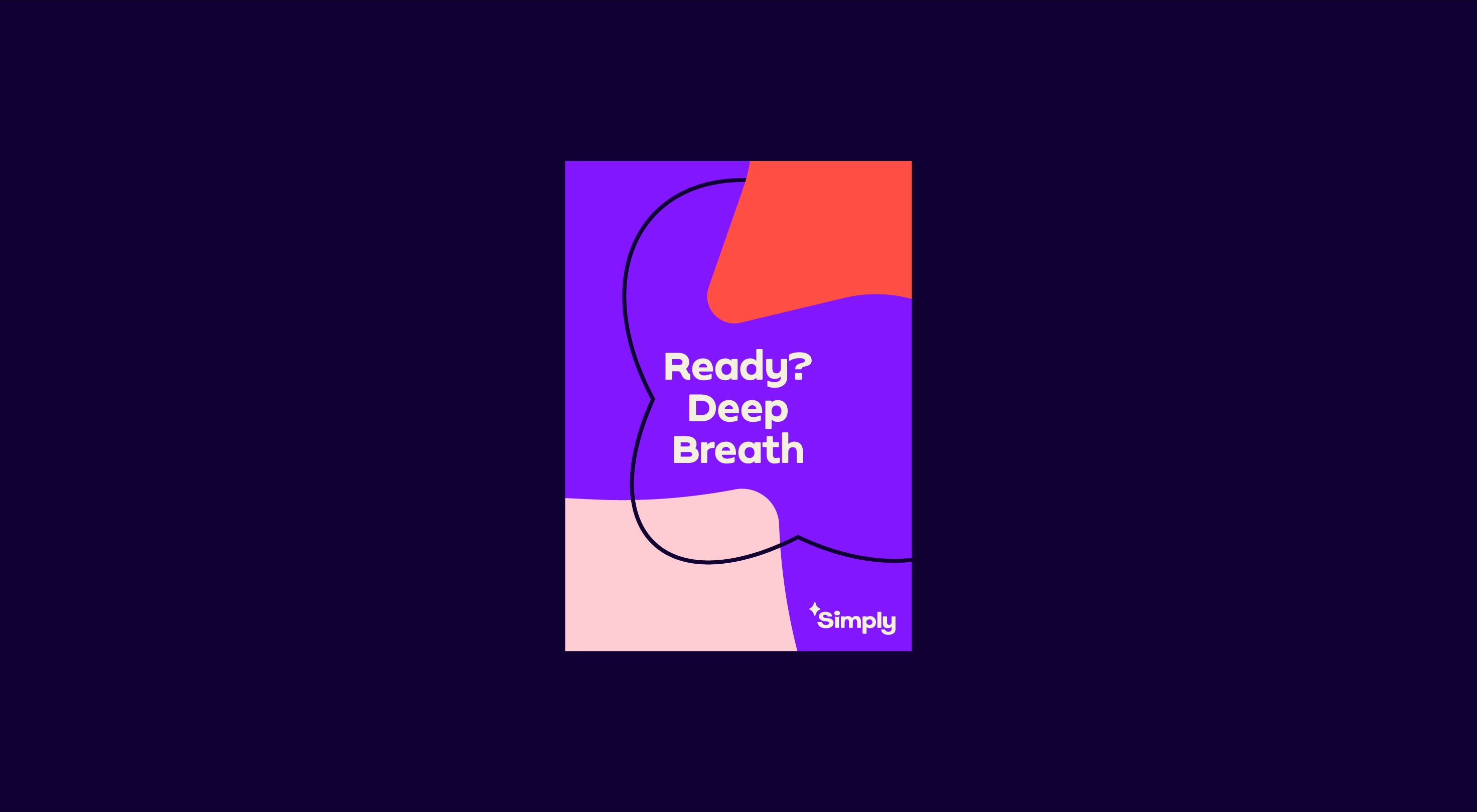
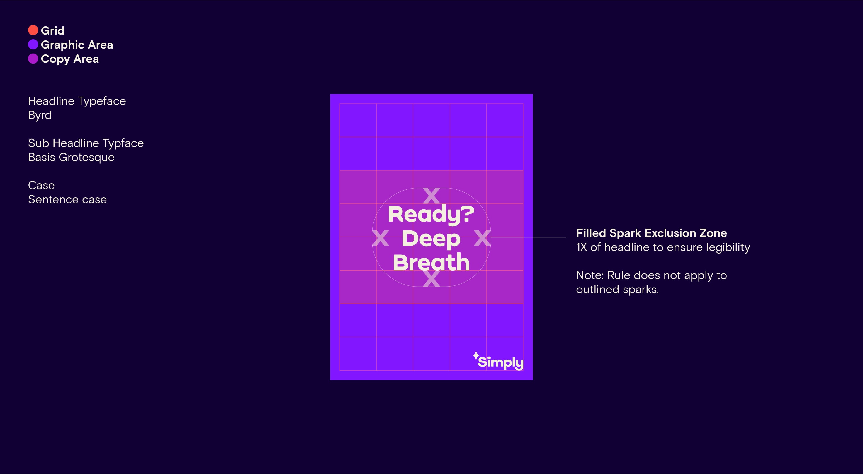
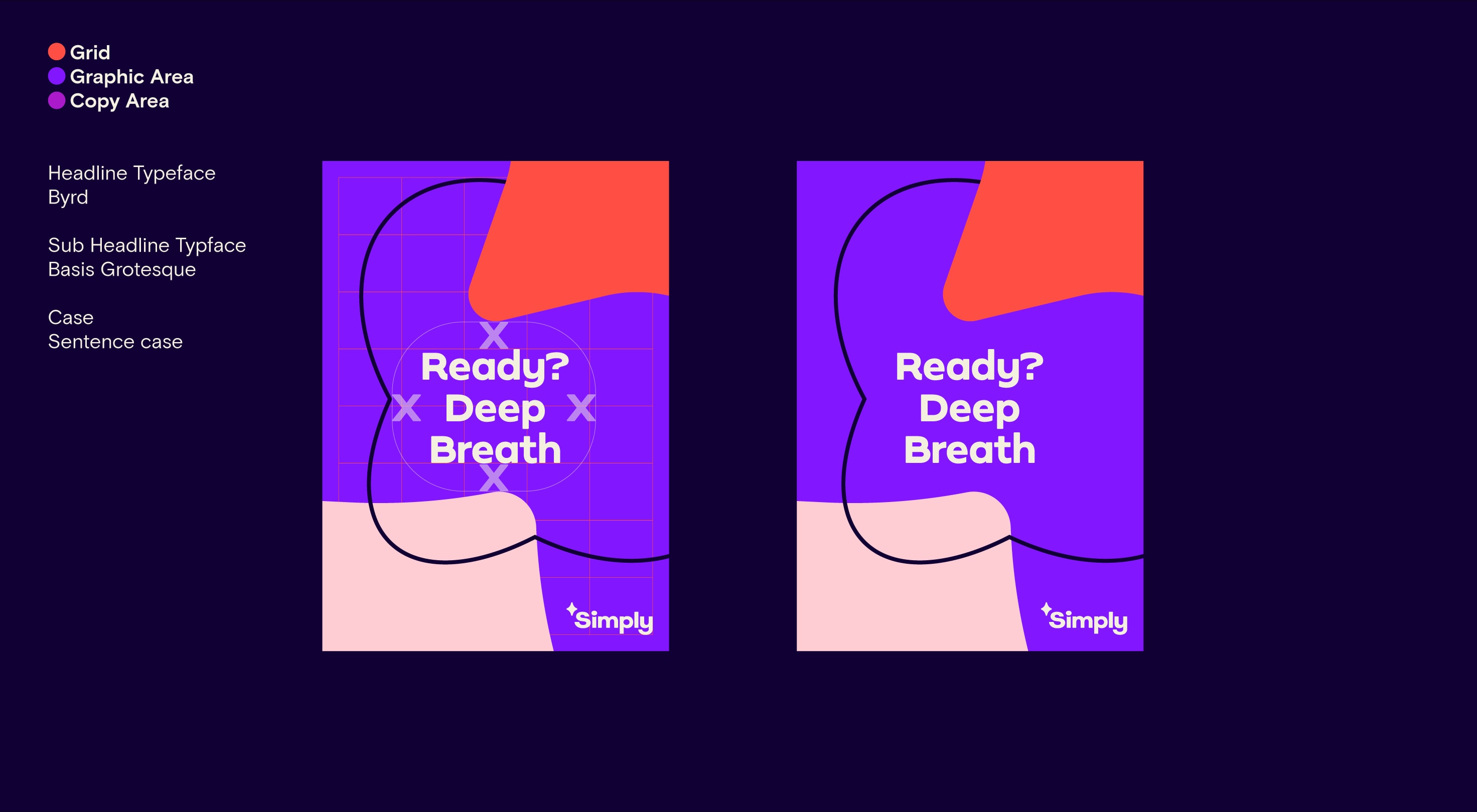
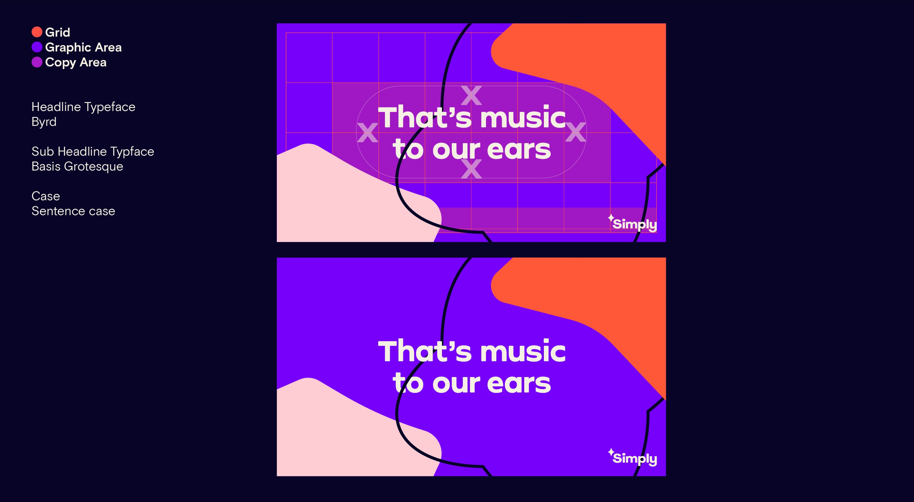
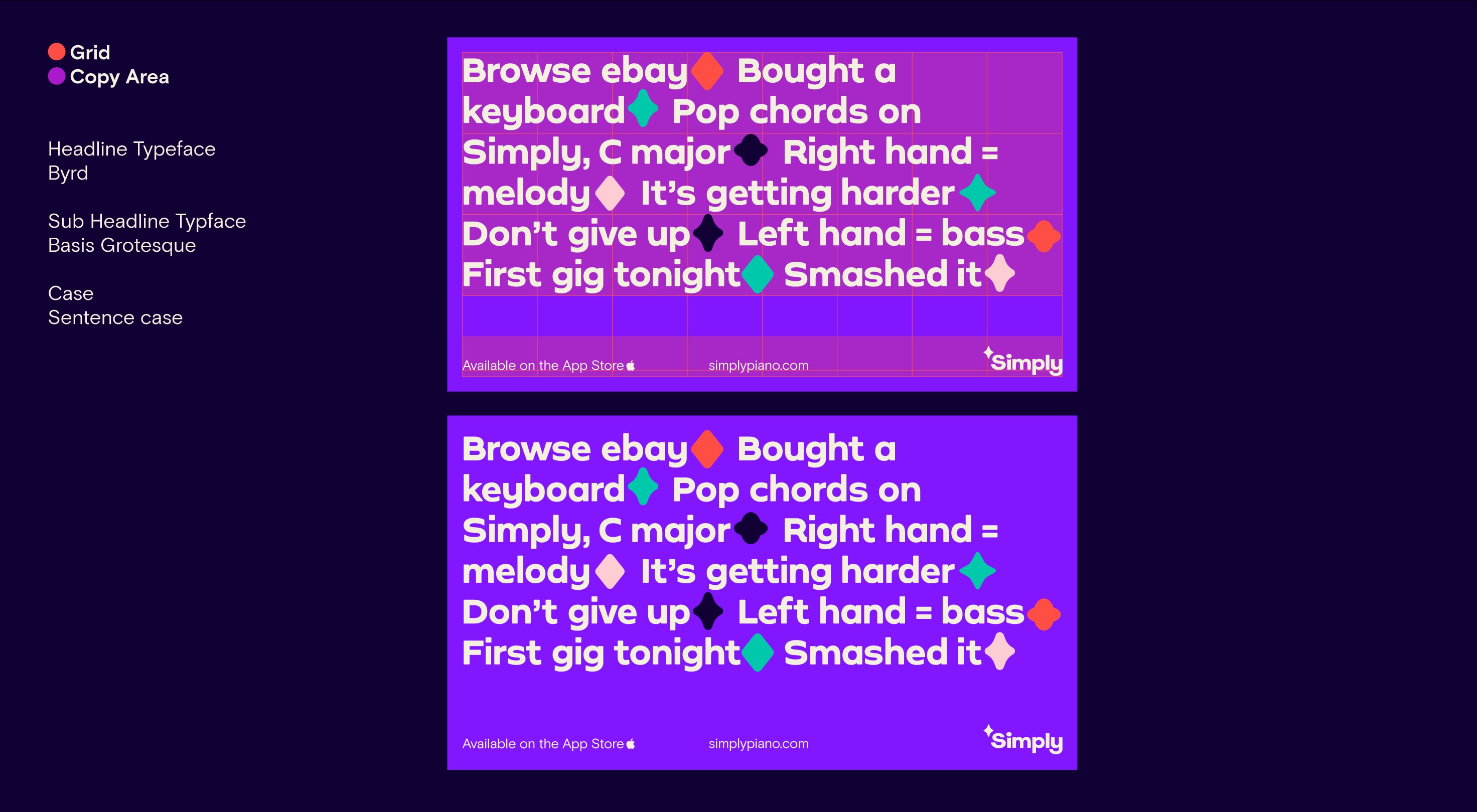
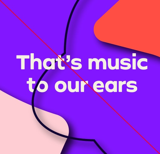
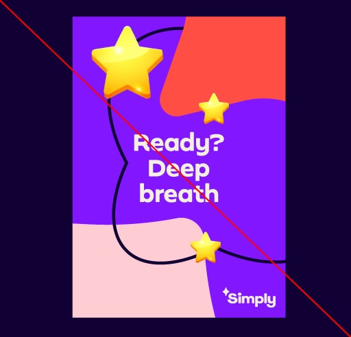
Graphic layout Portrait
Our graphic layouts are underpinned by using our spark elements across the page. Our headlines are set in the middle of the page to create maximum impact, creating a feeling of immersion within our journey graphic.

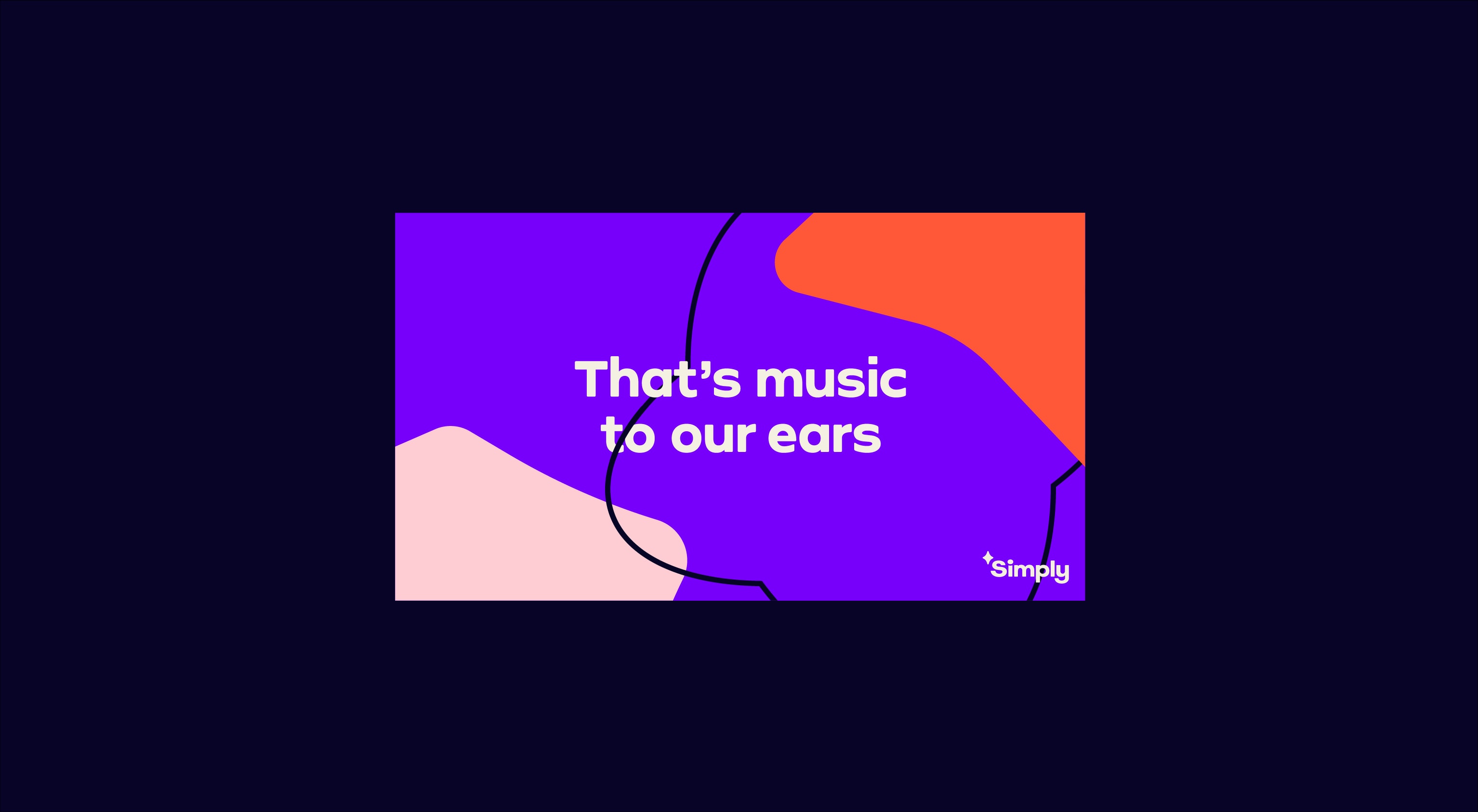
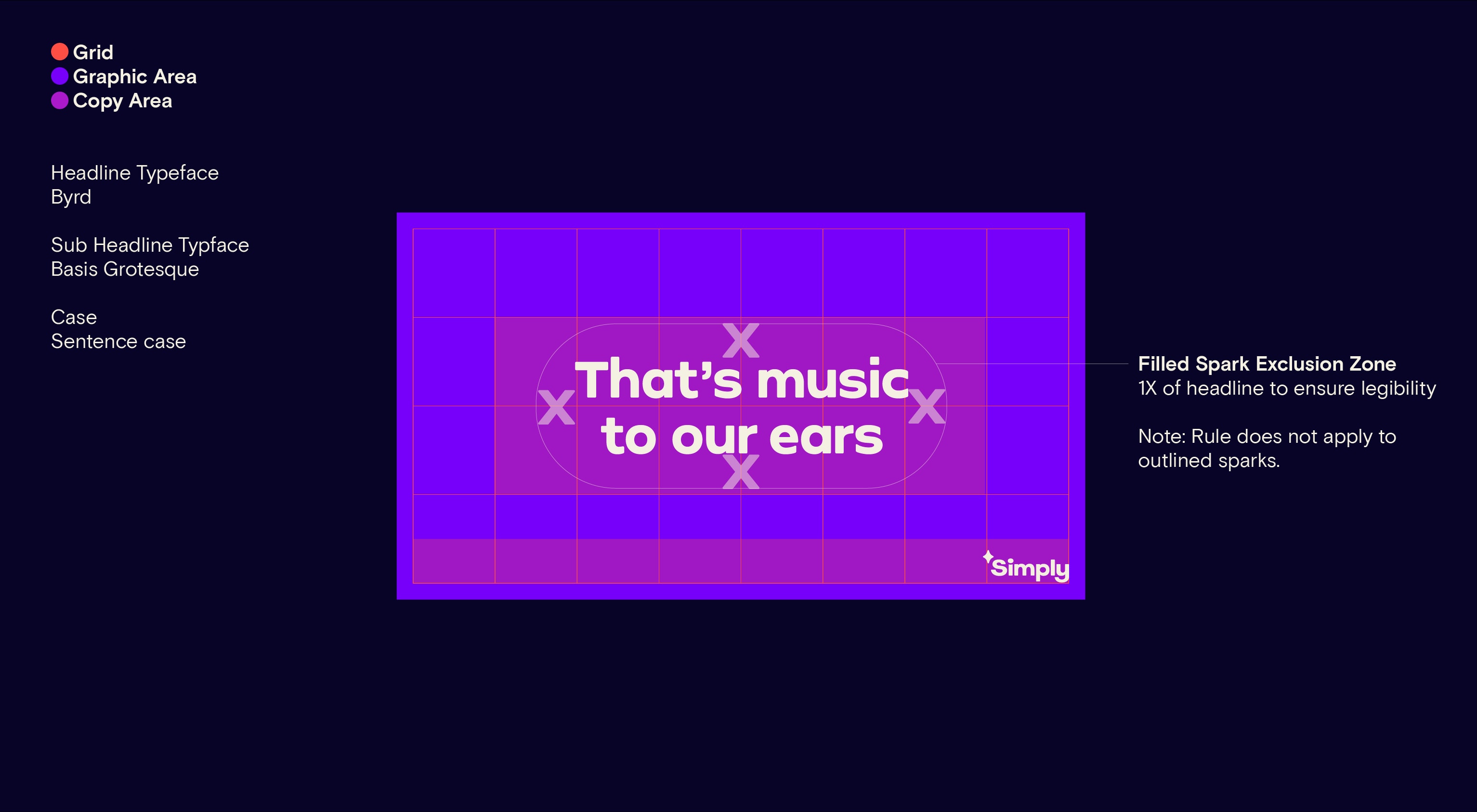
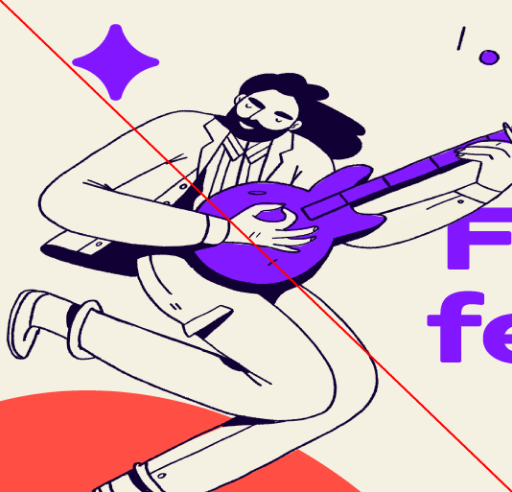
Graphic layout Landscape
Our graphic layouts are characterised by our spark elements. Our headlines are set in the middle of the page to create maximum impact, creating an immersive feeling within our journey graphic.
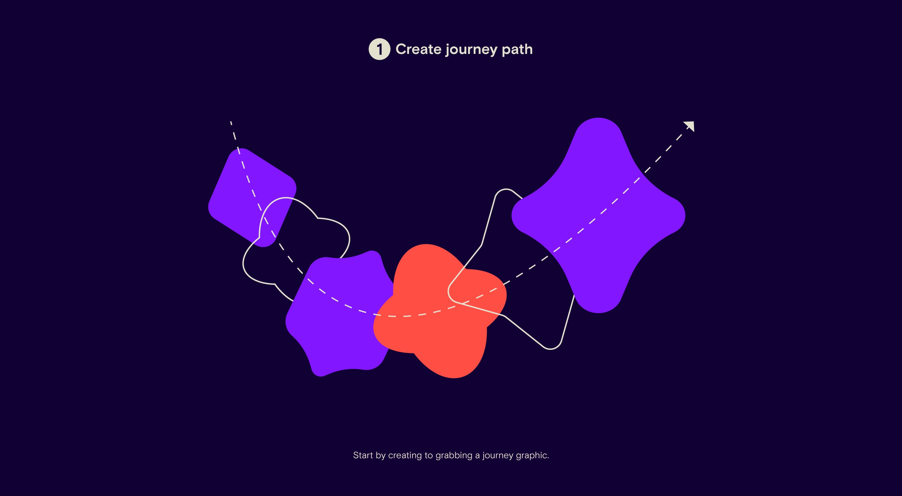
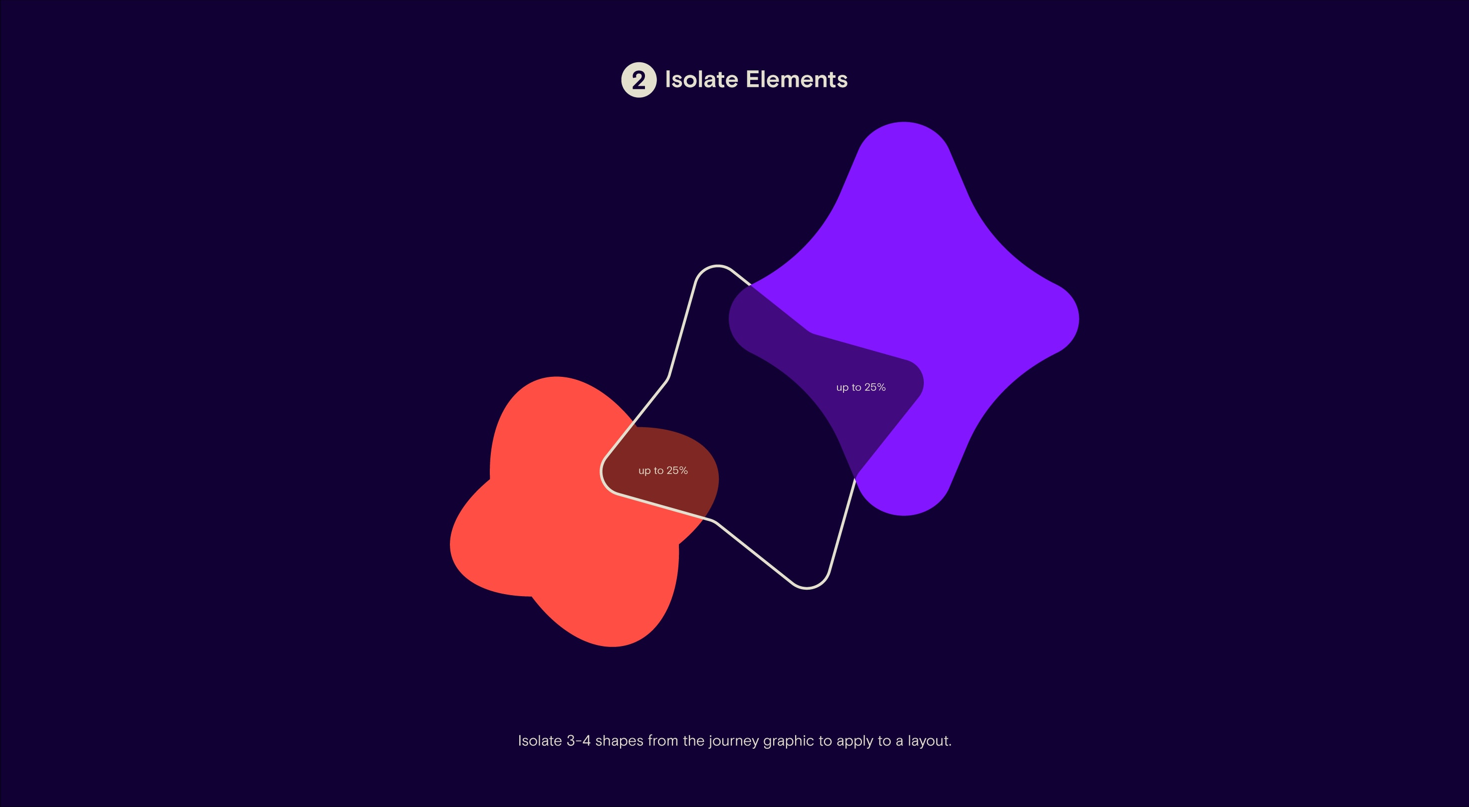
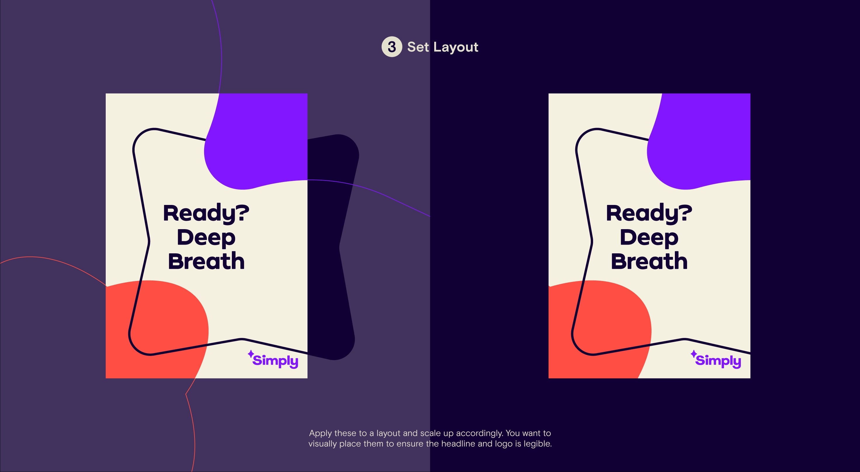
Graphic layout elements
To create a graphic segment of our journey graphic, we need to take up to 4 spark elements and combine them as per the visual below. Then, scale this up across the desired layout and shift it to pair up with the title accordingly.
For more detail refer to the ‘Sparks’ section of the guidelines.
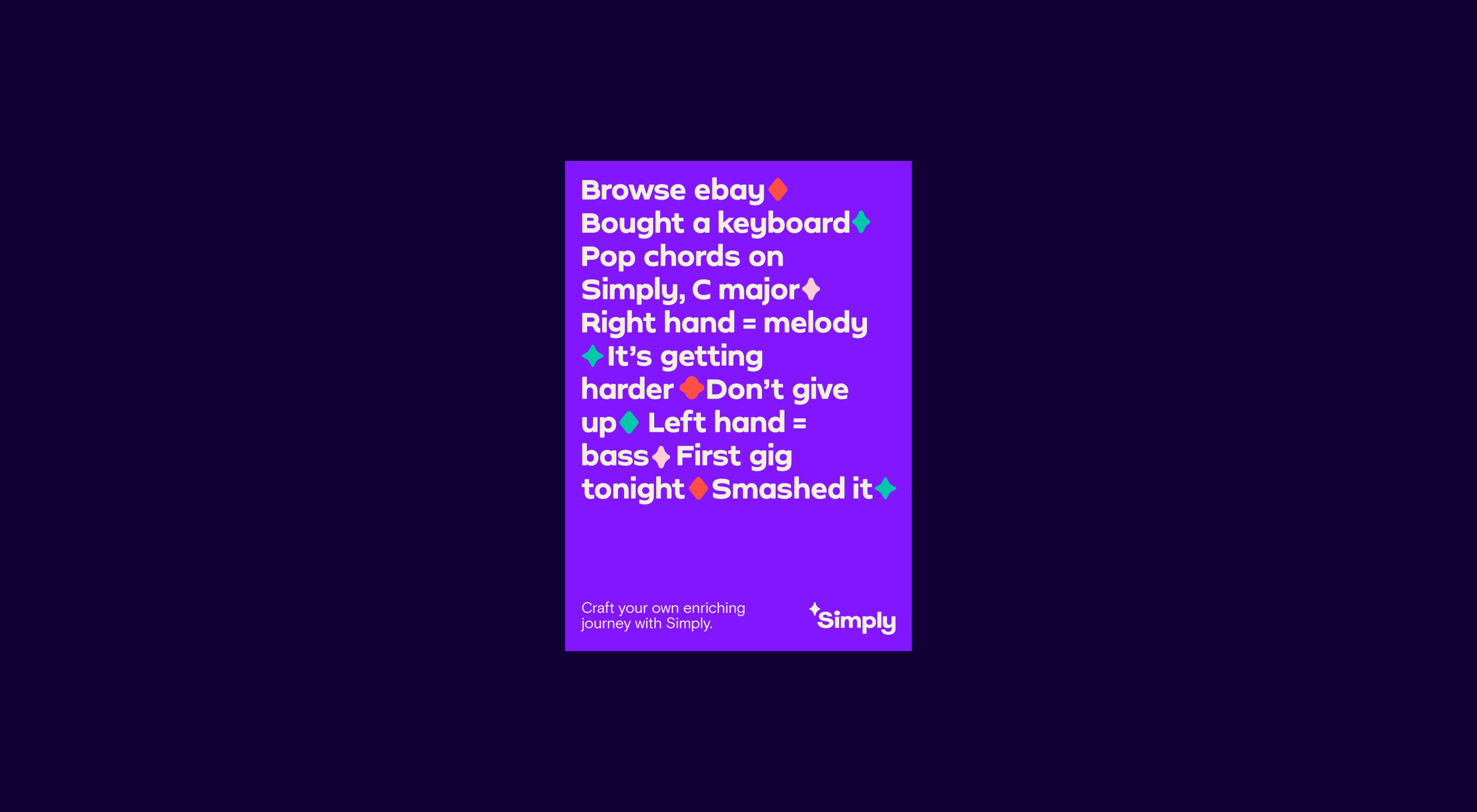
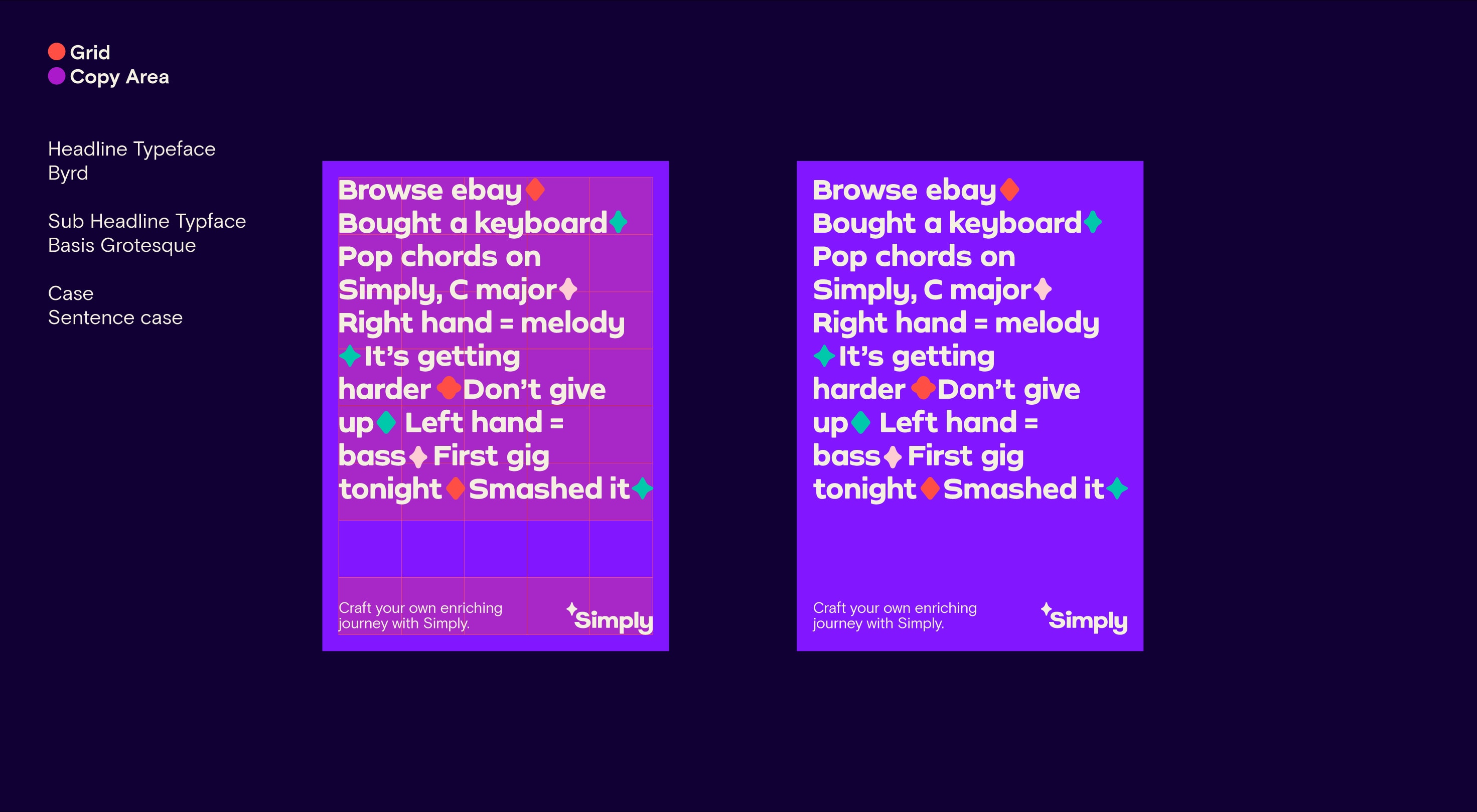
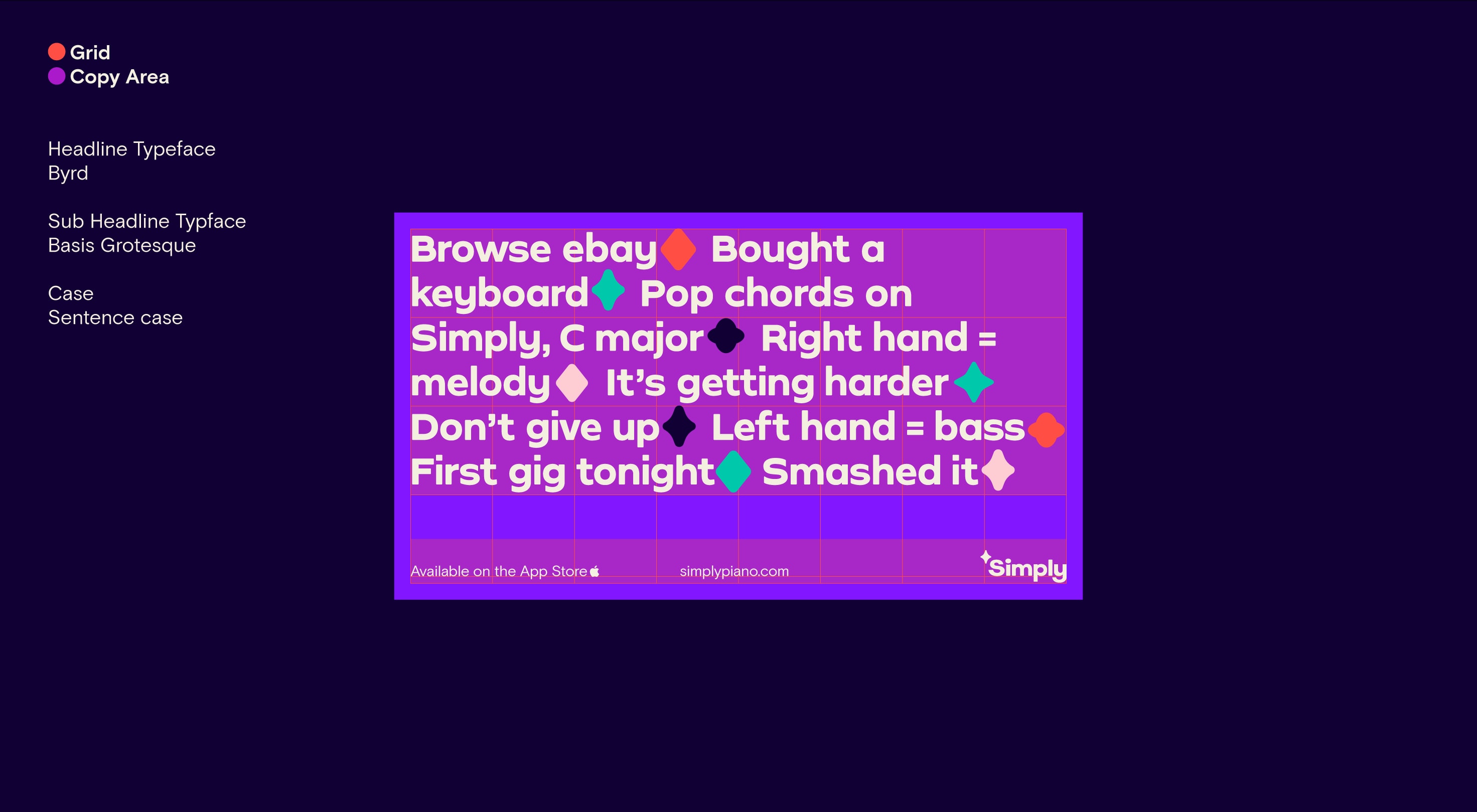
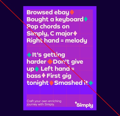
Story layout Portrait
The story layouts are a combination of typographic storytelling and using our graphic shapes as full stop mechanisms. These layouts create a new rule where we left align our headline typeface and lock it to the top left of our margins to create type-led visual. Our logo and sub-headline frame the bottom of the page.
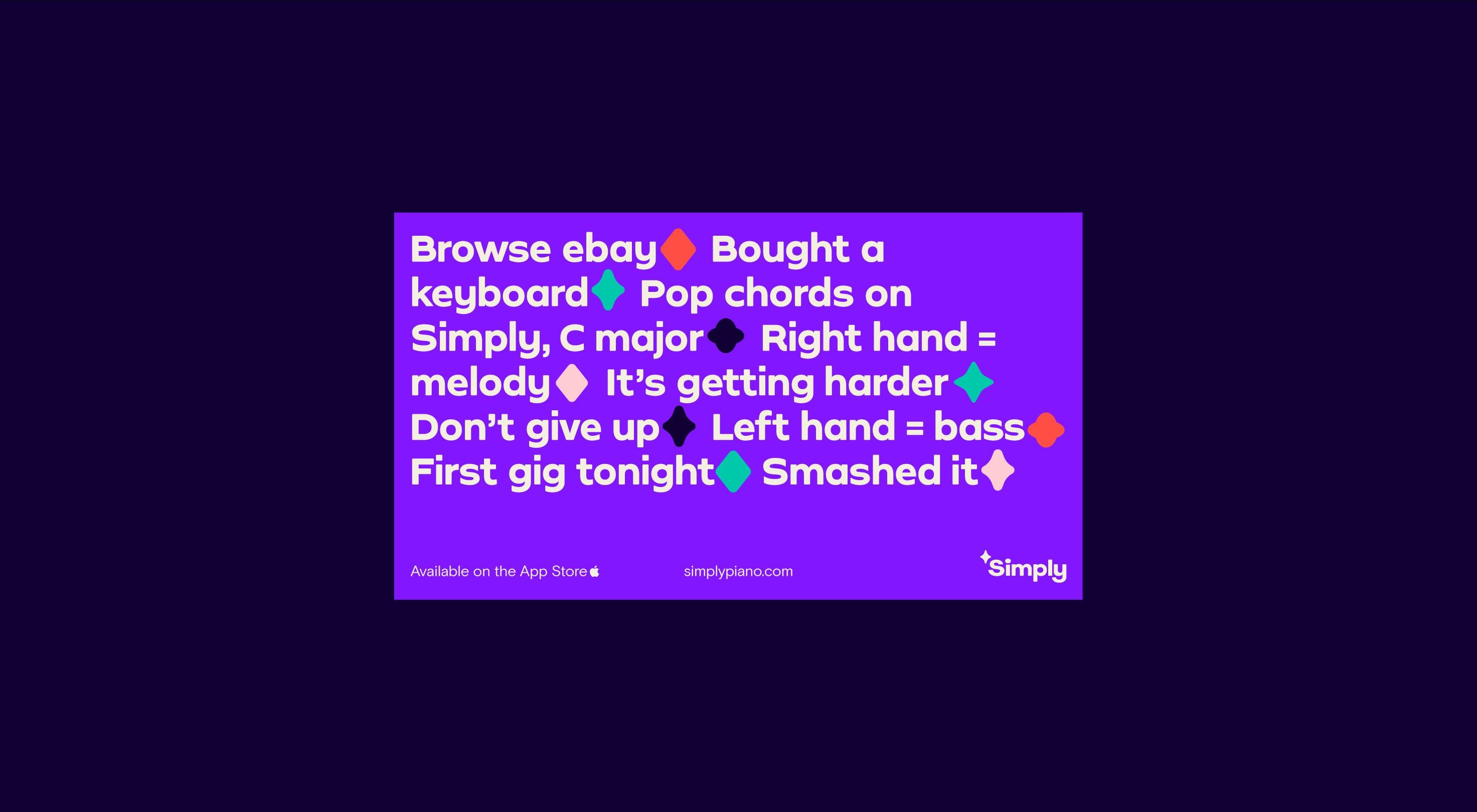
Story layout Landscape
The story layouts are a combination of typographic storytelling and using our graphic shapes as full stop mechanisms. These layouts create a new rule where we left align our headline typeface and lock it to the top left of our margins to create type-led visual. Our logo and sub-headline frame the bottom of the page.
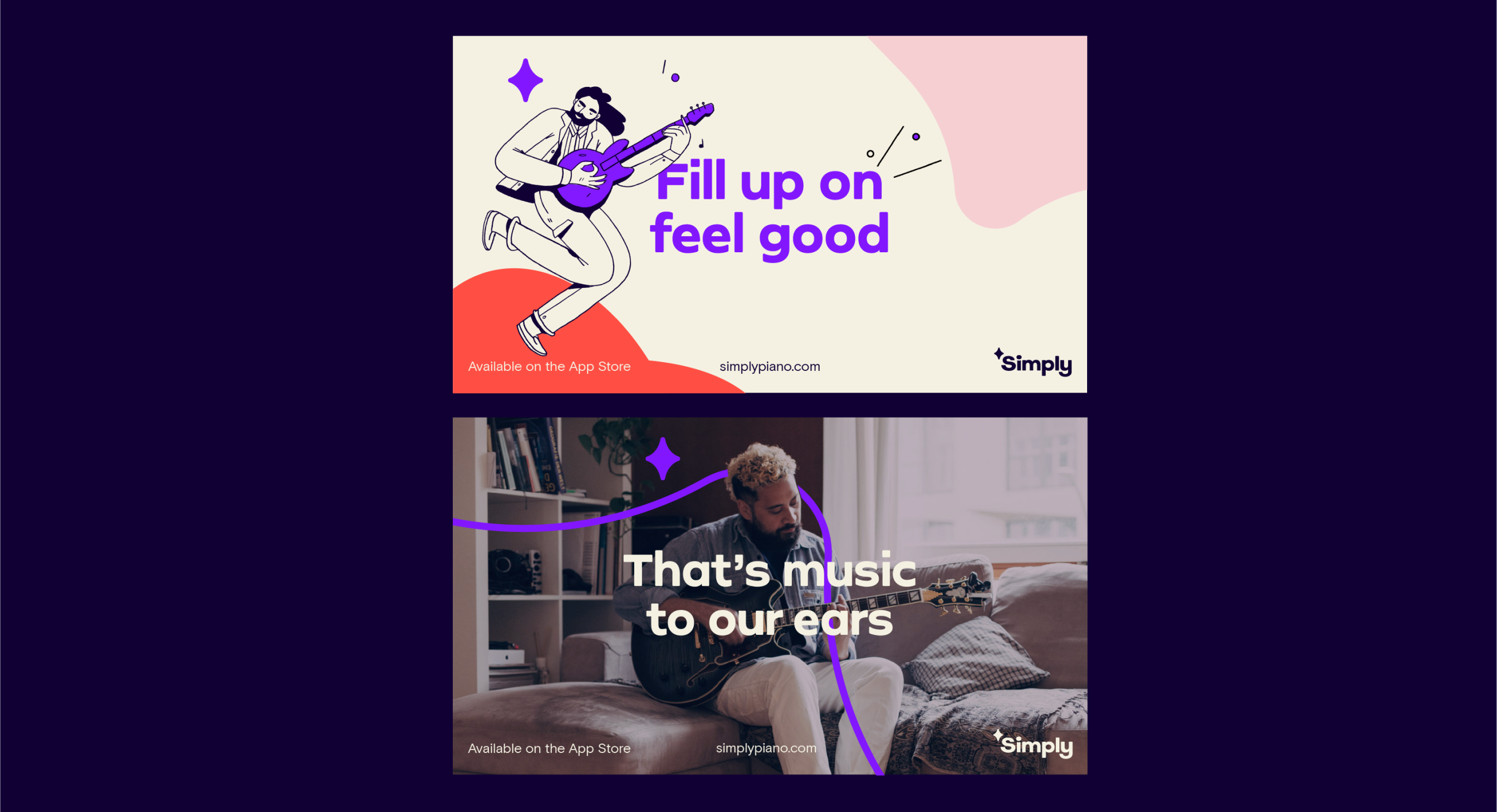
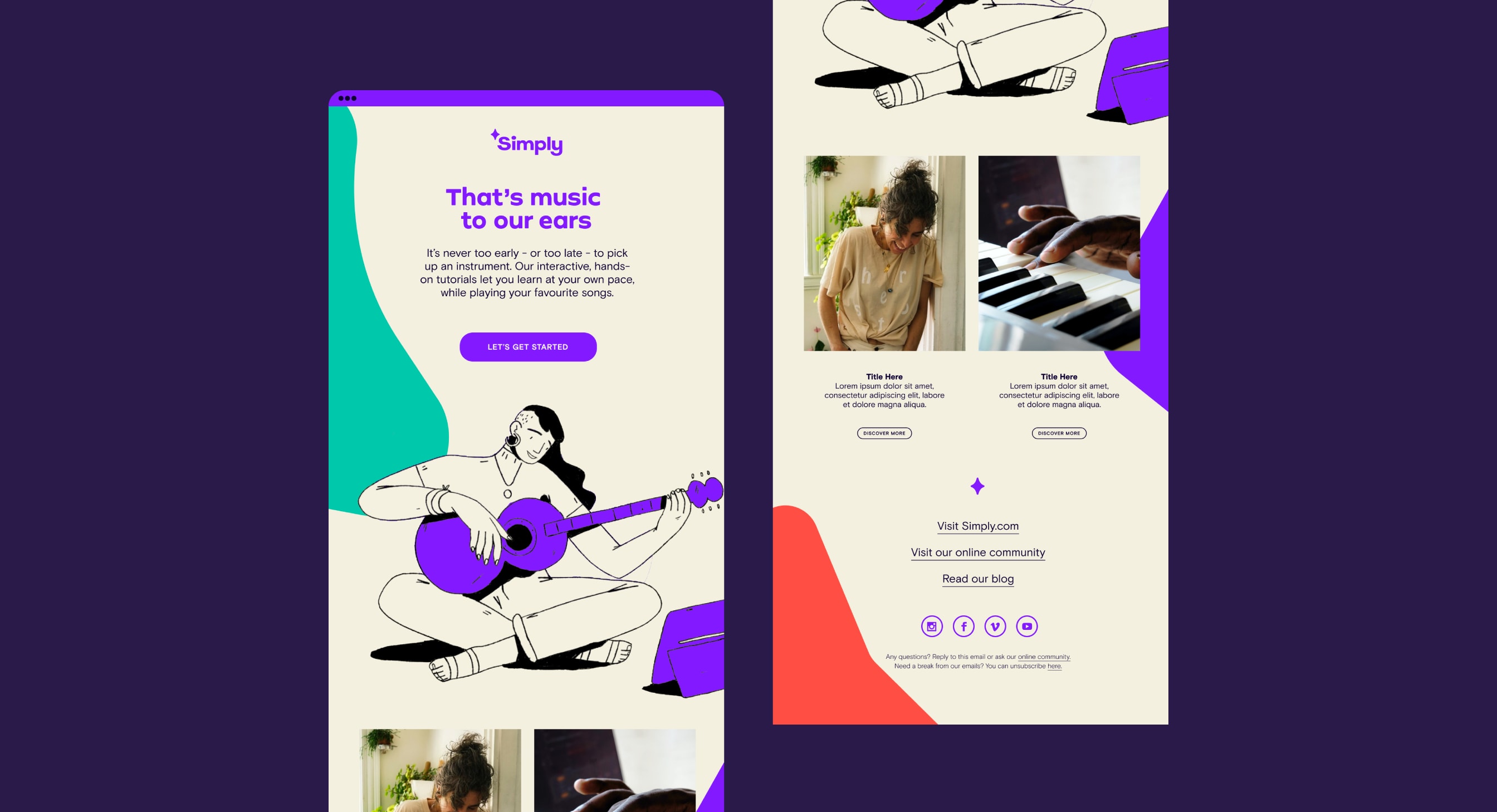
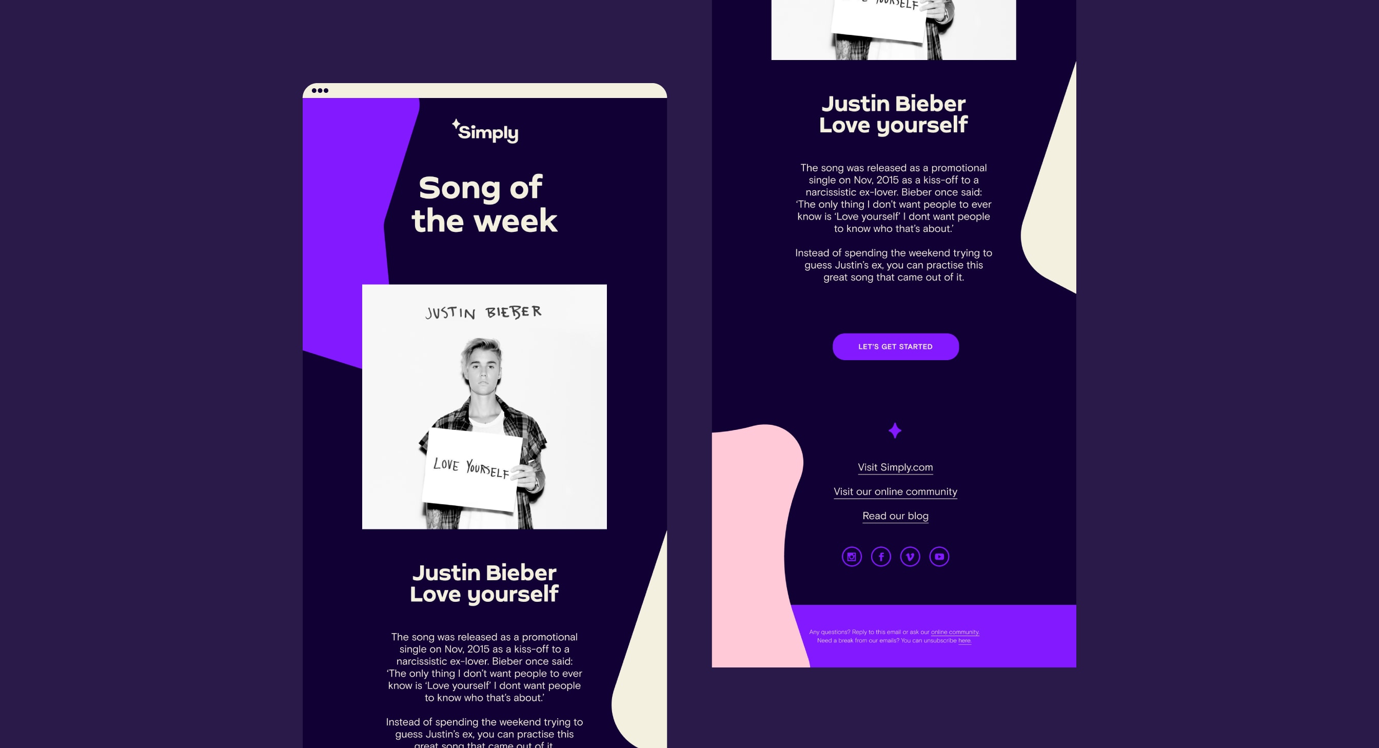
Emailer
Here is an example of how an emailer can be approached. We can have any primary color way as a background as this gives us the flexibility and hierarchy we need across all our different eCRM messages. Our sparks elements help to give our visuals additional depth and show moments within our journey trail. Ensure typography is highly legible and follows typography color rules.
In-app examples
*Add Copy Here*
Ad layouts
*Add Copy Here*
Video layout
*Add Copy Here*
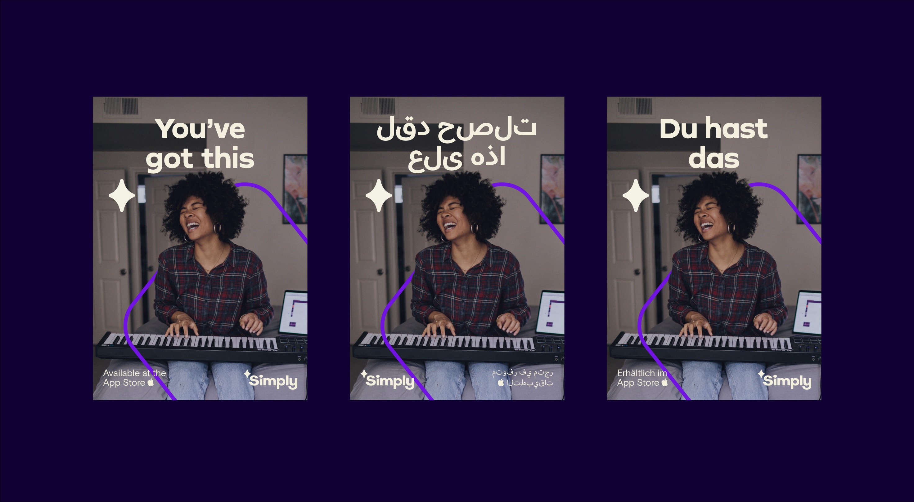
International language layouts
Here is an example of how we create layouts when reading right to left. Our headlines remain center aligned and appear in one of our international alternative fonts stated in the typography section. Our sub-header text swaps alignment to the native reader’s direction.
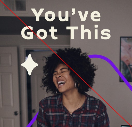
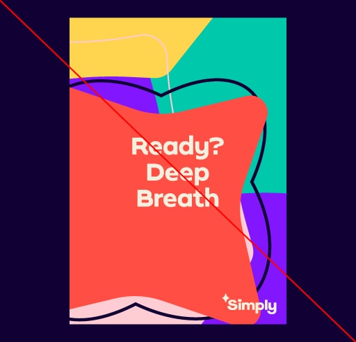
Things to avoid
Here are some examples of things to avoid when creating a layout.
Do not use title case or add tracking to headlines.
Do not use excessive sparks or arrange them outside of a trail graphic layout.
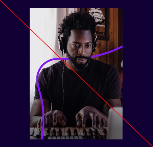
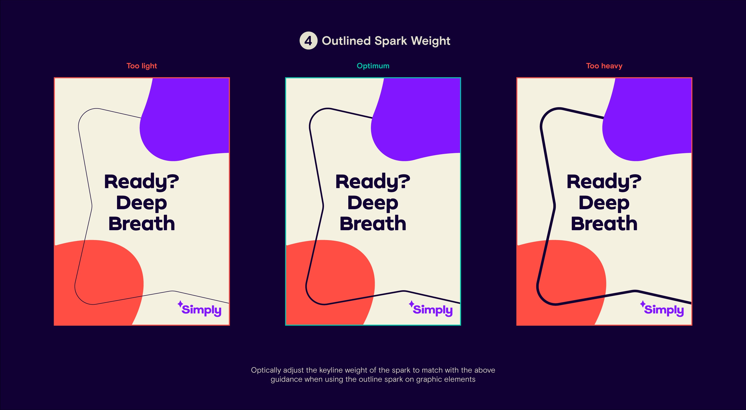
Do not strangle visuals with keyline sparks.
Do not add drop shadows, gradients or effects to layouts.
Do not stretch or warp sparks to fit layouts.
Do not set copy outside of intended copy area.
Do not over-scale our logo or cover people’s faces with headlines.
Do not add non-brand elements into layouts.