Illustration

add text here
Illustration overview
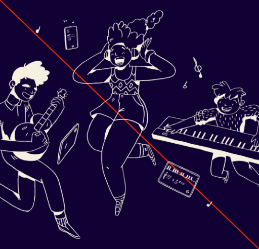
We have 4 illustration pillars that make our illustrations uniquely Simply – Authenticity, Emotion, Line art and Dynamism. These should be the starting point for creating our illustration style and ensures we avoid looking like corporate memphis. Here is an overview of our illustration style showing authentic people experiencing the joy of playing a musical instrument in their home.

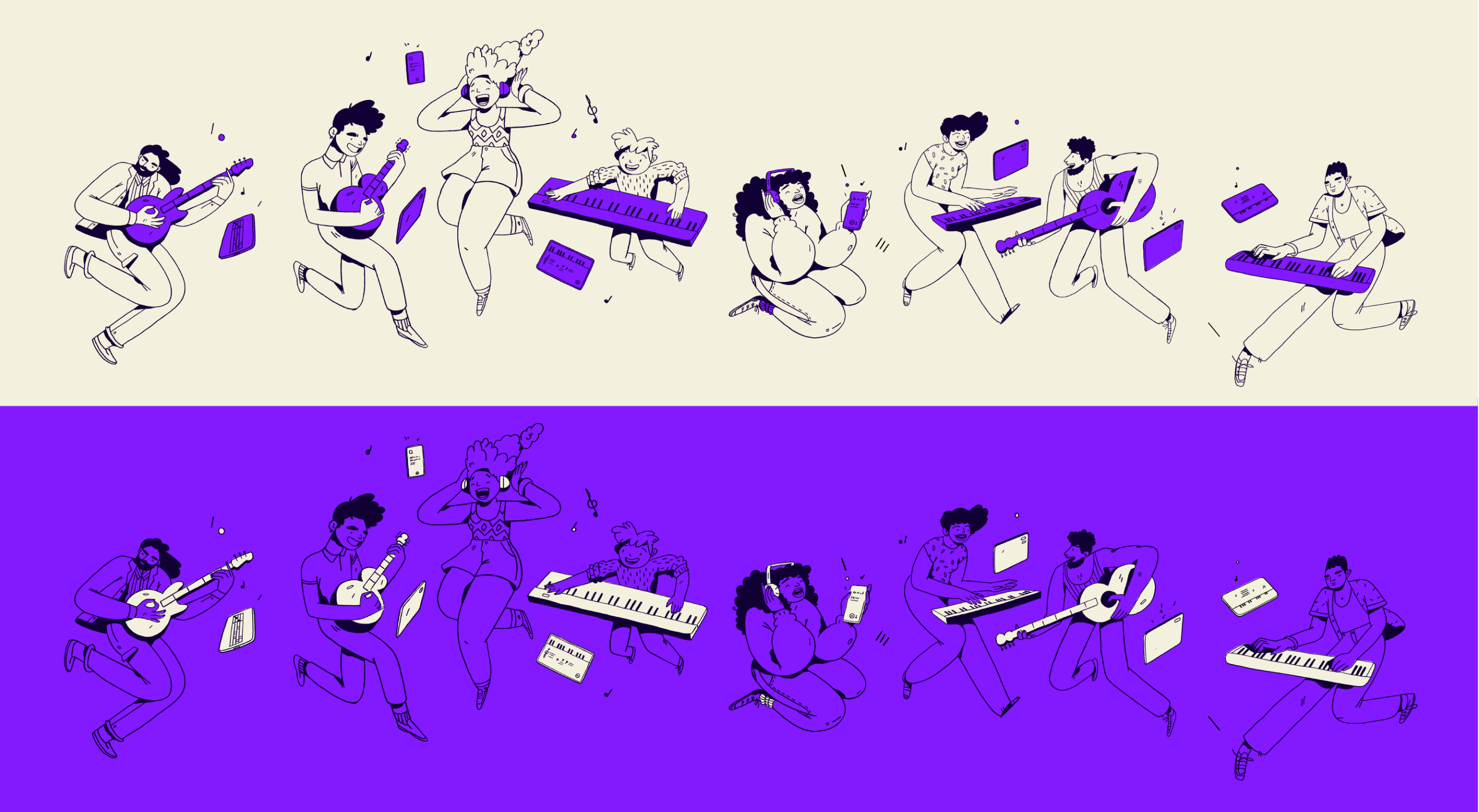
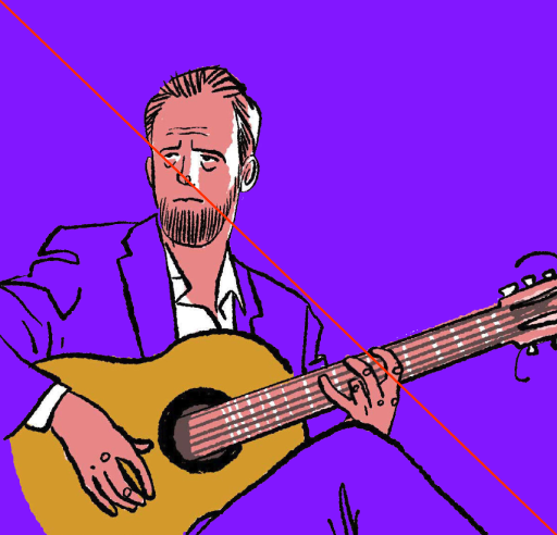
Simply does not own the rights to these illustrations, these are for reference-use only.
Illustration uses
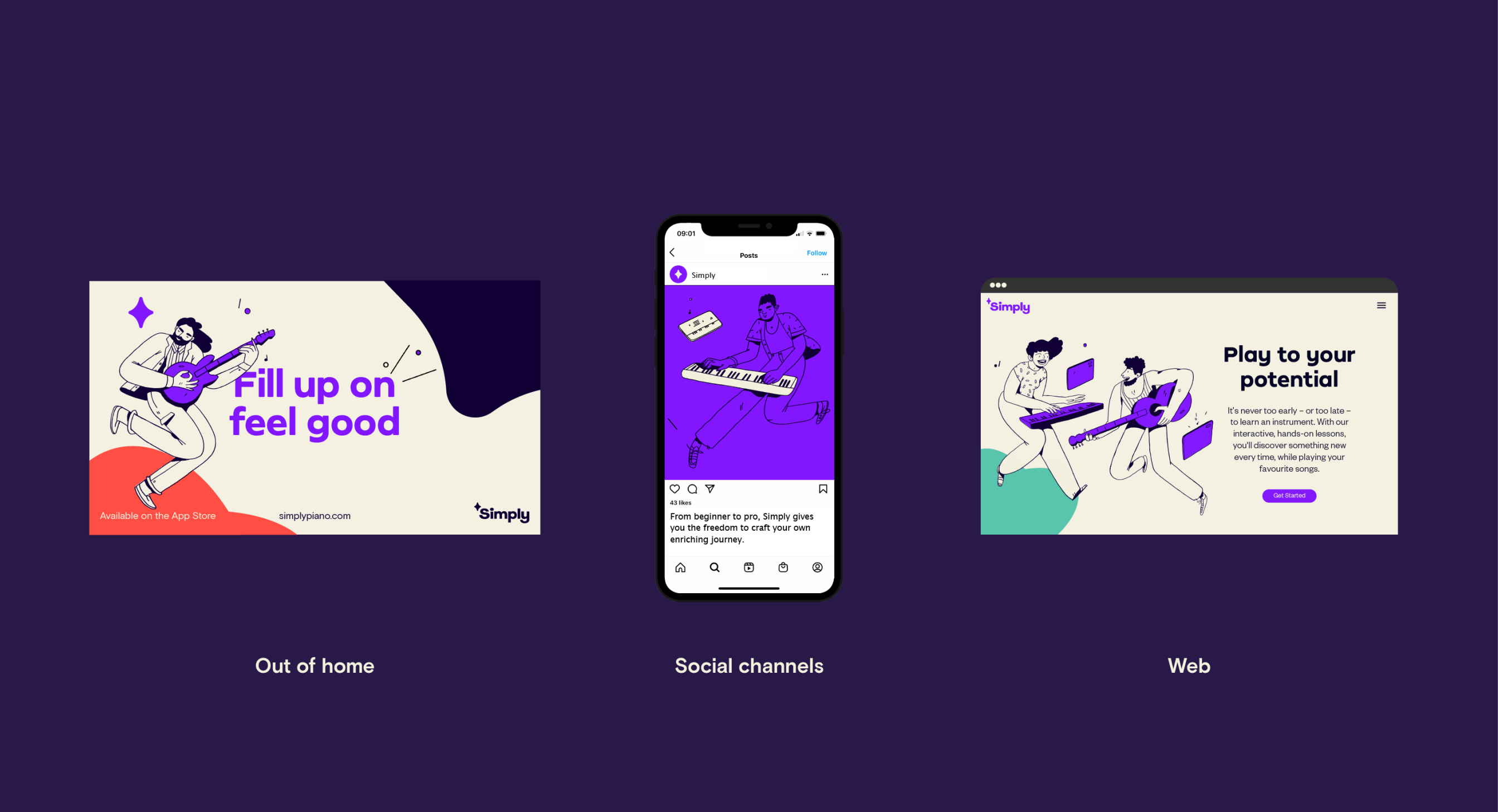
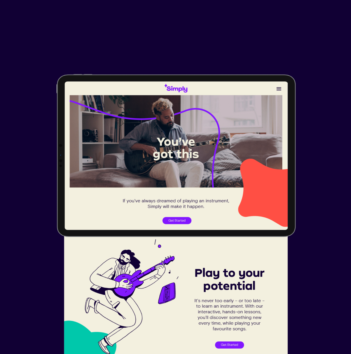
Our illustration can become a powerful tool across our communications like OOH, social, web and product to help give our customers a sense of joy and to illustrate elements outside our photography.
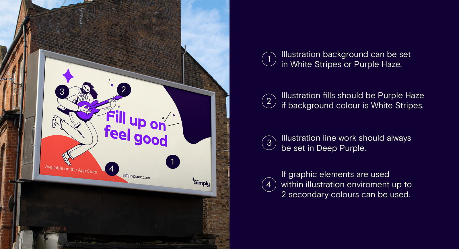
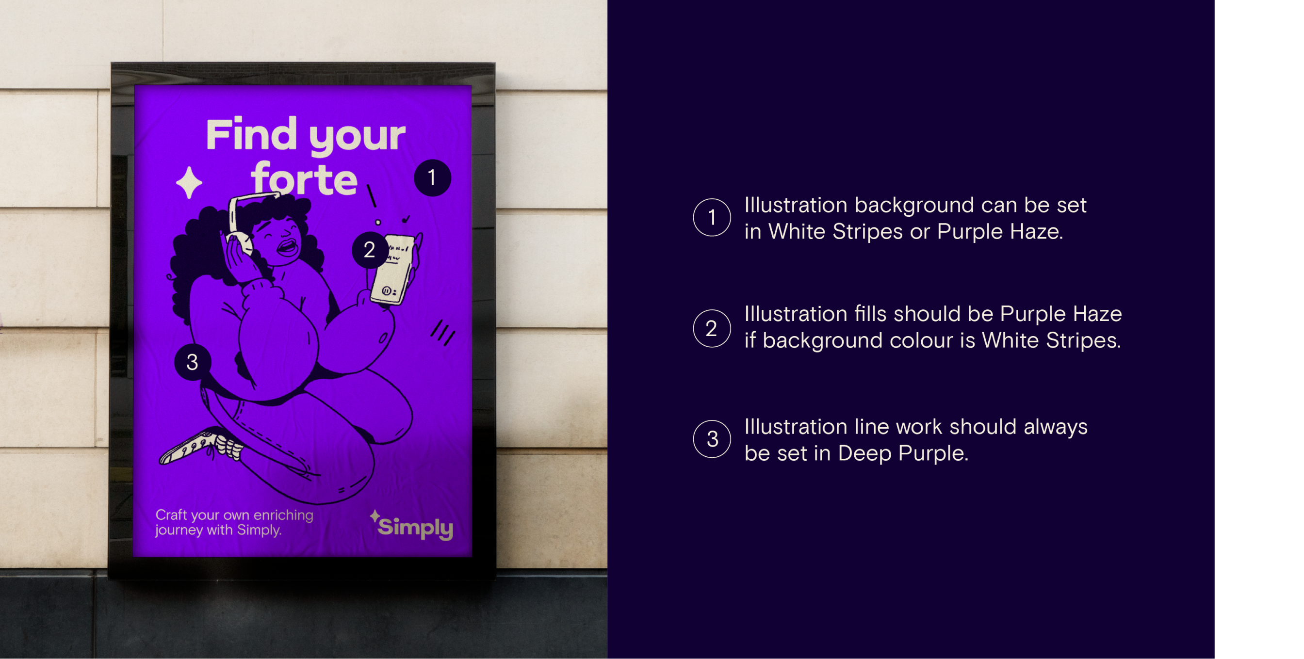
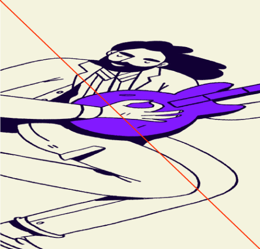
Color in illustration
Our illustration can be set across two color-ways seen in both examples below.
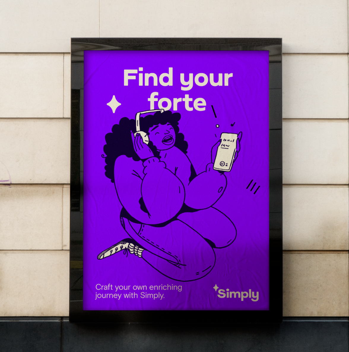
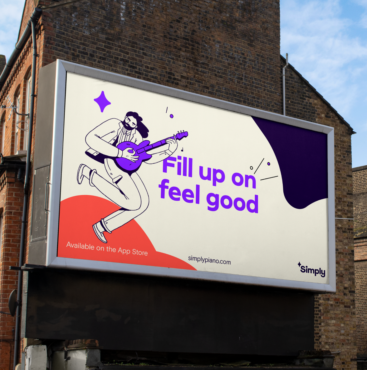
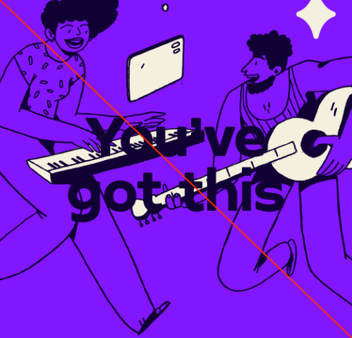
Application
Here are some examples of how our illustration should look across a series of successful brand applications.
Things to avoid
Here are some things to avoid when working with our illustration.

Do not use a secondary color as background.
Only use Deep Purple as illustration linework.
Do not stretch or warp illustrations.

Do not use excessive sparks with illustrations.
Ensure copy is legible when used with illustration.

Do not fill illustrations with colors from the secondary palette.
Do not use incorrect illustration styles.

Do not mix illustrations with photography.