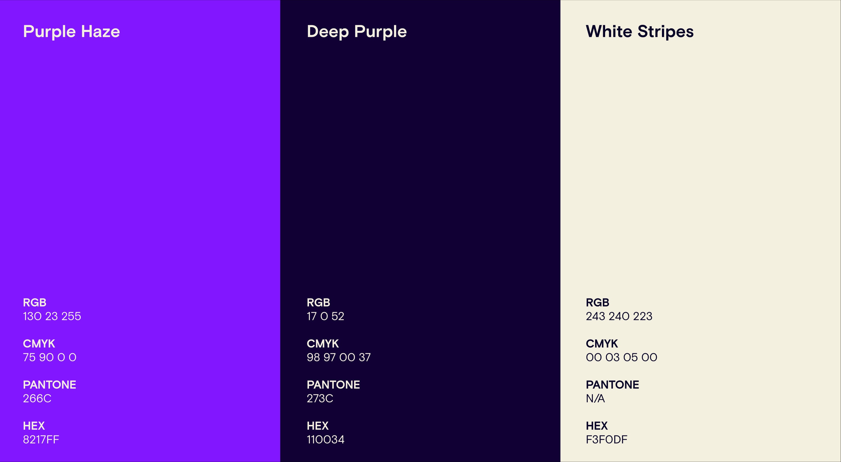
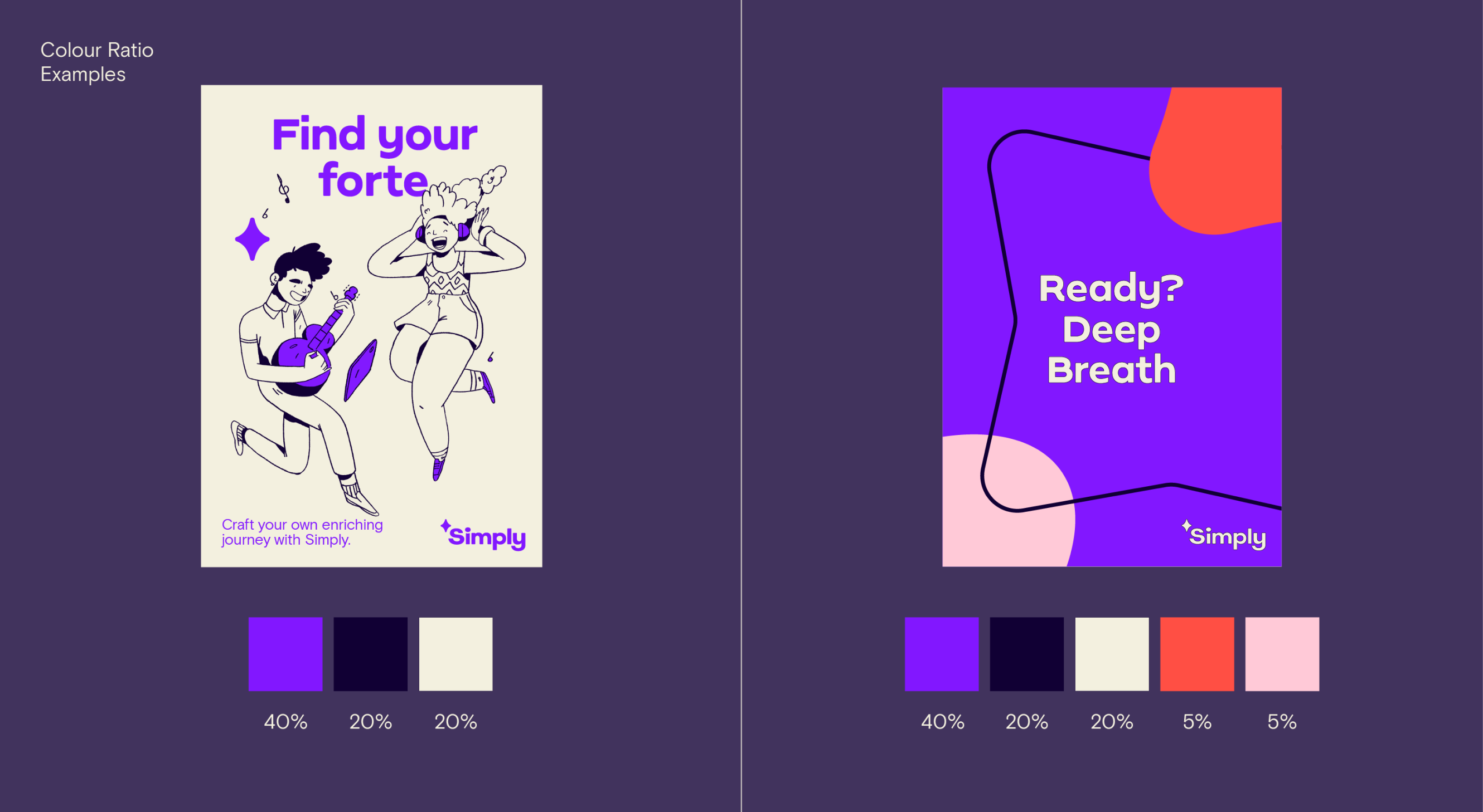
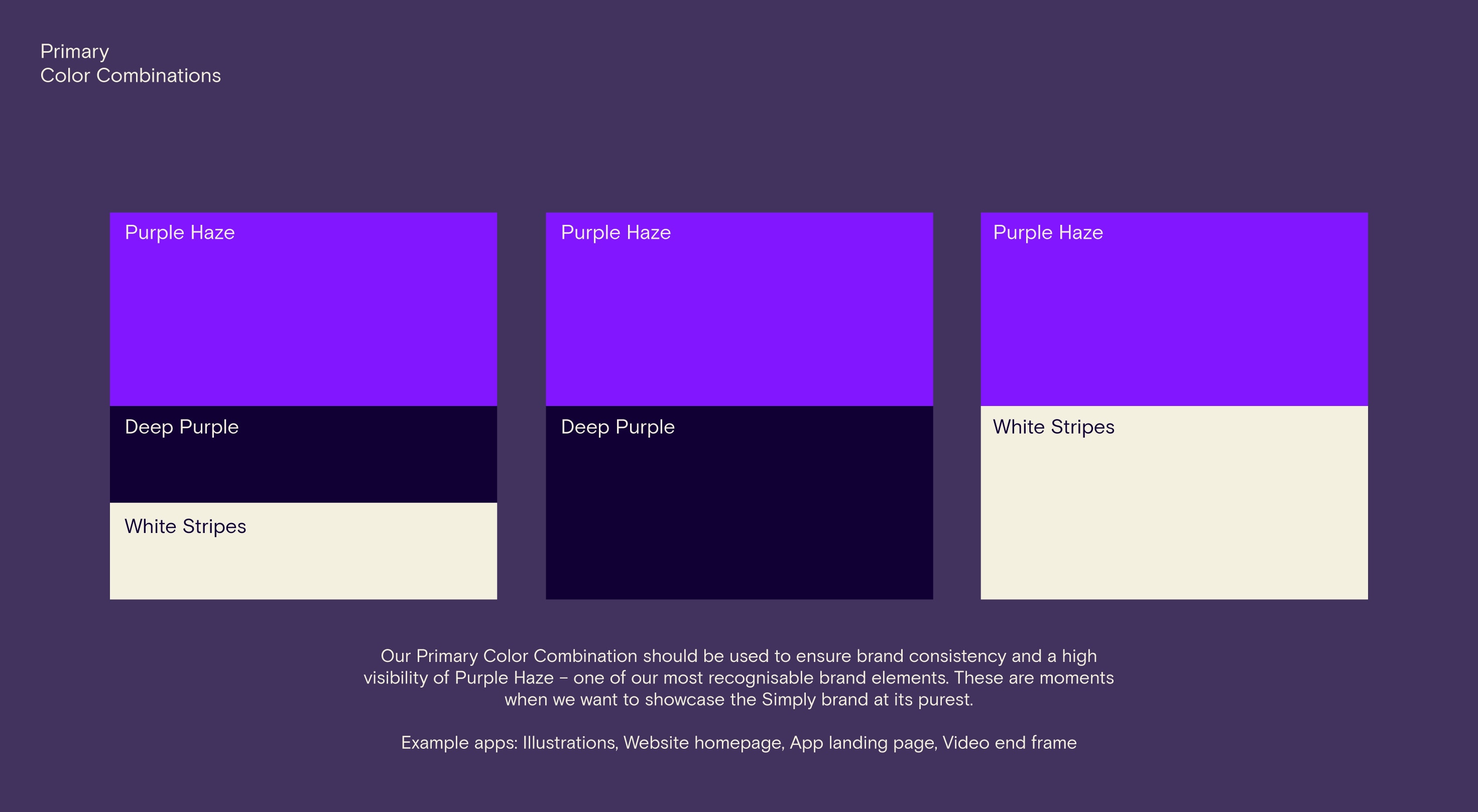
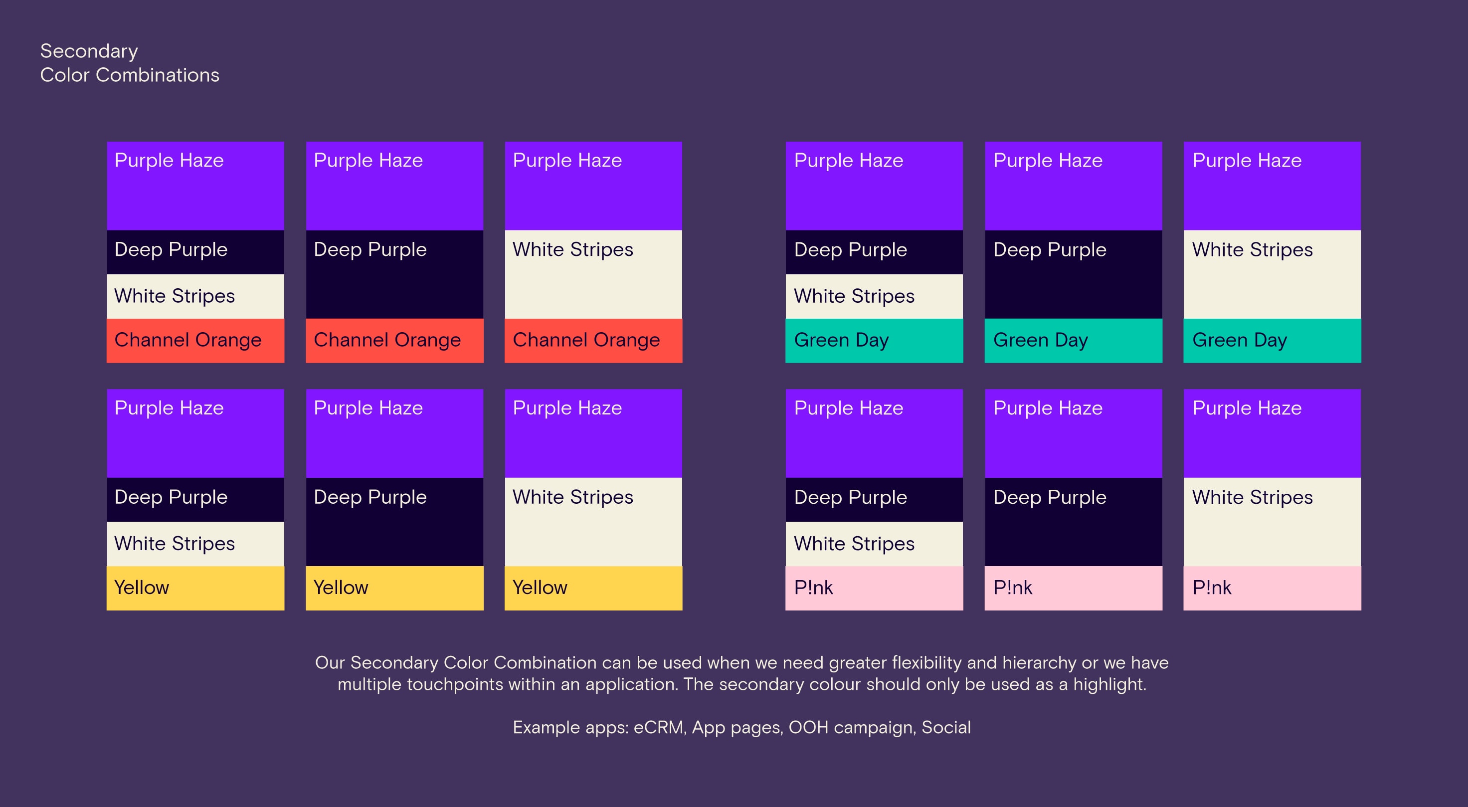
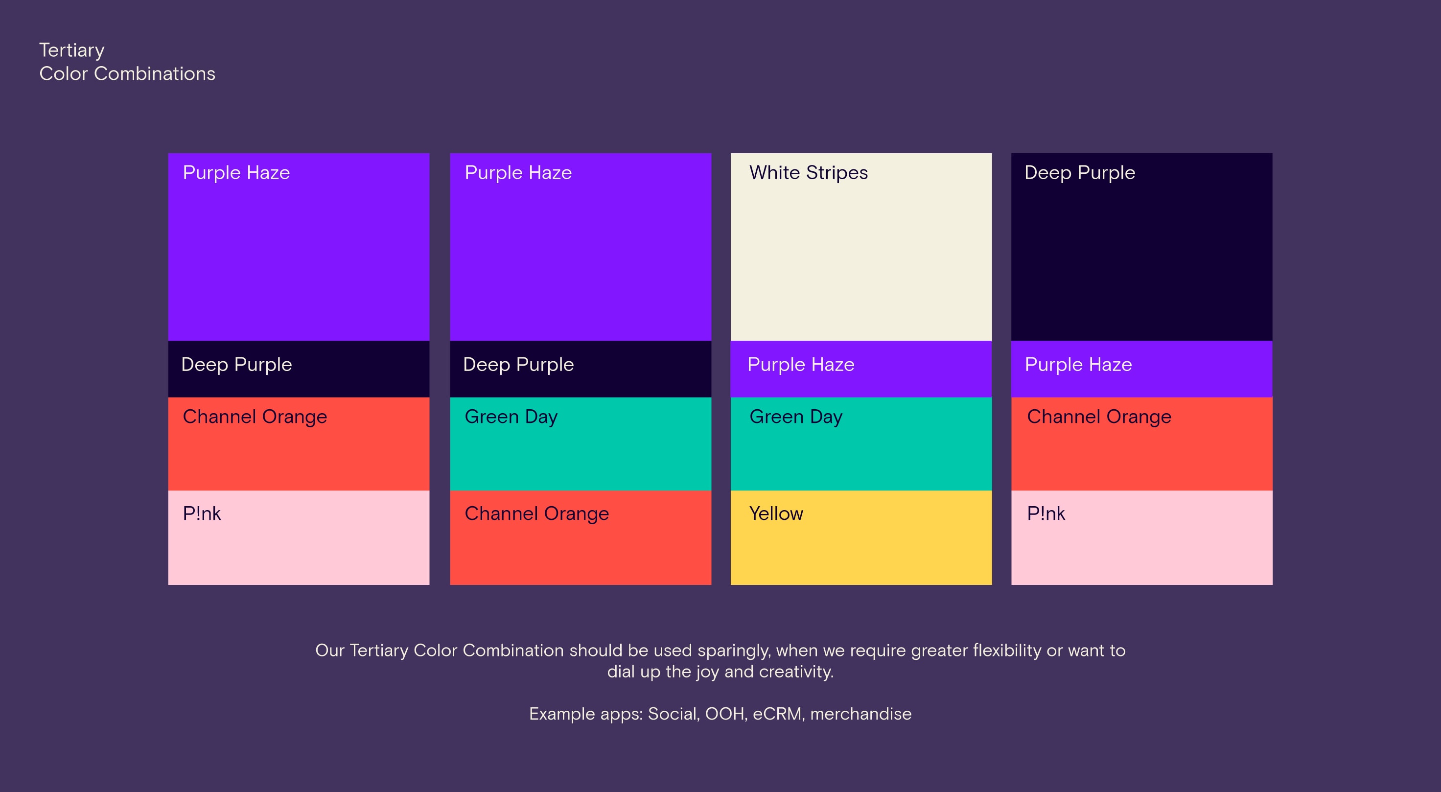
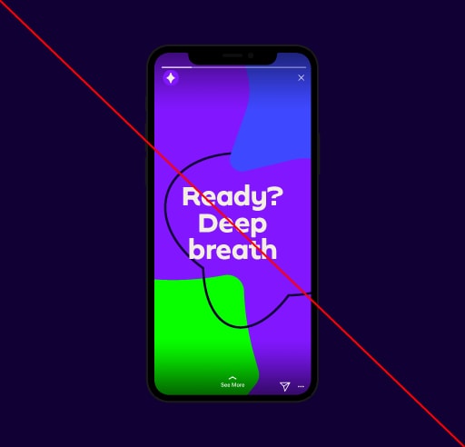
Our color palette truly sets us apart. We are a purple brand but it’s the distinguishing combination of Purple Haze with a choice of secondary colors that creates our recognizable palette. We should use it proudly and confidently to inspire and excite our learners.

Our flat, modern colors – we never use gradients – have been carefully selected to tie all our brand elements together. Secondary colors support emotion and flexibility for functionality. Together, they allow us to communicate more clearly, add life and spirit to our brand and help us stand out in a competitive field.

Primary colors

Our primary colors consist of Purple Haze, Deep Purple and White Stripes. Each color helps to visually enrich our brand. We should always use the RGB values of our colors. When managing colors for print we recommend using Pantone where possible, and advise that your printers supply proofs before any print run so you can check how the CMYK or Pantones reproduce.

Secondary colors

Our secondary colors help to add an additional enriching layer across our brand. These colors should always be used in combination with our primary palette, to add visual sparks of joy across our collateral. We should always use the RGB values of our colors. When managing colors for print we recommend using Pantone where possible, and advise that your printers supply proofs before any print run so you can check how the CMYK or Pantones reproduce.

Functional product palette

Our functional product palette extends our existing colors to give greater flexibility when working across the product.

Color ratios

Our colors should be used in the correct ratios. As an overarching rule, the majority use of color should always be Purple Haze to retain brand equity within our purple world, followed by the rest of our primary colors. Our secondary colors should be used mostly as spot colors that add rich touches of joy in places.

Color combinations 
& ratios

Our color combinations can be mixed in the following three ways. We should aim to prioritize using primary combinations for our core communications, and refrain from any new combinations outside of these limitations.

Do not create gradients with our colours

We no longer use gradients within our brand. We use flat colours throughout all our communications to maintain consistency and help with brand recognition.

Application

Here are some examples of how our colors should look across a series of successful brand applications.

Things to avoid

Here are some examples of things to avoid when working with color.

Do not create new colors outside of our palette.

Do not adapt existing colors.

Do not create color combinations outside of the suggested palettes.

Do not use secondary colors for backgrounds.

Do not set text in primary colors that don’t contrast well with an image.

Do not add secondary colors into illustrations.

Do not create gradients from our color palette.

Do not use secondary colors for keylines on images.

Next
Typography